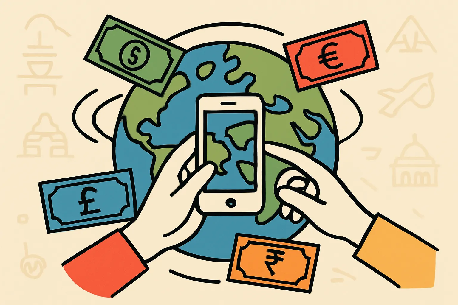
Designing Cross-Border Payment Experiences That Work Everywhere
Global money transfers have become as common as sending an email. Yet many fintech companies still approach UX design with a one-size-fits-all mentality—and their conversion rates suffer for it.
Here's the reality: a German user opening a money transfer app expects something fundamentally different than a Turkish user, who in turn has different needs from someone in the Philippines or Brazil. These aren't just minor preference differences—they're rooted in distinct banking ecosystems, cultural contexts, regulatory environments, and technological infrastructures that shape how people interact with financial products.
During my time designing global transfer experiences at Paysend, I've witnessed these differences create both challenges and opportunities. A feature that drove engagement in one market would be completely ignored in another. Payment methods that felt trustworthy in Western Europe seemed foreign in Southeast Asia. Even color choices that tested well in one region triggered entirely different emotional responses elsewhere.
The solution isn't to create dozens of separate products. It's about building flexible, culturally-aware design systems that can adapt to regional contexts while maintaining a cohesive brand experience. This article breaks down practical strategies for designing financial products that resonate across borders, based on real-world lessons from the trenches of global fintech UX.
Quick Takeaways
- Regional banking infrastructure dramatically affects UX expectations—cash-heavy economies need different workflows than card-dominant markets
- Cultural context influences everything from color psychology to information hierarchy and trust signals
- Localization goes beyond translation—it requires rethinking user flows, payment methods, and verification processes
- Mobile-first isn't universal—some markets still prefer desktop for high-value transactions due to trust factors
- Regulatory compliance shapes UX decisions differently across regions, requiring flexible design systems
- Iterative testing with regional users prevents costly assumptions and reveals hidden friction points
- Cross-functional collaboration between designers, local market experts, and compliance teams is non-negotiable
Understanding the Real Impact of Regional Banking Habits
Before you touch Figma or Sketch, you need to understand the financial ecosystem your users actually live in.
In Germany, bank transfers (Überweisung) are deeply ingrained in daily life. Germans trust their established banking infrastructure and expect transfer apps to integrate seamlessly with it. They're comfortable with IBAN numbers and anticipate features like standing orders. Security certifications and regulatory compliance badges aren't just nice-to-have—they're table stakes for credibility.
Contrast this with Turkey, where mobile banking adoption has leapfrogged traditional banking infrastructure. Turkish users expect instant gratification, real-time notifications, and seamless mobile wallet integrations. They're more comfortable with app-first experiences and often prefer biometric authentication over traditional password systems.
The Philippines presents yet another scenario. With a massive remittance economy and millions of OFWs (Overseas Filipino Workers) sending money home, users prioritize low fees, multiple payout options, and the ability to send to areas with limited banking infrastructure. Cash pickup locations, mobile wallet deposits (GCash, PayMaya), and door-to-door delivery aren't premium features—they're essential.
Understanding these foundational differences prevents you from designing solutions that look elegant but fail in practice. Start every project by mapping the actual banking behaviors, infrastructure limitations, and competitive landscape of your target markets.
Conducting Research That Uncovers Cultural Nuances
Generic user research won't cut it when designing for global audiences. You need culturally-informed research methodologies that account for how people from different backgrounds respond to questions, express concerns, and interact with researchers.
Start with ethnographic research when entering a new market. Shadow users in their natural environments. Watch how they actually send money—not in a testing lab, but at home, at work, during their daily routines. I've learned more from observing a user struggle with spotty internet in a Manila coffee shop than from a dozen perfectly-controlled usability tests.
Partner with local researchers who understand cultural nuances. Direct questions that work in low-context cultures (like Germany or the Netherlands) often fall flat in high-context cultures (like Japan or Saudi Arabia) where people communicate more indirectly. Your research approach needs to adapt.
Pay attention to trust signals during research. What makes users feel confident about sending their money through your platform? Germans might point to regulatory certifications. Nigerian users might emphasize social proof and recommendations from their network. Thai users might focus on the reputation of the parent company or banking partners.
Don't skip the competitive analysis, but look beyond direct competitors. In many markets, your real competition isn't another money transfer app—it's informal value transfer systems (like hawala), cash-carrying relatives, or cryptocurrency channels. Understanding these alternatives reveals what your UX needs to overcome.
Designing With Cultural Sensitivity Beyond Surface-Level Localization
Cultural sensitivity in UX goes far deeper than swapping out flag icons and translating button labels.
Color psychology varies dramatically across cultures. Red signals danger and debt in Western contexts but represents prosperity and good fortune in Chinese culture. While white conveys cleanliness and simplicity in Western design, it's associated with mourning in many Asian cultures. Your color system needs cultural flexibility built in from the start.
Information hierarchy expectations differ too. Western users typically scan in F-patterns and expect the most important information top-left. Middle Eastern users reading right-to-left languages need mirrored layouts. But it's more than text direction—Arabic interfaces often benefit from different visual weight distributions because of how Arabic script creates visual density.
Imagery and iconography require careful consideration. A thumbs-up icon seems universally positive until you discover it's offensive in parts of the Middle East and Africa. Family imagery that resonates in collectivist cultures might feel manipulative in individualist ones. Financial imagery showing casual interactions with money can seem disrespectful in cultures where financial matters are handled with more formality.
Even the concept of "user-friendly" varies. American users often appreciate helpful tooltips and onboarding flows. Japanese users might find the same elements condescending, preferring to discover features independently. German users want comprehensive information upfront, while Brazilian users might prefer to learn by doing.
Build design systems with cultural variables—not just for visual elements but for interaction patterns, tone of voice, and information density. This systematic approach scales better than creating separate designs for each market.
Adapting Payment Method Displays to Regional Expectations
The payment methods you support—and how you display them—dramatically affect conversion rates.
In the Netherlands, iDEAL isn't just popular—it's expected. If your checkout flow doesn't prominently feature it, Dutch users will bounce. In Poland, Przelewy24 and BLIK dominate. Indian users expect UPI, Paytm, and PhonePe. Russian users look for Yandex.Money and Qiwi.
But it's not just about supporting regional methods. It's about how you present them. In markets with dozens of popular payment options (like Indonesia or Brazil), users expect to see their preferred method immediately visible, not buried under a "more options" dropdown. This might mean rethinking your mobile payment selector to accommodate more choices without creating decision paralysis.
Trust indicators around payment methods also vary. Europeans respond well to PSD2 compliance badges and bank security logos. Latin American users might prioritize seeing familiar local brand partnerships. Southeast Asian users often want to see which payment method offers the fastest processing time displayed upfront.
Consider the verification flows associated with each payment method. Bank transfers in some regions require multi-step authentication through separate banking apps. Mobile wallet payments might need PIN verification. Card payments could trigger 3D Secure flows. Your UX needs to prepare users for these transitions rather than letting them feel like they've left your experience.
Testing payment method displays regionally reveals surprising preferences. In some markets, showing estimated arrival times next to each option significantly increased conversion. In others, displaying fees upfront (even when higher) built more trust than hiding them until later.
Building Flexible Verification and KYC Flows
Know Your Customer (KYC) requirements vary globally, and your verification UX needs to flex accordingly.
European markets operating under strict AML regulations require comprehensive identity verification before users can send meaningful amounts. Your onboarding flow needs to accommodate this without feeling bureaucratic. Break multi-step processes into digestible chunks. Show progress clearly. Explain why you're asking for information, not just what you need.
Some Asian markets allow limited transactions before full verification—a "try before you verify" model that reduces initial friction. Your information architecture needs to support progressive disclosure of verification requirements as users increase their transaction volumes.
Document types accepted for verification vary by country. Driver's licenses work in the US but aren't universal. National ID cards are standard in some countries but don't exist in others. Passport verification is globally recognized but not everyone has one. Your upload interface needs to accommodate various document formats, sizes, and quality levels.
Biometric verification adoption differs too. Indian users familiar with Aadhaar expect seamless biometric options. European users might be more cautious about facial recognition, preferring traditional document uploads. Your verification flow should offer appropriate options based on regional comfort levels and regulatory frameworks.
Communication during verification matters enormously. In high-uncertainty-avoidance cultures (like Greece or Japan), users need frequent updates on verification status. In lower-uncertainty-avoidance cultures, less frequent communication might suffice. Your notification strategy should adapt to regional expectations around transparency and communication frequency.
Optimizing Information Architecture for Different User Mental Models
How users expect to find information and complete tasks varies by cultural mental models and previous digital experiences.
Western money transfer apps typically organize around transaction types: "Send Money," "Request Money," "Transaction History." This works for users whose primary banking apps use similar structures. But in markets where mobile wallet apps dominate, users expect organization around people—"Send to Contact" or "Pay Friend"—rather than abstract transaction types.
Navigation depth preferences differ. American users often tolerate deeper navigation hierarchies if well-labeled. Japanese users frequently prefer broader, shallower structures even if that means more initial options. German users want comprehensive navigation that shows all available options. Brazilian users might prefer personalized dashboards that surface their most common actions.
The prominence of recipient management varies in importance. In markets with high domestic transfer volumes, users want quick access to saved recipients, recent transfers, and favorites. In markets dominated by international remittances, users need robust recipient management with multiple payout options, currency displays, and delivery method selections.
Feature discoverability requires regional calibration. Some cultures appreciate proactive feature announcements and tutorials. Others find these interruptions annoying, preferring subtle indicators they can explore optionally. Test how users in your target markets prefer to discover new features—through guided tours, modal announcements, in-context hints, or self-directed exploration.
Consider how financial literacy varies across markets and affects information architecture. Some users need educational content integrated throughout the flow—explaining exchange rates, fees, and delivery times. Others find this patronizing and want streamlined access to core functions.
Creating Responsive Customer Support Experiences
When something goes wrong with money, users need help immediately—but expectations around support vary globally.
In the US and UK, users expect multiple self-service options: comprehensive FAQs, chatbots, video tutorials. They'll try solving problems independently before contacting support. Design with robust help centers and contextual support integrated throughout the experience.
In many other markets, users want immediate human contact. Middle Eastern users often expect phone support to be prominent and easily accessible. Latin American users value WhatsApp support channels. Asian markets might prefer live chat over phone calls.
Response time expectations differ dramatically. Users in fast-paced markets expect instant responses, even outside business hours. Users in markets with different work-life balance norms might accept longer response times if communicated clearly.
Language support is obviously critical, but consider dialect and formality variations. Spanish speakers in Spain, Mexico, and Argentina use different terminology and expect different formality levels. Arabic varies significantly across regions. Your support content needs regional language adaptation, not just translation.
Even how you present support options matters culturally. Some cultures respond well to friendly, casual support tone. Others expect formal, professional communication. The same support message optimized for Australian audiences might feel unprofessional to German users or too stiff for Filipino audiences.
Designing for Diverse Device and Connectivity Contexts
Assuming all users have the latest smartphones and reliable internet is a costly mistake.
In developed markets, mobile-first design makes sense. But consider that in some markets, users still prefer desktop for high-value financial transactions due to perceived security and seriousness. Your responsive design needs to recognize that "mobile-first" doesn't mean "mobile-only."
Device diversity is enormous in many markets. While you might design primarily for iOS and flagship Android devices, users in India, Nigeria, or Indonesia often use budget Android phones with limited RAM, older OS versions, and smaller screens. Your app performance and design needs to work smoothly across this spectrum.
Connectivity varies even more. Intermittent connectivity, slow data speeds, and expensive data plans affect how users interact with your product. Design for offline-first where possible. Show clear loading states. Allow users to queue transactions when offline. Optimize image sizes and minimize unnecessary data transfers.
Consider data cost consciousness. In markets where data is expensive, users notice heavy apps. They appreciate lightweight designs that don't consume unnecessary data. Show file sizes before downloads. Offer lite versions of your app where appropriate. Provide progress indicators that let users know how much data a transaction flow will consume.
App size matters for initial downloads too. Users on limited storage devices might delete and reinstall apps between uses. Your onboarding needs to account for returning users who've cleared data, while still being quick for genuinely new users.
Implementing Continuous Feedback Loops Across Markets
Launching in multiple markets isn't a one-time design effort—it requires ongoing regional feedback and iteration.
Set up region-specific analytics that go beyond standard metrics. Track where users drop off in different markets. Compare task completion rates across regions. Monitor which features get adopted enthusiastically in some areas but ignored in others. These patterns reveal where your design assumptions missed the mark.
Establish feedback channels appropriate to each market. In-app surveys work in some regions. Others respond better to WhatsApp community groups, local social media channels, or in-person user panels. Meet users where they are rather than forcing them into your preferred feedback format.
Create regional user advisory boards. Regular sessions with engaged users from key markets provide invaluable qualitative insights that pure analytics miss. These users can flag cultural missteps, explain confusing behaviors in your data, and validate new feature concepts before development.
Monitor customer support tickets by region. Support inquiries reveal friction points in your UX. When Turkish users consistently ask the same questions, your interface isn't communicating clearly in that market. When Indian users frequently contact support about verification, your KYC flow needs regional optimization.
Don't just collect feedback—close the loop. When users in a specific market report issues or request features, communicate back about changes. This builds trust and creates advocates who'll continue providing valuable input. Regional users who see their feedback implemented become your most valuable design partners.
Building Cross-Functional Teams With Regional Expertise
Great global UX doesn't emerge from design teams working in isolation—it requires collaboration with regional experts.
Partner with local market managers who understand regional nuances you'll never catch from a distance. They know which local competitors just launched features your users will now expect. They understand regulatory changes before they hit your market. They catch cultural missteps in your designs before users see them.
Work closely with localization teams, but push beyond translation. The best localization partners don't just convert words—they adapt meaning. They flag when your metaphors don't translate. They suggest regionally-appropriate alternatives to idioms and cultural references in your UX copy.
Collaborate with regional compliance and legal teams early in design. Compliance shouldn't be a design constraint applied at the end—it should inform your design direction from the start. Understanding what's required in each market helps you design flexible systems rather than creating technical debt through post-hoc modifications.
Include regional customer support teams in design reviews. They interact with user frustrations daily and spot usability issues designers miss. A support team member saying "we get calls about this constantly in Brazil" is invaluable design feedback that might not surface in formal testing.
Consider hiring designers in your major markets. Remote work enables distributed design teams. A designer based in Manila brings lived experience to designing for Filipino users that no amount of research can replicate. They catch assumptions, validate solutions, and help the broader team build cultural competence.
Conclusion: Design Systems That Embrace Regional Diversity
Creating effective UX for global money transfers isn't about finding the lowest common denominator—it's about building intelligent, adaptive systems that respect regional diversity while maintaining coherent brand experiences.
The fintech companies winning internationally don't just localize their products—they build cultural awareness into their design DNA. They establish flexible design systems with regional variables. They hire local expertise and empower regional teams to make decisions. They measure success differently across markets because they recognize that user needs differ fundamentally.
This approach requires more upfront investment than copying Silicon Valley patterns globally. But the payoff is significant: higher conversion rates, better user retention, reduced support costs, and authentic market penetration rather than superficial presence.
Start by deeply understanding one new market before expanding to the next. Resist the temptation to launch everywhere simultaneously. Build your capability to adapt gradually, learning from each market and applying those lessons systemically.
The most important shift is mental: stop thinking about international expansion as "adapting our product for new markets" and start thinking about "designing products that work for humans in different contexts." This mindset change unlocks better solutions and prevents costly missteps.
Ready to audit your global transfer experience? Map your user journey for your top three markets side by side. Identify where the same flow creates different friction points regionally. Those gaps represent your biggest opportunities to improve conversion and user satisfaction through culturally-informed design.
FAQs
How much localization is actually necessary for a money transfer app?
It depends on your target markets and growth goals. At minimum, translate all user-facing content professionally (not just machine translation), support regional payment methods, and comply with local regulations. For competitive advantage, adapt user flows to regional mental models, adjust information hierarchy, customize support channels, and optimize for local device and connectivity contexts.
Should I create completely separate apps for different regions?
Usually no. Build a flexible design system with regional variables instead. Maintain one codebase with configurable elements for color schemes, navigation patterns, payment methods, verification flows, and feature sets. This approach scales better than managing multiple codebases while still allowing meaningful regional customization.
How do I prioritize which markets to design for first?
Consider three factors: transaction volume potential, strategic importance to your business model, and cultural distance from your current markets. Start with markets offering significant volume that aren't dramatically different from where you've already succeeded. Learn from these expansions before tackling markets requiring more substantial adaptation.
What's the biggest mistake companies make with global UX?
Assuming users everywhere think like users in their home market. This leads to imposing solutions that worked in one context onto others where they don't fit. The second biggest mistake is treating localization as a final step rather than a core design consideration from the start.
How do I measure success differently across regions?
Define regionally-appropriate benchmarks based on local competitive context and user behaviors. Conversion rates, average transaction values, retention patterns, and feature adoption will vary based on regional factors. Compare performance against local competitors and historical baselines for each market rather than expecting uniform metrics globally.