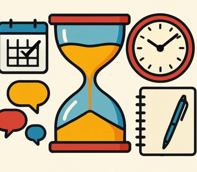
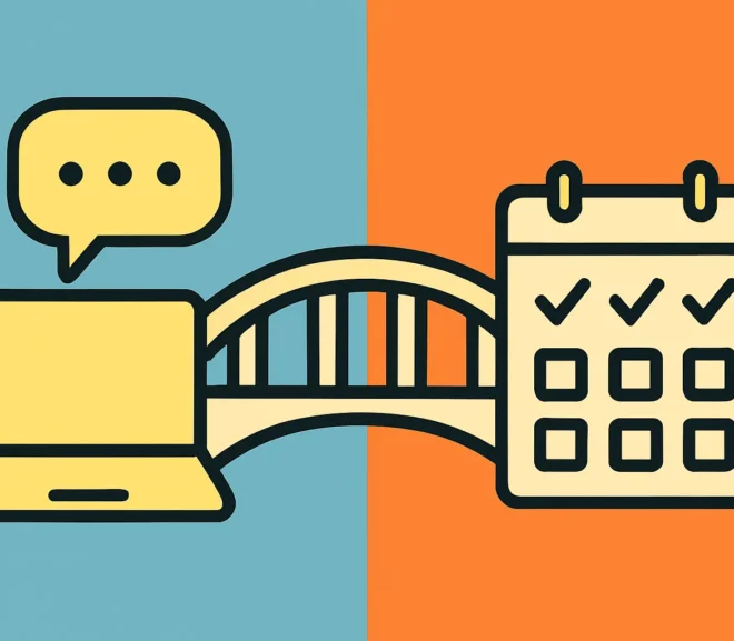
How to Run Meetings People Actually Want to Attend We've all been there—stuck in another meeting that could've been an email. The calendar invite drops…
UX UI Product designer blog
How to Run Meetings People Actually Want to Attend We've all been there—stuck in another meeting that could've been an email. The calendar invite drops…
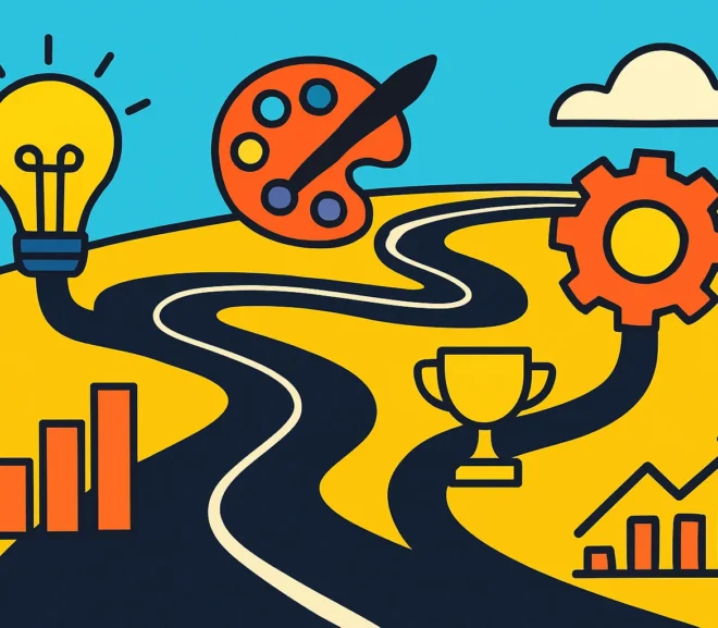
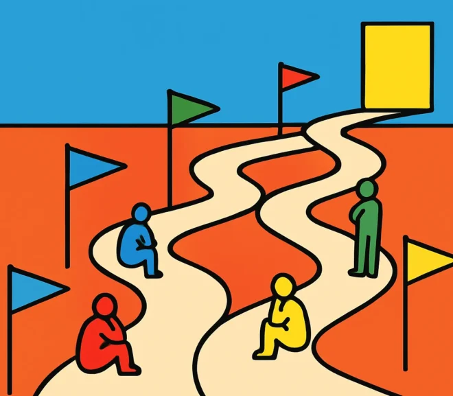
Napoleon's Decision-Making Trick Every Product Team Needs Napoleon Bonaparte conquered most of Europe before he turned 35. But his secret weapon wasn't cannons or cavalry—it…
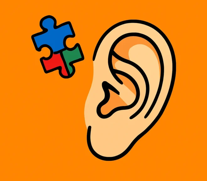
Why Asking "Why" Five Times Reveals Hidden UX Problems You've launched your site. Traffic is coming in. But something's off. Users aren't converting. They're bouncing.…
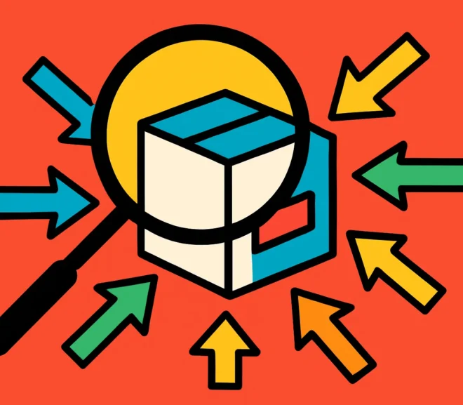
The UX Skills Gap: Why 60+ Applicants Still Isn't Enough The UX job market looks healthy on paper. Companies receive 60+ applications per role, design…
Why Career Success in Design Has Nothing to Do With Your Job Title For fifteen years, I've watched talented designers burn out chasing promotions they…
Why 6 Seconds Matters: Streamline Your E-Commerce UX or Lose Sales You have 6 seconds to convince a visitor your e-commerce site is worth their…
Why User Engagement Fails: Stop Building Products Nobody Wants "We built it, but users aren't engaging with our product." A founder shared this with me…
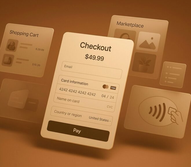
Turn More Clicks Into Customers: 6 Proven Landing Page Fixes Every marketing dollar you spend driving traffic to your landing page is wasted if visitors…
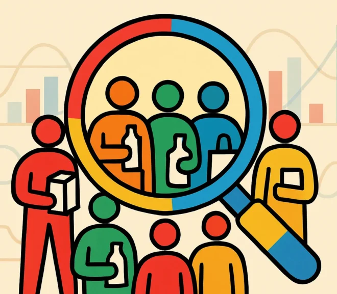
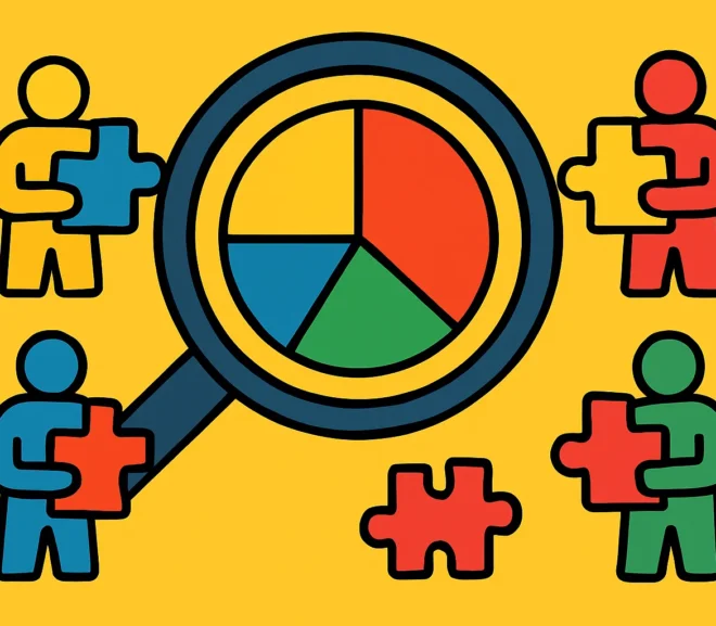
User Research: Stop Chasing Trends, Start Finding Truth After 15 years designing products that people actually use, I've watched user research become both more sophisticated…
Boost Remote Team Productivity with Essential Strategies The shift to distributed work models has fundamentally changed how organizations operate. What was once a perk offered…
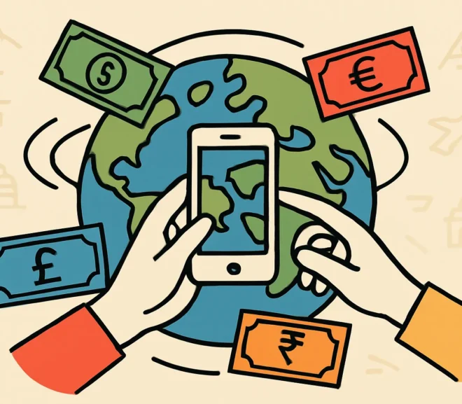
Designing Cross-Border Payment Experiences That Work Everywhere Global money transfers have become as common as sending an email. Yet many fintech companies still approach UX…
Turn Casual Visitors Into Loyal Users: 6 Proven Retention Tactics You've poured resources into acquiring users, only to watch them vanish after a few sessions.…
Why Users Leave Apps: 6 Retention Strategies That Actually Work You've built something great. Users downloaded your app, signed up, maybe even explored a few…
Boost User Satisfaction with the Kano Model for Feature Design Why Smart Feature Prioritization Matters You've probably been there: staring at a backlog bursting with…

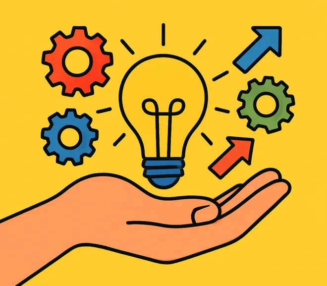
How a Strong Product Vision Drives UX/UI Success Have you ever wondered why some products immediately resonate with users while others fall flat despite impressive…
Mastering Product Design: How to Connect with Your Target Audience Ever wonder why some products feel like they were made just for you? That's not…
Enhance Designer-Stakeholder Communication With 5 Simple Steps Every design project lives or dies on how well designers and stakeholders communicate. I've watched brilliant concepts crumble…
7 Word Swaps That Transform Your Marketing Message Every word in your marketing carries weight. The difference between a message that converts and one that…
Why Social Proof Drives More Sales Than Features Ever Will Here's something most businesses get wrong: they obsess over listing every feature, spec, and benefit…
Analytics: Your Secret Weapon for UX/UI Evolution There's still a belief in some companies that analytics is just for counting how many visitors come to…
Balancing Creativity and Business Goals for Impactful Design Here's the uncomfortable truth: most design projects fail not because the work isn't beautiful, but because creativity…
Streamline Onboarding for SaaS: Tips for Engaging Medical Professionals Healthcare technology is only as good as its adoption rate. I've spent countless hours refining the…
Why Every Designer Needs Copywriting in Their Toolkit You've nailed the visual hierarchy. Your color palette is spot-on. The user flow? Flawless. But then you…
Hiring for Passion: Building a Design Team That Thrives Together When I started building the design team at TransferGo, I wasn't the most seasoned interviewer.…
Launch Your Product Successfully: A Complete Strategy Guide Launching a product isn't just about flipping a switch and hoping for the best. I've watched countless…
Unlock Product Success by Understanding Your Users' Needs Why User Understanding Drives Product Success I've spent years launching products that either soared or stumbled, and…
Accelerate Your Design Career: 5 Steps to Senior Designer Status The journey from junior to senior designer isn't just about putting in the years—it's about…
Seamlessly Integrate Design Tools to Maximize Productivity The design landscape evolves at lightning speed. What felt cutting-edge six months ago might already be outdated. For…
Maximize Productivity with Effective Feedback Loops Design isn't a linear process—it's iterative, collaborative, and entirely dependent on the quality of communication between stakeholders. Whether you're…
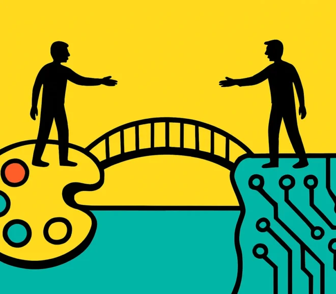
Designer-Developer Collaboration: Building Bridges That Last The divide between designers and developers is one of the oldest friction points in digital product creation. You've probably…
Delivering Excellence: High-Quality Design Under Pressure Let's be honest—tight deadlines are part of the design reality. Whether you're working with a startup racing to launch…
Master Project Planning for Design Success Every design project starts with a plan—or at least it should. Whether you're crafting a brand identity, developing a…
Remote Team Productivity: Communication That Works Remote work isn't going anywhere. What started as a necessity has become the preferred working model for millions of…
Keep Your Design Team Energized and Productive Every design leader knows the feeling—that moment when your once-fired-up team starts showing signs of creative fatigue. Projects…
Balancing Innovation and Timelines in Creative Teams Every design leader faces this paradox: your team needs unstructured time to generate breakthrough ideas, yet clients and…
Designer-Stakeholder Communication: 4 Core Strategies When designers and stakeholders can't effectively communicate, projects derail. I've seen it happen countless times—brilliant design work shelved because the…
How to Hire the Right Designer for Your Project Hiring a designer shouldn't feel like a gamble. Yet too many businesses rush into partnerships with…
Scale User Feedback Effectively as Your Product Grows Remember when you could personally respond to every customer email? When you knew each user by name…
Building Community: Your Secret Weapon for Engagement You've built something valuable—a product, a service, a brand people care about. But here's the reality: launching something…
Cross-Platform UX: Building Consistency That Works In today's fragmented digital landscape, your users don't just interact with your product on one device—they switch between desktop…

Social Proof: Your Secret Weapon for Product Trust When potential customers land on your product page, they're asking themselves one crucial question: "Can I trust…
Why Personalization in UX Is Your Competitive Edge Personalization in UX has evolved from a nice-to-have feature to an absolute necessity. Think about it: when…
Why User Behavior Analytics Matter More Than Ever Understanding how people interact with your product isn't optional anymore—it's the foundation of sustainable growth. User behavior…
Design for Growth: Scalable UX/UI Strategies You've landed a few hundred users. Then a few thousand. Suddenly, you're staring at exponential growth, and your once-sleek…
How to Boost User Activation Rates Through Smart Onboarding You've invested time and money getting users to sign up for your product. They've filled out…
Remove UX Barriers to Boost Conversions Fast You've invested in marketing, brought traffic to your site, and yet conversions remain frustratingly low. The problem isn't…
Why Users Abandon Your Product: Decoding Churn You've poured resources into acquiring users, but they're slipping through your fingers like sand through an hourglass. Sound…
Choose the Right KPIs for Your Early-Stage Product Launching a new product feels like navigating without a map. You've got ambition, a vision, and hopefully…
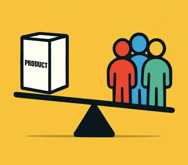
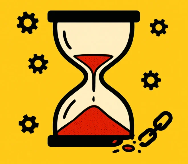
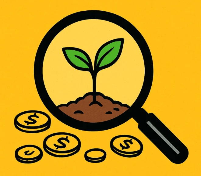
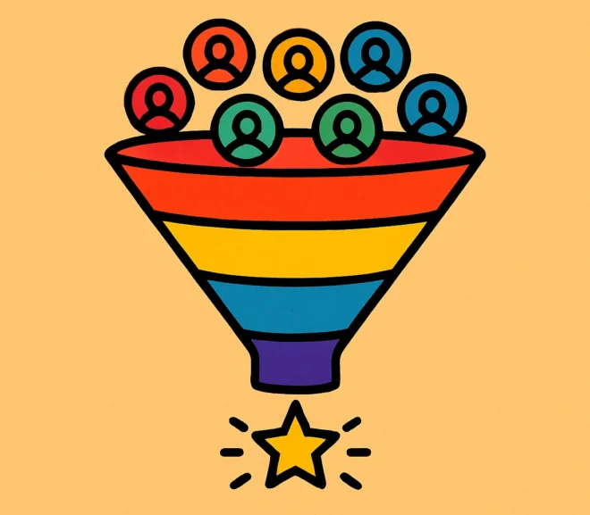
Finding Equilibrium: Product Development and User Acquisition The tension between building a better product and acquiring more users represents one of the most critical challenges…
Turning User Voices Into Product Wins: A Priority Guide You've got a backlog bursting with feature requests. Your support inbox is overflowing with suggestions. Product…
Map Your User Journey to Boost Conversions Every click tells a story. Your users arrive with intent, navigate through your site, and either convert—or disappear.…
Drive More Engagement: Key UX/UI Enhancements That Work User engagement isn't accidental—it's the result of deliberate, strategic design decisions that put your users first. If…
Building User Trust: Essential Strategies for New Products Launching a new product is exhilarating, but here's the reality: users are skeptical by default. They've been…
Product page optimization can deliver extraordinary returns, but most advice relies on theory rather than evidence. This report synthesizes 150+ documented A/B tests from major…
SEO Tactics Product Managers Need to Win Online You've built an incredible product. You've solved real problems, refined the user experience, and launched with confidence.…
Why Feedback Loops Transform Startup Growth Starting a company without listening to your users is like driving blindfolded—you might move forward, but you're guaranteed to…

Across the global eCommerce market, even modest conversion uplifts can translate into huge revenue gains. This research consolidates validated A/B test results from roughly the…
Onboarding Experience: Your User's First Love Story Picture this: A user downloads your app or signs up for your service. They're curious, maybe a little…
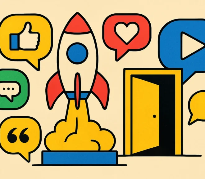
Launch Strategies to Win Your First Users You've built something amazing. Now comes the hard part: getting people to actually use it. Most products fail…
Design Trends for Startups: Smart Navigation Guide The startup landscape moves fast, and design trends move even faster. Every year brings a fresh wave of…
Smart Design Strategies That Maximize UX/UI Impact on Any Budget You don't need a Silicon Valley budget to create exceptional user experiences. I've seen countless…
Brand-Driven Design: Why Your UX/UI Must Speak Your Brand Language Your users don't just interact with screens—they interact with your brand. Every button click, every…
User Feedback: Your Product's Secret Weapon From Day One Building a product without user input is like constructing a house without checking if anyone wants…

Transforming International Payments: A UX Case Study When Paysafe approached us to revolutionize their international money transfer offering through Skrill, the challenge was clear: launch…
UX Design vs. Technical Limits: Finding Balance Every UX designer has been there: you've crafted the perfect user experience—smooth interactions, intuitive flows, delightful micro-animations—only to…

MVP Development: Needs vs Wants Every product team faces the same dilemma: your backlog is overflowing with features, stakeholders have endless requests, and your timeline…
Master User Interviews to Unlock Actionable Insights User interviews remain one of the most powerful tools in a designer's arsenal. When done right, they reveal…
Product Vision: Your Blueprint for Design Success A product without a clear vision is like a ship without a compass—you might be moving, but you're…
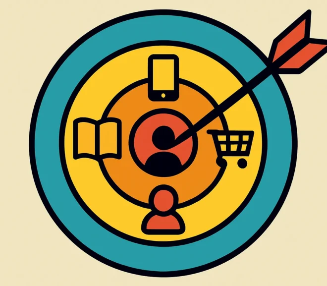
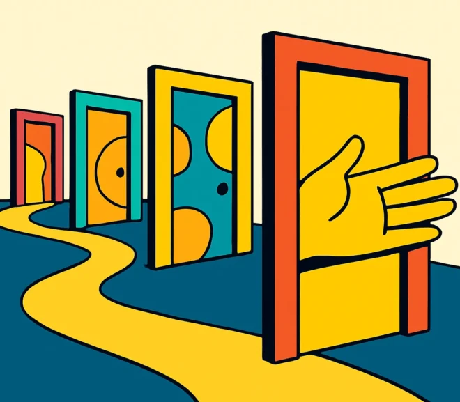
Define Your Target User Base in 5 Steps You can't design a product for everyone. Attempting to do so is the fastest route to creating…
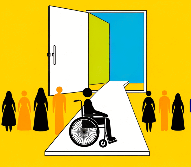
Why the EAA Matters for Your Digital Presence The digital landscape is shifting beneath our feet, and it's not just AI that's driving change. The…

Revolutionizing Telemedicine: The Oxygen Healthcare Case Study When traditional healthcare systems struggle with accessibility and convenience, digital solutions step in to bridge the gap. Oxygen…

Stop Losing Revenue: The Urgent Need for a UX Audit Here's a statistic worth your attention: 87% of consumers say they'll avoid a brand after…
ChatGPT Traffic: Why Your Conversions Are Tanking You've noticed the spike. ChatGPT is sending traffic to your e-commerce site, and on the surface, it looks…
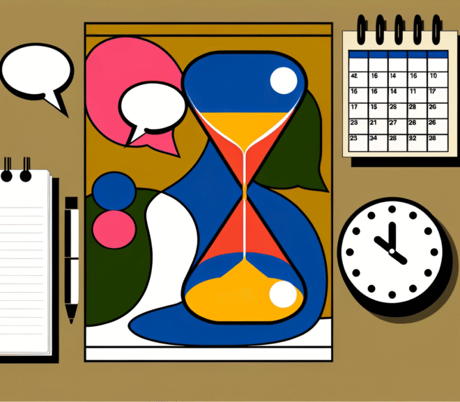
Run Effective Meetings People Actually Want to Attend We've all been there—staring at our calendar, dreading yet another meeting that could've been an email. The…
AI Chatbots Drive Clicks But Miss Checkouts: The Conversion Gap The promise of AI chatbot e-commerce conversion seemed straightforward: automate customer service, answer questions instantly,…
AI Heatmaps Won’t Save Your UX Strategy AI heatmaps UX optimisation has become the latest buzzword in conversion rate optimisation circles. Every week, a new…
ChatGPT Traffic Conversion: Why AI Visitors Drop Off Meta Description: ChatGPT can bring visitors, but they rarely convert. Learn why AI-driven traffic underperforms and how…
In today’s competitive e-commerce landscape, a seamless UI/UX can make or break your online store. A/B testing helps you move beyond guesswork—validating design decisions with…
The design industry is changing fast. AI tools now handle tasks that took hours, and designers need to understand how to use them well. This…

Where to Design a Website? Top Tools & Platforms Compared Choosing the right platform or approach to web design can be overwhelming. Whether you’re a…

Understanding the Z-Pattern in Web Design When designing a website, understanding how users naturally scan a page can significantly impact user experience and conversions. The…
Navigational Excellence Getting the hang of pretty navigation is a big deal in web design. Let’s check out two nifty trends for 2022 that really…

Importance of Responsive Web Design Responsive web design is kind of a big deal these days, mostly because people use all sorts of gadgets to…
Understanding Web Design Basics As I’ve tinkered with web design, getting a grip on the essential principles has been a game-changer. Think accessibility, usability, inclusion,…

Design Trends in 2025 I’m just gonna jump right in and say that staying on top of trends in web design isn’t just about keeping…

Understanding Web Design Principles Importance of UI/UX in Web Design UI and UX are the lifeblood of web design. They’re the difference between a user…
Does a UX/UI Designer Need to Know Coding? As a UX/UI designer, one of the most common questions I get asked is: “Do I need…
Kodėl profesionali UX/UI dizaino paslauga yra būtina jūsų verslo sėkmei? Jei esate verslo savininkas, produkto vadovas arba skaitmeninės rinkodaros specialistas, turbūt jau žinote, kad išskirtinė…

Crafting a Standout UX UI Design Portfolio Building an eye-catching UX UI design portfolio is key to strutting my stuff and snagging new gigs. Here,…
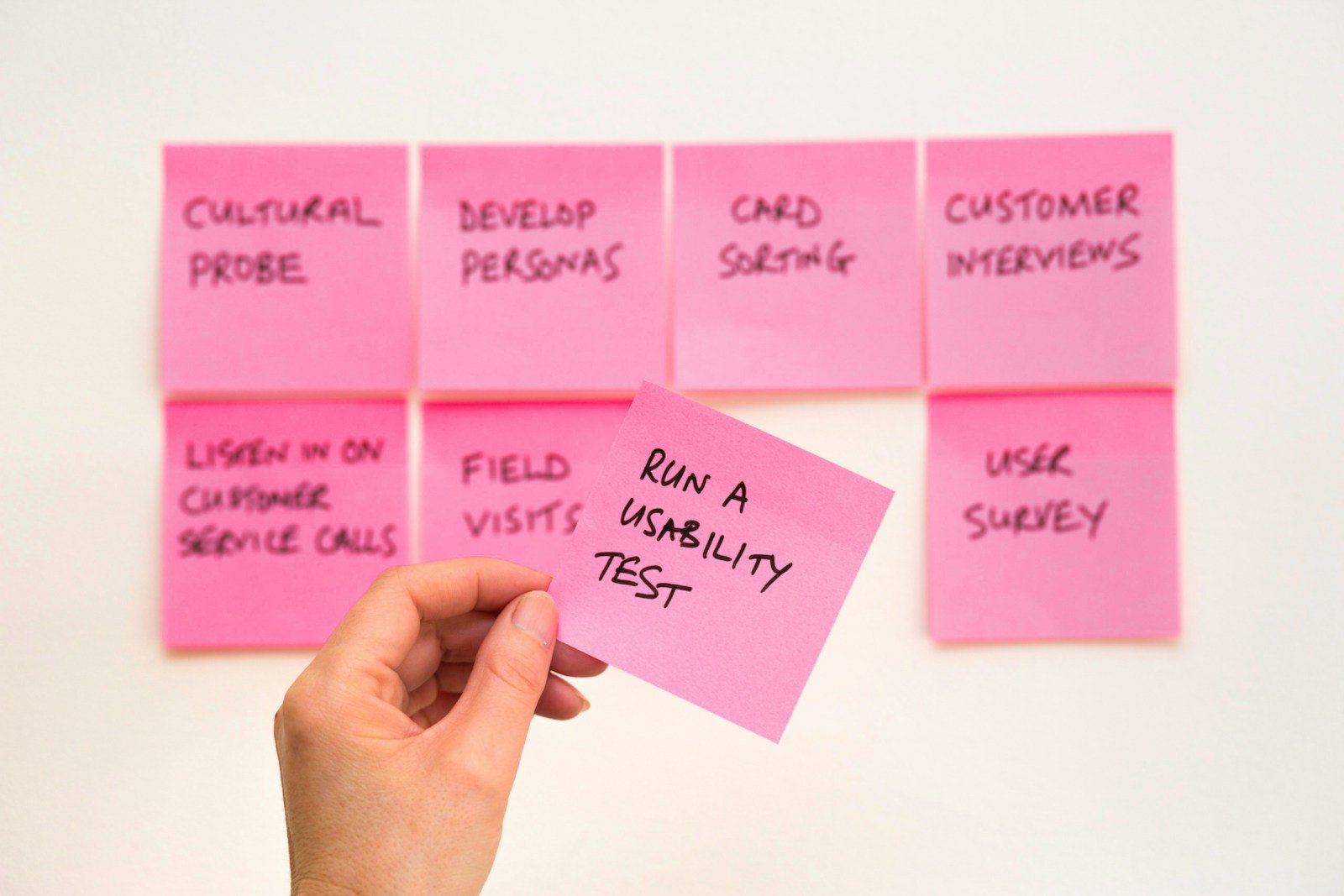
How to Do User Testing on a Budget? For startups, small businesses, and e-commerce brands, effective user testing can be the key to building intuitive…
Introduction to Freelance UX UI Design My Journey in UX UI Design Let me take you on a quick stroll down memory lane. When I…
# How to Conduct User Testing on a Budget: Maximizing Efficiency for E-Commerce and Mobile Apps ### Methods for Budget-Friendly User Testing When it comes…

Introduction to UX/UI Design in Money Transfer Apps Understanding UX/UI Design Relevance in Money Transfer Apps The world of international money transfer has been revolutionized…
DA 28 10Words Directory https://10words.io/ DA 6 AI Awesome Directory https://www.aiawesome.com/ DA 2 AI Combined Directory https://aicombined.com/ DA 29 AI Cyclopedia Directory https://www.aicyclopedia.com/ DA 8…

Introduction to UX UI Design Courses Why UX UI Design Matters Right Now We’re living in a time where UX UI design has cozied up…

My Journey with UX UI Design Software Introduction to My Experience Jumping into UX UI design wasn’t exactly a walk in the park, but my…
Importance of UX UI Design in Business In today’s digital landscape, the principles of UX and UI design play a crucial role in the success…

Dipping your toes into the design world can feel a bit overwhelming, right? Especially when you’re faced with terms like UI (user interface) and UX…
Discover the critical role of UX UI design in shaping the user experience of fintech products.

We’re about to embark on a thrilling journey through the fascinating world of UX Design. Now, you might be wondering, ‘What on earth is UX…