Have you ever wondered why certain colors seem to evoke different emotions or reactions? As a UX/UI designer, understanding how to master color in your interface designs is crucial. When used effectively, color can transform a plain layout into an eye-catching work of art that effortlessly guides users through the experience you’ve crafted. Follow these key best practices and you’ll be well on your way to color mastery.
Color Selection: Using the 60-30-10 Rule for UI Design
The 60-30-10 rule is a tried-and-true method for creating color palettes in UI design. It suggests using colors in 60%, 30%, and 10% of the design area, with 60% for the dominant hue, 30% for the secondary shade, and 10% for an accent color.
For the dominant hue, pick a primary color that aligns with your brand. Blues and greens are calming, while reds and oranges evoke energy. Limit the dominant color to one or two choices for consistency.
The secondary shade should complement the dominant hue. For example, pair a medium blue with a lighter blue-green. The accent color adds visual interest in small doses. A bright red or yellow works well with a blue-green color scheme.
Keep in mind color psychology and what each shade communicates to users. Blue signifies trust, green indicates eco-friendliness, and red means love or urgency. Ensure the overall palette elicits the right emotions and perceptions for your product or service.
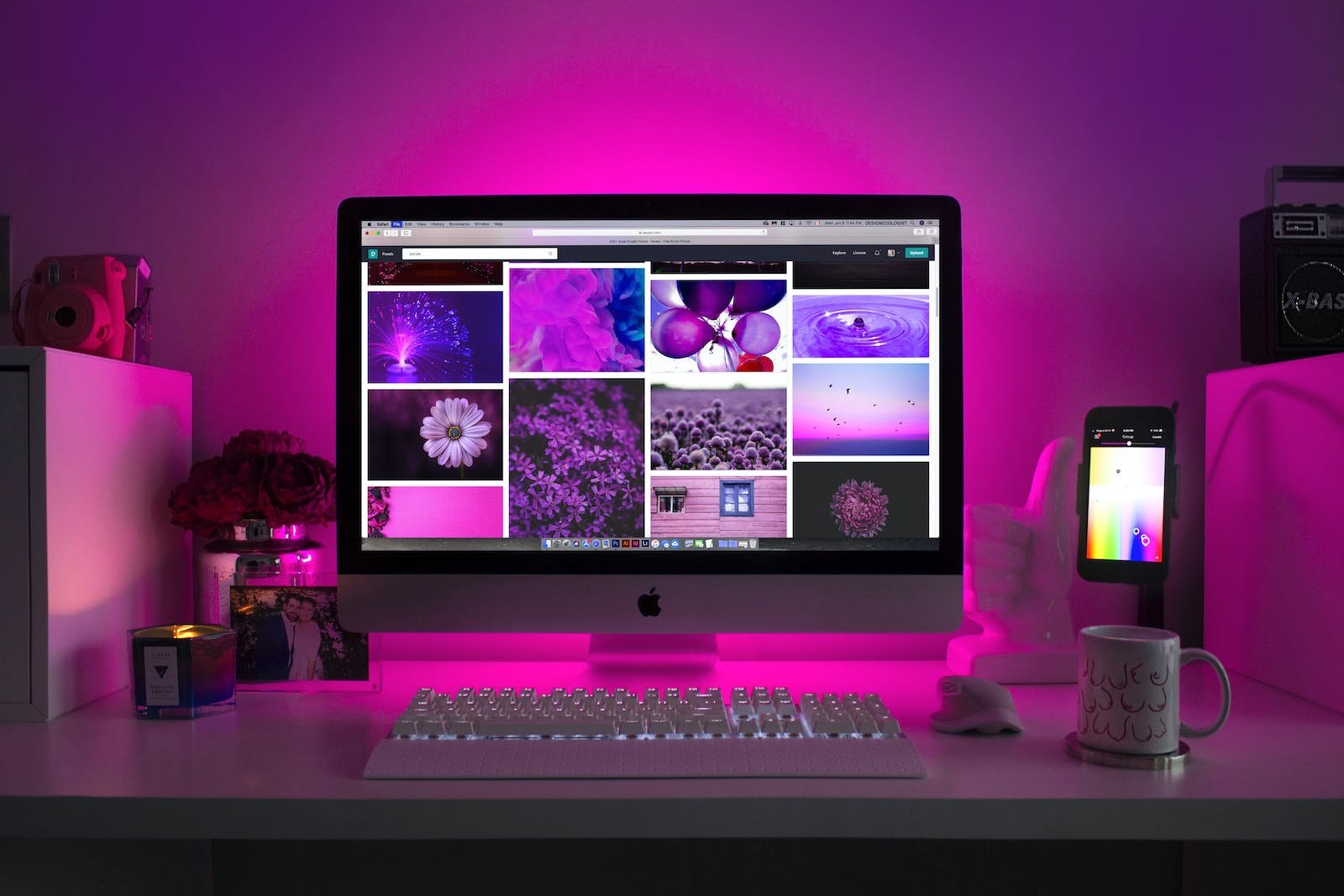
Once you have a color palette, view your design in grayscale to check that elements have sufficient contrast before adding color. Colors should always have the same meaning, even when the context changes. For instance, red always signals an error or required field.
Following the 60-30-10 rule and other best practices will result in an intuitive, impactful color scheme that enhances the user experience. With a harmonious palette and strategic use of color, you’ll craft a design that effectively communicates your brand message.
 Applying Color Theory and Psychology in UX
To create engaging UI designs, you need to understand how color influences users. By applying color theory and psychology, you can evoke the right emotions and encourage specific actions.
Choosing a Color Palette
When selecting a palette, use the 60-30-10 rule. Pick a dominant hue for 60% of the interface, a secondary color for 30%, and an accent for 10%. For example, shades of blue, green and orange. Stick to 1-3 primary colors to build brand recognition.
The Meaning of Colors
Colors have psychological associations. Red signifies excitement or danger, green is natural and balanced, blue calm and trustworthy. Consider how colors make people feel and the perceptions they trigger. If your brand is fun and energetic, bright hues might work well. For a medical app, cooler tones could inspire confidence.
Start in Black and White
Begin by designing in grayscale. This lets you focus on layout, content hierarchy and flow before adding color. Ensure there’s enough contrast for accessibility, then introduce your palette.
Consistency is Key
Keep color meaning consistent across the interface. For example, always use red buttons for the main call-to-action. This helps users develop intuition about how the interface works.
By leveraging color theory and understanding the psychology of color, you can craft designs that resonate with users, support your brand, and most importantly, create a great experience. Carefully chosen colors lead to interfaces that are easy to navigate and a pleasure to use.
Practical Tips for UI Designers on Using Color
As a UI designer, following some practical tips for using color effectively can help you create visually compelling and user-friendly interfaces.
Work in grayscale
Start designing your interface in black and white before adding color. This helps ensure there is enough contrast between elements and that the layout is balanced. Once the grayscale design is solid, you can choose a color palette to bring it to life.
Ensure consistency and context
The colors you choose should remain consistent across the interface so they always signify the same thing to users, even as the context changes from screen to screen. For example, don’t use red to indicate “delete” on one screen and “save” on another. Consistent color usage helps users intuitively understand the meaning and purpose of interface elements.
Consider accessibility
Choose a palette with sufficient contrast between foreground and background colors so that text and visuals are legible for colorblind and low-vision users. Aim for a minimum 4.5:1 contrast ratio for standard text, and 3:1 for large text. Also consider how your color choices might appear to users with other visual impairments.
Test on multiple devices
Colors can appear different on varying screen technologies like LED, LCD and AMOLED displays. Make sure your palette renders well across the devices and operating systems your users will access the interface on. Some colors may need to be adjusted to look consistent on all platforms.
By following these practical tips, you can craft an interface with a color scheme that is visually cohesive, meaningful, accessible and optimized for the end user experience. Keeping your audience in mind at each step of the design process will result in an intuitive UI that people will find simple and satisfying to use.
 How to Choose the Right Colors for Your Brand’s UI
Choosing the right colors for your UI design is crucial. The colors you select represent your brand and can evoke emotions in users. When picking colors for your interface, keep these tips in mind:
Focus on your brand
Select primary colors that align with your brand identity. Are you a bold, innovative company? Choose vibrant shades. A traditional, trustworthy business? Stick to blues and grays. Limit your primary palette to 1-3 colors for consistency.
Consider color psychology
The colors you choose can impact how users perceive your brand. Blue signifies trust, green indicates eco-friendliness, red means passion. Know what message you want to convey and choose accordingly. The colors should match the overall tone and personality of your product or service.
Use the 60-30-10 rule
This popular rule recommends using your primary color for 60% of the design, a secondary color for 30%, and an accent color for 10%. The dominant color establishes the overall look and feel, the secondary color complements it, and the accent color adds visual interest. This creates a balanced yet vibrant color scheme.
Start with grayscale
Begin by designing your interface in black, white and gray. This helps ensure proper contrast and visual hierarchy before adding color. Once the grayscale design is complete, slowly introduce your brand colors, starting with the primary color. Colors should be consistent and meaningful throughout the design.
Consider accessibility
Certain color combinations can make text difficult to read for those with visual impairments. Choose colors that provide enough contrast, especially for important interface elements like buttons and links. Check that your color scheme follows accessibility guidelines to accommodate all users.
By strategically choosing a color palette that aligns with your brand and considering accessibility, you can craft an interface that effectively communicates with and engages your users. Selecting the right colors for your UI design is key to creating a great user experience.
The Importance of Color Consistency in UX/UI Design
As a UX/UI designer, paying close attention to color consistency is crucial to creating a great user experience. Color is one of the most powerful tools at your disposal, but it needs to be used properly.
Choose a Color Palette and Stick to It
Select 3-5 main colors that represent your brand and work well together. Then use those colors consistently throughout your design. For example, don’t use dark blue links on one page and orange links on another. Keep things cohesive by using the same primary color for all links across the site or app.
Using the same color palette everywhere establishes a clear visual style guide for your users. They will come to associate those colors with your product, making the interface feel familiar and intuitive. Subtle variations in shade and tint are fine, but dramatic changes in hue can confuse users and make your design feel disjointed.
Ensure Color Has Meaning
The colors you choose should not be arbitrary. They should be selected purposefully to represent specific elements. For example, use one shade of blue only for links, a different shade of blue for buttons, and green to indicate success or completion. Be consistent with your color-coding so users know what to expect.
Don’t Rely on Color Alone
While color is an important design tool, don’t use color as the only means of conveying information. Approximately 8% of men and 0.5% of women have some form of color blindness, so color alone may be missed by some users. Use additional cues like icons, labels, and context to reinforce the meaning. Providing redundancy in your design will make the interface accessible to more people.
By maintaining a consistent color palette and using color purposefully, you’ll create an interface that is easy to understand, appealing to look at, and accessible to all users. Consistency and clarity are key to crafting a quality user experience. Keep these principles in mind as you select and apply color in your UX/UI designs.
Conclusion
So there you have it, a solid set of principles for using color effectively in your UI and UX designs. When you follow the 60-30-10 rule, choose a harmonious color palette, understand color theory, consider color psychology, start in grayscale, and maintain consistency, you’ll be well on your way to mastering color and creating memorable digital experiences for your users. Apply these techniques and watch as your designs transform from flat and lifeless to vibrant, emotive and impactful. You’ll gain valuable skills that will serve you well as you continue honing your craft as a UI/UX designer.
выездной шиномонтаж в москве
шумоизоляция арок авто https://shumoizolyaciya-arok-avto-77.ru
шумоизоляция авто
Приветствую! На первом этапе нужно разобраться — гидроизоляция склада. Лень разбираться — вот проверенную компанию: https://montazh-membrannoj-krovli-spb.ru. На практике большие площади — нуждаются в профессионалах. В общем, площадь 1000+ квадратов — то есть важен опыт бригады. Можно поставить профессиональное оборудование. Вот потому что один из самых эффективных способов. Что в итоге: это отличные параметры.
Приветствую! В этой статье я расскажу — можно ли делать крышу зимой. Суть здесь в чем: рубероид на морозе не клеится. ПВХ монтируют круглый год — могу рекомендовать: https://montazh-membrannoj-krovli-spb.ru. На практике знаю: монтаж ПВХ — работает и в мороз. Короче стройка не ждёт — соответственно мембранная кровля выручает. На первом этапе специальные режимы сварки. Что в итоге: это работает — сроки соблюдены.
шумоизоляция авто
For those seeking an exceptional online gaming experience, us.com](https://maxispin.us.com/) stands out as a premier destination. At Maxispin Casino, players can enjoy a vast array of pokies, table games, and other thrilling options, all accessible in both demo and real-money modes. The casino offers attractive bonuses, including free spins and a generous welcome offer, along with cashback promotions and engaging tournaments. To ensure a seamless experience, Maxispin provides various payment methods, efficient withdrawal processes, and reliable customer support through live chat. Security is a top priority, with robust safety measures and a strong focus on responsible gambling tools. Players can easily navigate the site, with detailed guides on account creation, verification, and payment methods. Whether you’re interested in high RTP slots, hold and win pokies, or the latest slot releases, Maxispin Casino delivers a user-friendly and secure platform. Explore their terms and conditions, read reviews, and discover why many consider Maxispin a legitimate and trustworthy choice in Australia.
Whether you’re a seasoned copywriter or just starting out, MaxiSpin.us.com provides the resources you need to enhance your content.
**Features of MaxiSpin.us.com**
The platform also includes a built-in editor, enabling on-the-spot adjustments for optimal results.
**Benefits of Using MaxiSpin.us.com**
The platform is also cost-effective, providing high-quality content at a fraction of the cost of traditional methods.
шумоизоляция торпеды
шумоизоляция дверей авто
Discover the thrill of real-money live casino action at real money live casino, where you can enjoy live dealers, top software providers, and exclusive promotions.
Transparent policies ensure users understand terms and community standards.
накрутка подписчиков в Телеграм
Sprawdz poradnik analog czy digital fpv, jesli szukasz najlepszych wskazowek przy wyborze kamery FPV na start.
Obsluga roznych formatow i opcja nagrywania zewnetrznego zwieksza elastycznosc pracy.