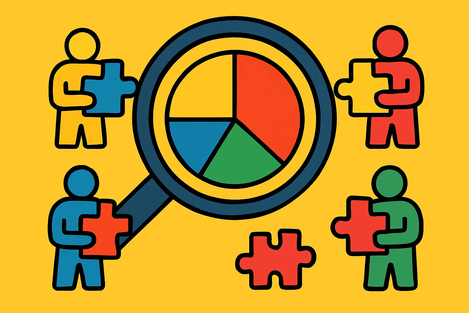
Why User Behavior Analytics Matter More Than Ever
Understanding how people interact with your product isn't optional anymore—it's the foundation of sustainable growth. User behavior analytics give you a window into the actual experiences of your customers, revealing not just what they're doing, but why they're doing it. And that "why" is where the real gold lies.
Too many product teams rely on assumptions or surface-level metrics like page views and sign-ups. But these vanity metrics don't tell you whether users are actually finding value in your product. They don't explain why someone signs up and never returns, or why feature adoption plateaus after an initial spike.
This is where advanced analytics comes in. By tracking and analyzing behavioral patterns—everything from click sequences to time spent on specific features—you can identify friction points, discover hidden opportunities, and make data-informed decisions that actually move the needle on product growth and retention.
The difference between products that thrive and those that stagnate often comes down to this: successful teams understand their users at a behavioral level. They know which features create "aha moments," which workflows cause confusion, and which segments of users are most likely to convert or churn. This article will show you how to uncover these insights and turn them into actionable strategies for growth.
Quick Takeaways
- Behavioral analytics reveal the "why" behind user actions, not just the "what," enabling more targeted product improvements
- Cohort analysis helps identify patterns in user segments, showing which groups retain better and why
- Funnel analysis pinpoints friction points in critical user journeys, highlighting where potential customers drop off
- Event tracking provides granular insight into feature usage and engagement patterns that aggregate metrics miss
- Retention curves show product-market fit, indicating whether users find lasting value in your offering
- Session recordings and heatmaps offer qualitative context that quantitative data alone can't provide
- Predictive analytics can forecast churn risk, allowing proactive intervention before users disengage
Understanding the Fundamentals of User Behavior Tracking
Before diving into complex analytics, you need to establish a solid foundation. User behavior tracking starts with instrumenting your product to capture meaningful events—actions that users take within your application or website.
Events might include things like "completed onboarding," "invited a team member," "created first project," or "upgraded to premium." The key is identifying which actions correlate with value delivery. What do users do when they're getting value from your product?
This requires thinking beyond page views. You need to track interactions: button clicks, form submissions, feature activations, and workflow completions. Each of these data points becomes part of a larger story about how people experience your product.
Event taxonomy matters enormously here. A messy, inconsistent tracking plan leads to unreliable data and wasted analysis time. Establish clear naming conventions, use consistent properties across events, and document everything. Your future self (and your team) will thank you.
The technical implementation typically involves analytics SDKs like Segment, Amplitude, or Mixpanel, but the strategic thinking comes first. What questions are you trying to answer? What user behaviors indicate success? What might signal risk?
Leveraging Cohort Analysis to Understand Retention Patterns
Cohort analysis groups users based on shared characteristics or timeframes, then tracks their behavior over time. This approach reveals patterns that aggregate metrics completely obscure.
For example, looking at overall retention might show a steady 40%. But cohort analysis could reveal that users who signed up in January retain at 60%, while March sign-ups only retain at 25%. What changed? Did you modify your onboarding? Shift your acquisition channels? This insight points you toward specific areas to investigate.
Time-based cohorts are common—grouping users by sign-up week or month—but behavioral cohorts are often more valuable. Compare users who completed onboarding versus those who didn't. Look at users who activated a specific feature versus those who didn't. The differences in retention, conversion, and engagement can be dramatic.
Cohort retention curves also help you understand product-market fit. Products with strong fit show retention curves that flatten after an initial drop-off period. The curve might drop from 100% to 40% in the first week, then stay relatively stable. This indicates a core group finding lasting value.
If your retention curve keeps declining without flattening, you have a leaky bucket. No amount of acquisition will fix that—you need to address the underlying value proposition or user experience issues first.
Mapping User Journeys Through Funnel Analysis
Funnels show you the step-by-step progression (or lack thereof) through critical user flows. Whether it's sign-up, onboarding, feature adoption, or purchase, funnel analysis illuminates exactly where users get stuck.
Start by defining your key conversion paths. For a SaaS product, this might be: visit landing page → start trial → complete onboarding → activate core feature → invite team member → convert to paid. Each step is an opportunity for drop-off.
The power comes from measuring conversion rates between steps and identifying the biggest leaks. If 80% of trial users complete onboarding but only 15% activate the core feature, you've found your problem. That massive drop-off deserves immediate attention.
But don't stop at identifying drop-offs. Dig deeper. Segment your funnels by traffic source, user role, company size, or any relevant dimension. You might discover that enterprise leads convert at 3x the rate of small business users, or that users from organic search have better onboarding completion than those from paid ads.
Time-to-convert within funnels also matters. How long does it take users to move from one step to the next? Extended time gaps often signal confusion, lack of urgency, or competing priorities. Fast progression usually indicates clear value perception and effective design.
Identifying Power Users and Their Common Behaviors
Your most engaged users—your power users—hold clues to product success. They've discovered workflows that deliver maximum value, and their behavior patterns can guide product development and marketing.
Start by defining what "power user" means for your product. Is it frequency of use? Breadth of features utilized? Depth of engagement with specific capabilities? Some combination of these?
Once you've identified this segment, analyze their behaviors systematically. What features do they use most? What's their typical session pattern? How did their first week with the product differ from average users? What actions did they take that others didn't?
Look for leading indicators—early actions that predict power user status. Maybe users who create more than three projects in their first week are 10x more likely to become highly engaged. That's actionable insight you can build into your onboarding experience.
The goal isn't just understanding power users for their own sake. It's reverse-engineering their success so you can guide more users down similar paths. If power users consistently engage with Feature X within their first three days, that feature deserves prominent placement in your onboarding flow.
Don't forget to talk to these users directly. Analytics tell you what they do; conversations tell you why. The combination is powerful.
Detecting Warning Signs Through Churn Prediction Analytics
Preventing churn is easier and cheaper than reacquiring lost customers. Predictive analytics can identify users at risk of churning before they actually leave, giving you a window to intervene.
Churn prediction models typically use machine learning to identify patterns in historical data. What did users who eventually churned have in common? Perhaps they logged in less frequently in their final weeks, stopped using certain features, or never reached specific engagement milestones.
Common churn indicators include: declining session frequency, reduced feature usage, longer gaps between visits, failure to reach activation milestones, or not inviting team members. The specific signals vary by product, which is why custom analysis matters.
Once you've identified at-risk users, create intervention campaigns. This might be proactive outreach from your customer success team, targeted email campaigns highlighting unused features, or special offers. The key is timing—reach out while users are disengaging, not after they've already decided to leave.
Churn cohorts also reveal structural issues. If users acquired through a particular channel consistently churn faster, that channel might be attracting the wrong audience. If users who skip onboarding churn at 2x the rate, making onboarding mandatory (or at least more compelling) could significantly improve retention.
Remember that not all churn is equal. Losing high-value enterprise customers hurts more than losing free-tier hobbyists. Segment your churn analysis accordingly.
Using Session Recordings and Heatmaps for Qualitative Insights
Numbers tell you what's happening; watching actual user sessions tells you why. Session recordings and heatmaps bridge the gap between quantitative metrics and qualitative understanding.
Session recordings let you watch exactly how individual users navigate your product. You'll spot confusing UI elements, workflow issues, and friction points that data alone wouldn't reveal. Maybe users repeatedly click on non-clickable elements, or they loop through the same three pages looking for something they can't find.
This is particularly valuable for investigating drop-off points identified in your funnel analysis. When you see that 60% of users abandon a particular step, watching recordings of those abandoned sessions often makes the problem immediately obvious.
Heatmaps aggregate interaction data visually, showing where users click, how far they scroll, and which elements attract attention. Click heatmaps reveal whether users are engaging with your primary calls-to-action or getting distracted by secondary elements. Scroll maps show if important content is buried below the fold where most users never see it.
Use these tools strategically. Don't randomly watch sessions—target specific questions. Why do users drop off at step three of onboarding? How do power users navigate the dashboard differently? What do first-time users do in their initial session?
Combine qualitative and quantitative approaches. Analytics identify what to investigate; recordings and heatmaps explain why it's happening. Together, they create a complete picture.
Segmentation Strategies for Personalized Product Experiences
One-size-fits-all products rarely excel at serving anyone well. User segmentation allows you to understand different user groups' distinct needs and tailor experiences accordingly.
Effective segmentation goes beyond basic demographics. Consider behavioral segments: new versus returning users, high versus low engagement, free versus paid, specific feature users, or workflow preferences. Also consider firmographic data for B2B products: company size, industry, use case, or team structure.
The real value emerges when you analyze how different segments behave differently. Do enterprise users adopt features in a different order than small business users? Do users from different industries have distinct workflow patterns? These insights should inform product prioritization and roadmap decisions.
Lifecycle segmentation is particularly powerful. New users need onboarding and education. Growing users need feature discovery and expansion. Mature users need advanced capabilities and optimization tools. Showing the right message to the right segment at the right time dramatically improves engagement.
Segmentation also improves your analysis accuracy. Company-wide metrics obscure crucial details. When you segment, patterns emerge. Maybe overall engagement is flat, but when you separate users by plan type, you discover that free users are declining while paid users are growing—a very different picture requiring different responses.
Test product changes on segments before rolling out broadly. A feature that delights power users might confuse beginners. Segmented testing reduces risk and provides clearer feedback.
Measuring Feature Adoption and Engagement Depth
Building features is expensive. Making sure they actually get used and deliver value is critical. Feature adoption analysis shows which capabilities resonate with users and which don't.
Start by tracking feature discovery: what percentage of users even know a feature exists? Poor discovery often explains low adoption. If you've built something valuable but buried it in settings, users won't find it.
Next, measure activation: of users who encounter the feature, how many actually use it? Low activation suggests unclear value propositions, complex interfaces, or inadequate onboarding. Watch session recordings of users who discover but don't activate features—the reasons are often immediately apparent.
Finally, track continued engagement: are users coming back to the feature repeatedly, or was it one-and-done? Sustained engagement indicates genuine value creation. One-time usage might mean the feature solved an immediate need but isn't valuable long-term, or that the experience wasn't compelling enough to build a habit.
Look at engagement depth, not just breadth. Are users superficially engaging with many features, or deeply utilizing a few core capabilities? Deep engagement with fewer features often indicates stronger product-market fit than shallow engagement with everything.
Feature adoption analysis should directly inform your product roadmap. Features with high adoption and engagement deserve continued investment. Low-adoption features need either better marketing, UX improvements, or honest evaluation about whether they're worth maintaining.
Implementing Event-Based Analytics for Granular Tracking
Event-based analytics track specific user actions rather than just page views or sessions. This granular approach provides the detailed insights needed for modern product optimization.
Unlike traditional analytics that focus on traffic metrics, event-based systems track meaningful interactions: "clicked upgrade button," "completed tutorial step 3," "exported report," "invited team member." Each event can carry properties—metadata that provides context like plan type, feature used, file size, or time taken.
This level of detail enables sophisticated analysis. You can answer questions like: "What's the average time between sign-up and first value creation?" or "Which feature combinations correlate with highest retention?" These insights are impossible with page-view-only tracking.
Building an effective event taxonomy requires upfront planning. Work with your product team to identify key user actions worth tracking. Prioritize events that indicate value creation, feature engagement, and progression through important workflows.
User properties complement event tracking by capturing attributes about the user themselves: account age, plan type, team size, or cumulative usage metrics. This enables segmentation and cohort analysis. You can compare how different user types interact with your product.
Don't over-instrument initially. Start with critical events, then expand. Too many events too quickly leads to noisy data and analysis paralysis. Focus on what you'll actually use to make decisions.
Translating Insights Into Actionable Product Improvements
Analytics only creates value when insights drive action. The gap between data analysis and product improvement is where many teams stumble.
Start by establishing a feedback loop between analytics and product development. Regular review sessions where teams examine key metrics, discuss anomalies, and identify opportunities ensure insights don't sit unused. Make someone responsible for turning findings into experiments.
Prioritize insights based on potential impact and implementation effort. A massive drop-off in your conversion funnel deserves immediate attention. A minor usability issue in a rarely-used feature can wait. Use frameworks like ICE (Impact, Confidence, Ease) or RICE scoring to systematically evaluate opportunities.
Frame insights as hypotheses to test. "We believe that simplifying step two of onboarding will increase completion rates by 20% because session recordings show users repeatedly abandoning at this step due to confusion." This creates testable predictions and sets success criteria.
Run A/B tests to validate improvements before full rollout. Analytics might identify a problem, but your proposed solution might not work as expected. Testing prevents investing heavily in changes that don't actually improve outcomes.
Document what you learn. Create a knowledge base of tested hypotheses, results, and insights. This institutional knowledge prevents repeating mistakes and helps new team members get up to speed quickly. It also reveals patterns over time—maybe you've tested five different onboarding approaches, and the pattern reveals what actually works for your users.
Conclusion: Building a Culture of Data-Informed Decision Making
Understanding user behavior isn't a one-time project—it's an ongoing practice that should be woven into your product development culture. The teams that win are those that consistently observe, analyze, learn, and iterate based on how users actually engage with their products.
Advanced analytics provides the raw material, but human judgment determines what matters. You need to balance quantitative data with qualitative insights, combine behavioral patterns with customer conversations, and use metrics to inform decisions without letting them make decisions for you.
Start small if you're just beginning. Pick one critical user journey and instrument it properly. Establish your funnel, set up cohort analysis, and identify where users struggle. Make one data-informed improvement, measure the impact, and build from there. This approach creates momentum and proves value without overwhelming your team.
The competitive advantage goes to companies that understand their users more deeply than anyone else. When you know which features create "aha moments," which workflows cause friction, and which early behaviors predict long-term success, you can systematically improve every aspect of your product experience.
Ready to transform how you understand your users? Start by auditing your current analytics setup. Are you tracking the right events? Can you answer critical questions about user behavior? Identify the biggest gap between what you know and what you need to know, then make filling that gap your next priority. Your users are telling you what they need—you just need the right tools and approach to listen.
FAQs
What's the difference between product analytics and traditional web analytics?
Traditional web analytics focus on traffic metrics like page views, sessions, and bounce rates. Product analytics track user interactions with specific features and workflows, providing insights into how people actually use your product rather than just how they navigate through pages. This distinction is critical for SaaS and digital products where value comes from engagement, not page views.
How many events should I track in my product?
Start with 15-25 core events that represent key user actions and value creation moments. You can expand over time, but beginning with too many events creates noise and makes analysis difficult. Focus on actions that indicate engagement, progression through critical workflows, and achievement of meaningful outcomes.
What's a good retention rate for SaaS products?
This varies significantly by product type and industry, but many successful SaaS products aim for 40-60% retention after 90 days. More important than the absolute number is the trend—improving retention and the shape of your retention curve (it should flatten after initial drop-off, indicating a core group finding lasting value).
How do I know if users aren't adopting a feature because they don't need it or because they can't find it?
Combine multiple data sources. Look at feature discovery rates (do users even encounter it?), activation rates (do those who find it use it?), and conduct user interviews or surveys. If discovery is low, it's a visibility problem. If discovery is high but activation is low, it might be a value proposition or usability issue—or genuinely low need.
What metrics should I monitor daily versus weekly or monthly?
Monitor operational metrics daily (uptime, error rates, critical conversion funnels) to catch problems quickly. Review engagement and retention metrics weekly to spot trends without over-reacting to normal variation. Analyze longer-term patterns (retention curves, cohort analysis, feature adoption trends) monthly or quarterly since meaningful changes emerge over time.