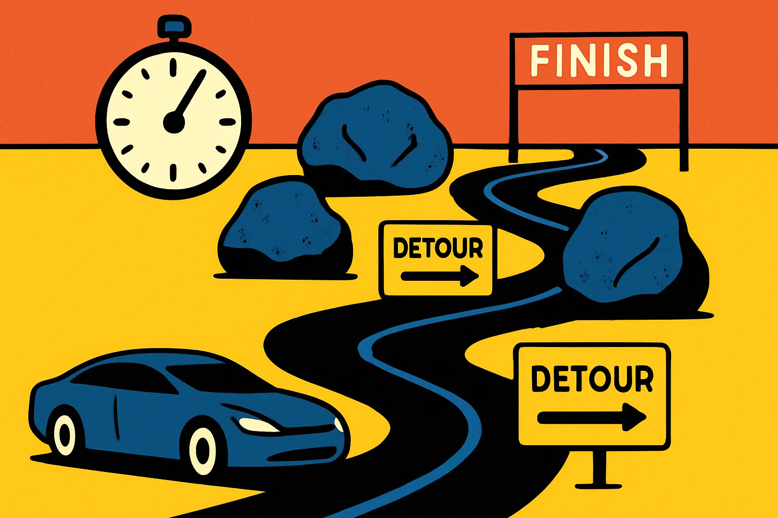
Why 6 Seconds Matters: Streamline Your E-Commerce UX or Lose Sales
You have 6 seconds to convince a visitor your e-commerce site is worth their time. That's it. Not a minute. Not even 30 seconds. Six.
After working with dozens of online retailers over the past 15 years, I've watched this pattern repeat: businesses invest thousands in driving traffic, then lose 88% of potential customers to poor user experience. The frustrating part? Most of these conversions are salvageable.
Here's what typically happens: A user lands on your product page. They're interested. They add items to cart. Then your checkout process kicks in with its seven-step workflow, mandatory account creation, and that address validation tool that seemed brilliant in the planning meeting. Three minutes later, your potential customer is shopping with your competitor.
The data backs this up. Research shows that 51% of shoppers abandon purchases due to complicated checkout processes. Another study found that simplifying forms alone can boost conversions by 120%. These aren't marginal improvements—they're game-changers.
This article breaks down exactly how to audit your e-commerce experience, identify friction points costing you money, and implement changes that drive measurable results. No theory. Just actionable strategies that work.
Quick Takeaways
- Speed is non-negotiable: Sites loading in 6 seconds or less retain significantly more users than slower alternatives
- Every form field costs you money: Removing just one unnecessary field can increase conversions by 10-20%
- Mobile-first isn't optional: Over 60% of e-commerce traffic comes from mobile devices
- Visible progress reduces anxiety: Clear checkout indicators can decrease abandonment by up to 30%
- Guest checkout should be default: Forcing account creation increases abandonment rates by 25%
- Trust signals matter more than design flair: Security badges and guarantees outperform fancy animations
- Data-driven iteration beats guesswork: A/B testing reveals what actually works for your specific audience
The Real Cost of Complexity in E-Commerce
Let's talk numbers. A client came to me last year with a fashion e-commerce site. Beautiful design. High-quality products. Marketing budget that would make most startups jealous. Their conversion rate? 0.8%.
Industry average sits around 2-3%. Something was broken.
We mapped the user journey. From homepage to completed purchase took an average of 14 clicks and 8 minutes. For a $40 t-shirt. The checkout alone had six screens. Each screen introduced new friction points where users could—and did—drop off.
Here's what complexity actually costs:
Lost revenue compounds quickly. If you're driving 10,000 visitors monthly with a 1% conversion rate and $50 average order value, that's $5,000 in monthly revenue. Increase that conversion rate to 2.5% by removing friction, and you're at $12,500. That's $90,000 annually from the same traffic.
Customer acquisition costs skyrocket. When only 1 in 100 visitors converts, you need massive traffic to hit revenue goals. Better UX means you need less traffic—and spend less acquiring it—to achieve the same results.
Brand perception suffers. A frustrating checkout doesn't just cost one sale. It damages trust. Users associate your brand with that frustration, making them less likely to return or recommend you.
The fashion retailer? We simplified their process to 7 clicks and under 3 minutes. Conversion rate hit 2.4% within two months.
Audit Your Current Experience: Where Users Actually Struggle
Before fixing anything, you need to understand where problems actually exist. Not where you think they exist. Where data shows real users struggle.
Start with session recordings. Tools like Hotjar or Microsoft Clarity show you exactly how people interact with your site. Watch 20-30 sessions. You'll spot patterns: rage clicks on non-clickable elements, users scrolling up and down searching for information, abandoned carts at specific steps.
I watched recordings for an electronics retailer and noticed something odd. Users kept clicking the product images during checkout, like they wanted to verify their selection. The images weren't clickable. This created doubt. "Is this really what I ordered?" Solution: Made images clickable to open product details in a modal. Cart abandonment dropped 12%.
Funnel analysis reveals dropout points. Google Analytics 4's funnel visualization shows exactly where users exit your conversion path. If 40% drop off at the shipping information page, that page needs immediate attention.
Set up these key funnels:
- Homepage → Product page → Cart → Checkout → Purchase
- Category page → Product page → Cart → Checkout → Purchase
- Search → Product page → Cart → Checkout → Purchase
Heat maps show what users actually see. You might think your "Free Shipping" banner is prominent. Heat maps reveal users never scroll far enough to see it. Move it up, watch clicks increase.
Form analytics expose friction. Tools like Formisimo or Mouseflow's form analytics track how long users spend on each field, where they hesitate, and which fields they abandon. One client discovered users spent an average of 47 seconds on their "Company Name" field—because most customers were consumers, not businesses. Field was optional but appeared required. Making this clear saved nearly a minute of confusion per checkout.
Streamline Your Checkout: The 3-Step Framework
Your checkout process has one job: convert intent into completed purchase as quickly and painlessly as possible. Every additional step, field, or decision point works against that goal.
Step 1: Cart Review (5-10 seconds)
Users need to confirm what they're buying and see the total cost. That's it. This screen should include:
- Clear product images and names
- Quantity adjusters
- Remove item option
- Subtotal, estimated shipping, estimated tax, and total
- Prominent "Proceed to Checkout" button
What doesn't belong here: Upsells, related products, newsletter signups, or promotional banners. Save those for post-purchase.
Step 2: Information Collection (60-90 seconds)
This is where most sites over-complicate things. You need shipping info and payment details. Combine them into a single page.
Smart defaults reduce cognitive load:
- Pre-fill known information for returning users
- Set "Shipping address same as billing" as default
- Auto-format phone numbers and credit cards as users type
- Validate in real-time but never interrupt typing
- Remember user preferences (gift wrapping, delivery instructions)
A furniture retailer I worked with had separate pages for shipping address, billing address, delivery preferences, and payment. Four pages became one. Time to complete checkout dropped from 4 minutes to 90 seconds. Completed purchases increased 34%.
Step 3: Confirmation (2-3 seconds)
Show order summary, confirmation number, and expected delivery date. One button: "Complete Purchase." That's the entire page.
Add trust signals: security badges, money-back guarantee, customer service contact. But keep them subtle. The goal is reassurance, not distraction.
Mobile Optimization: Design for Thumbs, Not Cursors
Over 60% of your traffic probably comes from mobile devices. Yet many e-commerce sites still treat mobile as an afterthought—a responsive version of their desktop experience.
That's backward.
Thumb-friendly navigation matters. Your primary CTAs should sit in the natural thumb zone: bottom third of the screen for one-handed use. I tested this with a home goods store. Moving their "Add to Cart" button from top-right to bottom-center increased mobile conversions 28%.
Form fields need extra attention on mobile. Typing on a phone is slower and more error-prone than on desktop. Each unnecessary field has a bigger impact.
Specific optimizations:
- Use appropriate input types (email keyboard for email, number pad for quantities)
- Make fields large enough (minimum 44×44 pixels)
- Use single-column layouts
- Implement autofill attributes
- Offer digital wallet options (Apple Pay, Google Pay)
An accessories brand simplified their mobile checkout to just email, phone, and address—with Apple Pay integration. Mobile conversion rate doubled in three weeks.
Images and media require compression. A 3MB product image might load instantly on desktop. On mobile with spotty connection? Users wait 10+ seconds or bounce. Compress images, implement lazy loading, and use modern formats like WebP.
Sticky CTAs keep next steps visible. As users scroll through product details on mobile, your "Add to Cart" button scrolls out of view. They forget it exists. A sticky button at the bottom keeps the conversion path clear.
Test everything on actual devices with realistic network conditions. Chrome DevTools' mobile simulation helps, but nothing replaces testing on real phones with 3G throttling enabled.
Form Field Strategy: Every Question Costs Money
Here's a hard truth: every form field you add decreases conversion rates by approximately 10%. Every. Single. One.
A client insisted on collecting customer birthdays "for birthday discounts." That single optional field—even marked optional—reduced completed checkouts by 11%. Users saw it and thought, "Why do they need this?" Doubt crept in. Some kept going. Many didn't.
The mandatory fields audit:
Go through every field in your checkout. Ask: "Can we complete this order without this information?" If yes, remove it. Not "make it optional." Remove it.
A typical bloated checkout asks for:
- Password (for account creation)
- Password confirmation
- First name
- Last name
- Company name
- Address line 1
- Address line 2
- City
- State/Province
- Postal code
- Country
- Phone number
- Delivery instructions
- Gift message
- Newsletter signup
That's 17 fields. Let's cut it down:
Actually required for order fulfillment:
- Full name (combined field)
- Address
- City
- State
- Postal code
- Country
- Phone number
That's 8 fields. We just eliminated 9 fields—and potentially improved conversion rates by 50-90%.
Smart field enhancements:
- Address autocomplete saves time and reduces errors. Google Places API or similar tools let users select their address from a dropdown.
- Inline validation provides immediate feedback but never interrupts typing. Wait until users leave a field before showing errors.
- Clear error messages explain problems and solutions. "Invalid email" is useless. "Please include an @ symbol in your email address" helps users fix the issue.
- Progress indicators show users how much remains. Even if your checkout is one page, visual progress ("Step 2 of 3: Payment Information") reduces anxiety.
Loading Speed: The Silent Conversion Killer
Your site takes 8 seconds to load. You just lost 40% of your visitors. They didn't see your products. Didn't read your value proposition. They clicked back and went to Amazon.
Speed impacts every metric:
- 1-second delay = 7% reduction in conversions
- 3-second load time = 32% bounce rate increase
- Sites loading in under 2 seconds see average conversion rates 15% higher than slower competitors
I worked with a beauty products site with gorgeous, high-resolution product photos. Load time: 9.2 seconds. Their response: "But the photos showcase our quality!"
We compressed images, implemented lazy loading, and used a CDN. Load time dropped to 2.1 seconds. Bounce rate decreased 29%. Revenue increased 41% despite images being slightly less sharp. Turns out users need to actually see images to appreciate their quality.
Actionable speed improvements:
Optimize images aggressively. Run every image through compression tools like TinyPNG or ImageOptim. Aim for under 200KB per image. Use WebP format with JPG fallback.
Implement lazy loading. Don't load images users can't see yet. As they scroll, images load just before coming into view. This dramatically improves initial page load.
Minimize third-party scripts. Each analytics tool, chatbot, social media widget, and tracking pixel adds load time. Audit every script. If it's not essential, remove it.
Use a Content Delivery Network (CDN). CDNs serve your site from servers geographically close to users, reducing latency. Services like Cloudflare offer free tiers that work for most small to medium e-commerce sites.
Enable browser caching. Let returning visitors load stored assets instead of re-downloading everything. A simple server configuration change that makes repeat visits nearly instant.
Test your site with Google PageSpeed Insights and GTmetrix. They provide specific recommendations prioritized by impact.
Trust Signals: Reducing Anxiety Without Adding Clutter
Users hand you their credit card information and home address. That requires trust. Building that trust doesn't mean plastering security badges everywhere or adding lengthy guarantees.
Strategic trust signals work. Excessive ones backfire.
A home décor brand added 14 trust badges to their checkout page—SSL certificates, payment logos, award seals, association memberships. Conversion rate dropped 8%. Why? The excessive badges created doubt. "Why do they need to try this hard to convince me they're legitimate?"
We removed all but three: major credit card logos, Norton Secured badge, and "30-Day Money-Back Guarantee." Conversions recovered and exceeded the original baseline by 5%.
What actually builds trust:
Clear return and refund policies. Link to your policy near the checkout button. A study by ComScore found that 63% of users check return policies before purchasing. Make it easy to find and easy to understand.
Visible customer service contact. A phone number and email address in your header reassure users they can reach you if something goes wrong. Bonus: Most users never contact you, but knowing they can reduces anxiety.
Real customer reviews. Not the generic 5-star testimonials that look fake. Real reviews with names, photos, and specific details. Include some 4-star reviews—perfect 5-star ratings often seem manufactured.
Professional photos and copy. Poor spelling, low-quality images, and amateur design trigger skepticism. You don't need a six-figure redesign, but invest in professional product photography and proofreading.
Security during payment. The padlock icon in the browser (HTTPS) is table stakes. Beyond that, one or two payment security badges near the credit card field work. More than that looks desperate.
Navigation: Making Product Discovery Effortless
Users can't buy products they can't find. Sounds obvious. Yet I regularly see e-commerce sites with navigation so complex it requires a user manual.
Your navigation has two jobs: help users find what they want, and help users discover products they didn't know they wanted. Balance these without creating overwhelm.
Mega menus work for large catalogs—when done right. Clothing retailers might have hundreds of categories. A well-organized mega menu lets users scan options quickly. A poorly organized one looks like a cluttered spreadsheet.
Good mega menu principles:
- Group related categories together
- Limit to 7-9 main categories (cognitive load limits)
- Use clear, descriptive labels
- Include images sparingly for visual interest
- Show popular subcategories
- Keep it to 2-3 levels deep maximum
Search functionality matters more than you think. According to research, site search users convert at 2-3x the rate of non-search users. They know what they want. Make it easy to find.
Search improvements that drive results:
- Autocomplete suggestions guide users toward products as they type
- Synonym handling ensures "couch" and "sofa" return the same results
- Typo tolerance doesn't punish "camra" when they meant "camera"
- Filtering options let users refine results by price, brand, rating, etc.
- Visual results show product images, not just text links
A sporting goods retailer improved their search with autocomplete and better synonym handling. Search-driven sales increased 37%.
Breadcrumbs prevent users from getting lost. Simple trail showing "Home > Men's Clothing > T-Shirts > Graphic Tees" lets users backtrack easily. They explore with confidence knowing they can retrace steps.
Filters reduce overwhelm. A category with 200 products paralyzes users. Effective filters (price range, size, color, brand, rating) let them narrow options to a manageable set quickly.
Testing and Iteration: What Actually Works for Your Audience
Everything I've shared works—for most sites, most of the time. But "most" isn't "all." Your audience might respond differently. The only way to know: test.
A/B testing reveals what actually drives conversions, not what you assume drives conversions. I've run tests where my "obvious winner" lost to the control by 20%. Happens more than I'd like to admit.
Start with high-impact tests:
Checkout flow variations: Test one-page checkout vs. multi-step. Test guest checkout as default vs. account creation as default. These can swing conversion rates by 20-50%.
CTA copy and placement: "Buy Now" vs. "Add to Cart" vs. "Add to Bag." Above the fold vs. sticky vs. both. Small changes sometimes yield surprising results.
Form field requirements: Test removing optional fields entirely vs. keeping them. Test different field labels and help text.
Pricing display: Show total cost including shipping early vs. revealing at final step. Show monthly payment options vs. full price only.
Key testing principles:
One variable at a time. If you test three changes simultaneously and conversions increase, which change drove results? You don't know. Test one element, measure results, implement or discard, move to next test.
Statistical significance matters. Your test shows a 12% improvement after 50 conversions. That's not enough data. Run tests until you reach statistical significance (95% confidence level). Most A/B testing tools calculate this automatically.
Segment your data. Mobile vs. desktop users might respond differently. New vs. returning visitors might behave differently. Analyze results by segment to uncover insights.
Don't test randomly. Base tests on data, user feedback, or established UX principles. "Let's try a purple button" without reason wastes time. "Our session recordings show users don't notice our green button; let's test a high-contrast orange button" focuses testing on solving an actual problem.
A food subscription service I consulted for ran 23 A/B tests over six months. 11 tests showed no significant difference. 7 tests showed improvements. 5 tests actually hurt conversions. They implemented the 7 winners and discarded the rest. Cumulative impact: 64% conversion rate increase.
Post-Purchase Experience: Turning Buyers Into Repeat Customers
Your user experience doesn't end at "Order Confirmed." What happens next determines whether this customer returns or becomes a one-time transaction.
Immediate confirmation sets expectations. The moment a user completes checkout, three things should happen:
- Order confirmation page with all details: order number, items purchased, shipping address, estimated delivery date, and customer service contact
- Confirmation email within minutes with the same information plus a prominent "Track Order" link
- Account creation (if they checked out as guest) offering to save their information for next time—after the purchase is complete, not before
Transparent fulfillment tracking reduces support inquiries. One client reduced "Where's my order?" support tickets by 67% simply by improving their tracking notifications.
Send these updates:
- Order confirmed (immediate)
- Order shipped with tracking number (when shipped)
- Out for delivery (day of delivery)
- Delivered (within hours of delivery)
Keep these notifications simple and mobile-friendly. Users often check order status on their phones.
Strategic follow-up encourages reviews and repeat purchases:
- Request review 1-2 weeks after delivery (enough time to use the product)
- Cross-sell related products based on purchase history
- Offer loyalty rewards that provide tangible value
One electronics retailer implemented a post-purchase email sequence: delivery confirmation, setup tips (3 days after delivery), review request (10 days after delivery), related product recommendations (20 days after delivery). Their repeat purchase rate increased 41%.
Easy returns build confidence. Counterintuitive but true: making returns easy increases conversions more than it increases returns. Users buy with confidence knowing they can return if needed. Most never do.
Provide prepaid return labels, clear instructions, and fast refunds. Yes, some users will abuse this. The revenue from increased conversions far outweighs the cost of returns.
Conclusion: Simple Changes, Measurable Results
E-commerce success isn't about implementing every trendy feature or creating the flashiest design. It's about removing friction, building trust, and getting out of your users' way.
Start with an honest audit of your current experience. Watch session recordings. Check your funnel analytics. Talk to actual customers. You'll find patterns—the same issues causing problems for multiple users.
Then prioritize. Don't try fixing everything simultaneously. Choose the highest-impact, lowest-effort improvements first. Maybe that's reducing form fields. Maybe it's speeding up your site. Maybe it's simplifying your checkout flow.
Implement. Measure. Iterate.
The fashion retailer I mentioned earlier? Their journey didn't stop at 2.4% conversion rate. They kept testing, kept simplifying, kept optimizing. Six months later, they hit 3.1%. That's a 288% improvement from their starting point of 0.8%.
Your users don't want clever features or complex experiences. They want to find products, feel confident purchasing, and receive their orders as expected. Every design decision should serve those goals.
Ready to audit your e-commerce experience? Record yourself completing a purchase on your own site. Time it. Count clicks. Note every moment of confusion or frustration. Those moments cost you money. Fix them, and watch your conversion rate climb.
Because in e-commerce, the simplest experience wins.
FAQs
Q: How long should my e-commerce checkout process take?
A: Aim for under 2 minutes from cart to completed purchase. Industry data shows that checkouts taking longer than 3 minutes see significantly higher abandonment rates. The fastest converting checkouts typically complete in 60-90 seconds.
Q: Should I force users to create an account before purchasing?
A: No. Offer guest checkout as the default option. Research shows forced account creation increases abandonment by up to 25%. You can offer account creation after purchase completion, when users are already invested.
Q: How many form fields is too many in a checkout process?
A: Only collect information essential for order fulfillment: contact details, shipping address, and payment information. That's typically 8-12 fields maximum. Each additional field decreases conversion rates by approximately 10%. If you can't justify why you need specific information to complete the order, remove that field.
Q: What's the minimum acceptable page load speed for e-commerce?
A: Target under 3 seconds for initial page load, with under 2 seconds being ideal. Sites loading in 6+ seconds typically lose 40% or more of their visitors before the page even displays. Mobile users are especially sensitive to slow load times.
Q: Should I use a one-page checkout or multi-step checkout?
A: Both can work, but one-page checkouts typically convert better for simple purchases. Multi-step checkouts can work well if you need to collect complex information, but keep it to 2-3 steps maximum with clear progress indicators. Test both approaches with your specific audience to determine what works best.
Нужен проектор? магазин проекторов большой выбор моделей для дома, офиса и бизнеса. Проекторы для кино, презентаций и обучения, официальная гарантия, консультации специалистов, гарантия качества и удобные условия покупки.
Лучшее казино up x официальный играйте в слоты и live-казино без лишних сложностей. Простой вход, удобный интерфейс, стабильная платформа и широкий выбор игр для отдыха и развлечения.
заклепка вытяжная алюминиевая заклепка вытяжная
Нашёл наконец kraken marketplace официальный адрес на проверенном информационном ресурсе
современный дизайн дома дизайн интерьера коттеджа
дизайн 3 квартиры 2 х комнатная дизайн
полотенцесушитель от пола купить боковой полотенцесушитель
seogrowth site – Overall, professional vibe here; trustworthy, polished, and pleasantly minimal throughout.
clickrank site – Loved the layout today; clean, simple, and genuinely user-friendly overall.
clicktraffic site – Pages loaded fast, images appeared sharp, and formatting stayed consistent.
traffio site – Pages loaded fast, images appeared sharp, and formatting stayed consistent.
ranklio site – Overall, professional vibe here; trustworthy, polished, and pleasantly minimal throughout.
leadnex site – Overall, professional vibe here; trustworthy, polished, and pleasantly minimal throughout.
nicheninja site – Overall, professional vibe here; trustworthy, polished, and pleasantly minimal throughout.
leadzo site – Content reads clearly, helpful examples made concepts easy to grasp.
reachly site – Bookmarked this immediately, planning to revisit for updates and inspiration.
leadora site – Navigation felt smooth, found everything quickly without any confusing steps.
adster – Appreciate the typography choices; comfortable spacing improved my reading experience.
reacho – Appreciate the typography choices; comfortable spacing improved my reading experience.
offerorbit – Overall, professional vibe here; trustworthy, polished, and pleasantly minimal throughout.
promova – Navigation felt smooth, found everything quickly without any confusing steps.
rankora – Pages loaded fast, images appeared sharp, and formatting stayed consistent.
trendfunnel – Navigation felt smooth, found everything quickly without any confusing steps.
scaleify – Appreciate the typography choices; comfortable spacing improved my reading experience.
stackhq – Overall, professional vibe here; trustworthy, polished, and pleasantly minimal throughout.
bytehq – Mobile version looks perfect; no glitches, fast scrolling, crisp text.
cloudhq – Pages loaded fast, images appeared sharp, and formatting stayed consistent.
devopsly – Found practical insights today; sharing this article with colleagues later.
stackops – Found practical insights today; sharing this article with colleagues later.
kubeops – Content reads clearly, helpful examples made concepts easy to grasp.
cloudopsly – Bookmarked this immediately, planning to revisit for updates and inspiration.
keywordcraft – Appreciate the typography choices; comfortable spacing improved my reading experience.
adscatalyst – Loved the layout today; clean, simple, and genuinely user-friendly overall.
promoseeder – Content reads clearly, helpful examples made concepts easy to grasp.
clickrevamp – Overall, professional vibe here; trustworthy, polished, and pleasantly minimal throughout.
auditpilot – Color palette felt calming, nothing distracting, just focused, thoughtful design.
leadvero – Content reads clearly, helpful examples made concepts easy to grasp.
authoritylab – Navigation felt smooth, found everything quickly without any confusing steps.