Brand-Driven Design: Why Your UX/UI Must Speak Your Brand Language
Your users don't just interact with screens—they interact with your brand. Every button click, every navigation choice, every color they see becomes part of their understanding of who you are as a company. Yet too many businesses treat brand identity and UX/UI design as separate disciplines, creating a disconnect that confuses users and dilutes brand power.
Brand-driven design bridges this gap by embedding your brand identity directly into the user experience from day one. It's not about slapping your logo on a generic interface or choosing brand colors for buttons. It's about ensuring that every design decision—from information architecture to micro-interactions—reinforces who you are and what you stand for.
When your UX/UI design truly aligns with your brand identity, something powerful happens: users recognize you instantly, trust you more deeply, and remember you longer. They don't just complete tasks; they experience your brand in a way that feels authentic and coherent across every touchpoint.
This approach isn't cosmetic—it's strategic. Companies with strong brand-design alignment see measurably better engagement, higher conversion rates, and stronger customer loyalty. The question isn't whether you can afford to align your UX/UI with brand identity. It's whether you can afford not to.
Understanding Brand-Driven Design Fundamentals
Brand-driven design means letting your core brand values, personality, and positioning guide every UX/UI decision. Think of your brand identity as the north star that keeps your design choices consistent and meaningful.
At its heart, this approach requires three foundational elements working together: your brand strategy (who you are and what you promise), your visual identity (how you look), and your user experience (how people interact with you). Most companies have the first two figured out but stumble when translating them into actual user interfaces.
The distinction matters because a beautiful brand guide gathering dust helps no one. Brand-driven design operationalizes those guidelines, transforming abstract concepts like "trustworthy" or "innovative" into concrete design patterns, interaction models, and interface elements that users can actually feel.
Consider Airbnb's transformation in 2014. They didn't just redesign their logo—they created a comprehensive design language that expressed their brand promise of "belonging anywhere" through every element of their platform. Rounded corners suggested warmth and approachability. Their color palette evoked hospitality. Even their illustration style communicated inclusivity and human connection.
This foundation becomes your design system's DNA, ensuring that as your product evolves and your team grows, every new feature still feels unmistakably yours.
The Business Case for Alignment
Let's talk numbers. According to research by McKinsey, companies with strong design practices—including brand-design alignment—outperform industry peers by up to 2:1 in revenue growth. That's not coincidence; it's the compound effect of consistency.
When your UX/UI reinforces your brand identity consistently, you reduce cognitive load on users. They don't have to relearn who you are at each interaction. This familiarity breeds trust, and trust drives conversion. One e-commerce client I worked with saw a 34% increase in checkout completion simply by aligning their checkout flow's visual language with their brand's "simple luxury" positioning.
Brand recognition also compounds over time. Users who encounter consistent brand experiences across channels are 3.5 times more likely to recommend your product, according to Lucidpress research. Each cohesive interaction reinforces the last, building mental availability that makes users think of you first when they need what you offer.
There's a defensive case too. In crowded markets, a distinctive branded experience becomes your competitive moat. Competitors can copy features, but they can't copy the unique way your brand personality manifests in your interface. That's proprietary.
Finally, internal alignment matters. Teams with clear brand-driven design principles make decisions faster and more confidently. They waste less time debating subjective preferences because the brand provides objective criteria.

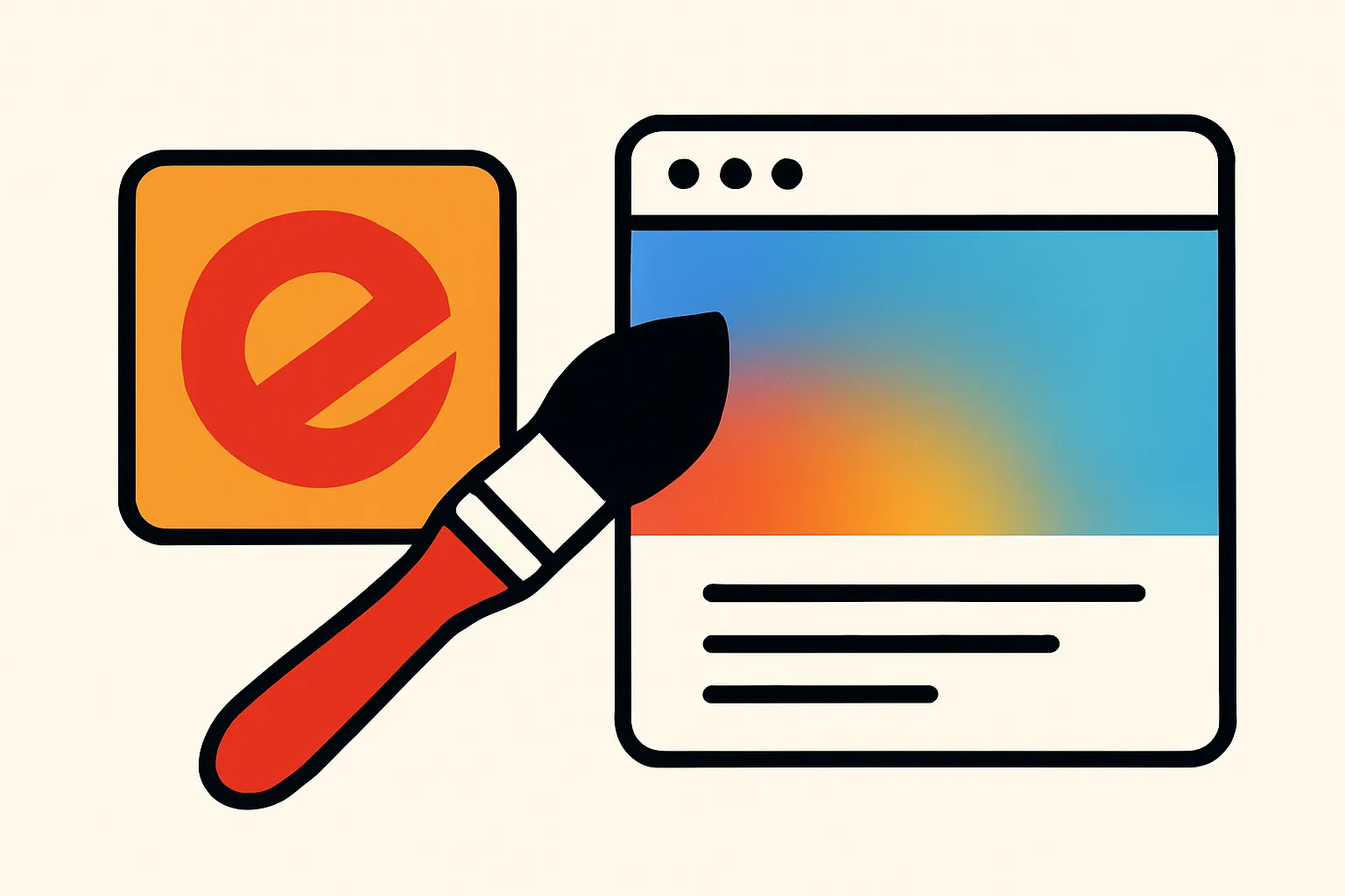
Alt text: Before and after comparison demonstrating how brand identity elements transform a generic user interface into a distinctive branded experience
Defining Your Brand's Core Design Principles
Before you can align UX/UI with brand identity, you need clarity on what your brand actually stands for. This goes deeper than logo usage guidelines—you're defining the design principles that will govern every interface decision.
Start by identifying your brand's 3-5 core attributes. Not aspirational marketing fluff, but the genuine characteristics that differentiate you. Are you bold or understated? Playful or serious? Luxurious or accessible? These aren't good-or-bad choices; they're strategic positioning decisions.
For each attribute, translate it into design language. If "trustworthy" is a core value, what does trust look like in interface design? Perhaps it means prominent security indicators, transparent pricing presentation, or abundant white space that suggests you're not hiding anything. If "innovative" defines you, that might manifest through progressive disclosure, unexpected micro-interactions, or cutting-edge interface patterns.
Create a "brand-to-design translation table" that maps brand attributes to specific design decisions:
- Brand attribute: Approachable
- Typography choice: Sans-serif, moderate weight, generous line-height
- Tone in microcopy: Conversational, supportive, using "you" language
- Interaction patterns: Forgiving error states with helpful guidance
This becomes your design team's decoder ring, transforming abstract brand concepts into concrete, actionable design specifications that anyone can apply consistently.
Creating Visual Systems That Express Brand Personality
Your visual design system is where brand identity becomes tangible in user interfaces. This goes far beyond choosing brand colors—it's about creating a comprehensive visual language that expresses personality consistently.
Color psychology plays a crucial role. If your brand is energetic and youth-oriented, vibrant, saturated hues communicate that instantly. If you're positioning as premium and sophisticated, a restrained palette with rich, complex colors conveys exclusivity. But here's where most teams stumble: they pick brand colors without considering how those colors function across UI states, accessibility requirements, and different contexts.
Typography makes equally powerful statements. Geometric sans-serifs feel modern and tech-forward. Humanist typefaces feel approachable and warm. Serif fonts can convey authority and tradition—or, in contemporary implementations, editorial sophistication. Your type choices should reinforce brand positioning, but they must also serve readability across devices and accessibility standards.
Imagery and illustration style might be your strongest personality lever. Airbnb's hand-drawn illustrations feel personal and human. Stripe's abstract gradients feel technical yet sophisticated. Dropbox's playful, colorful illustrations communicate creativity and simplicity. These aren't decoration; they're brand expression.
Spacing, rhythm, and layout density also communicate. Generous white space suggests premium positioning and makes users feel unhurried. Denser layouts can feel information-rich and efficient—perfect if that matches your brand promise. The wrong choice creates dissonance: imagine a "simple" brand with cluttered interfaces, or a "comprehensive" brand with sparse, minimal layouts.
Typography and Visual Hierarchy as Brand Expression
The way you structure information reveals as much about your brand as what colors you use. Visual hierarchy isn't just about usability—it's about expressing brand values through the prioritization of information.
A luxury brand might use generous sizing for product imagery, minimal text, and abundant breathing room between elements. This hierarchy says, "We're confident enough not to over-explain." A value-oriented brand might prioritize pricing, comparison features, and detailed specifications up front, communicating transparency and practicality.
Your typographic system creates this hierarchy while reinforcing brand personality. Consider the relationships between heading sizes, body copy, and supporting text. Dramatic scale contrast (very large headings with smaller body text) feels bold and editorial. More moderate contrast feels balanced and approachable. These aren't arbitrary choices—they're brand decisions.
Typographic details matter enormously. Letter-spacing on headlines, whether you use sentence case or title case, even your line length—each choice accumulates into an overall impression. Tight letter-spacing with all-caps headlines feels strong and contemporary. Generous spacing with sentence case feels open and friendly.
But here's the discipline required: these patterns must remain consistent across your entire product. Users subconsciously learn your visual language. When you break patterns randomly, you create friction and dilute brand recognition. Document these decisions in your design system and enforce them.
Motion and Interaction Patterns That Feel Branded
Movement and interaction design might be the most overlooked opportunity for brand expression in digital interfaces. How things move, transition, and respond to user input creates personality as powerfully as color or typography.
Animation timing and easing curves carry emotional weight. Bouncy, energetic animations feel playful and fun—perfect for consumer apps targeting younger audiences or entertainment products. Smooth, linear transitions with minimal embellishment feel professional and efficient—appropriate for productivity tools or financial applications.
Consider how Stripe's interfaces use subtle, sophisticated motion to guide attention and confirm actions. Nothing bounces or wobbles; movements are smooth and purposeful, reinforcing their "professional platform" positioning. Contrast this with Duolingo's enthusiastic, bouncy celebrations that perfectly match their brand's encouraging, gamified learning approach.
Micro-interactions—those small moments when users interact with individual elements—accumulate into overall brand perception. Does your loading state use a playful animation or a simple, understated spinner? When users complete an action, do they get enthusiastic confirmation or subtle feedback? These decisions should flow from brand personality, not designer preference.
Interaction patterns also communicate brand values. A brand positioned around transparency might use progressive disclosure carefully, preferring to show information upfront. A brand emphasizing simplicity might aggressively simplify choices, even if it means more steps. Your navigation structure, button styles, form patterns—all these reflect brand positioning.

Alt text: Visual comparison of animation easing curves ranging from playful bounces to professional linear movements, labeled with corresponding brand personalities
Voice, Tone, and UX Writing as Brand Touchpoints
Every word in your interface is a brand touchpoint, yet many companies treat UX writing as an afterthought. The language users encounter—button labels, error messages, onboarding instructions, empty states—shapes brand perception as powerfully as visual design.
Your brand's voice remains consistent (your core personality), while tone flexes for context. A generally friendly, casual brand might still adopt a more serious tone in error messages involving security or financial loss. But the underlying voice—the vocabulary choices, sentence structure, and perspective—should remain recognizable.
Consider Mailchimp's transformation. They built a strong brand partly through their distinctive voice: warm, slightly quirky, always helpful. Their interface copy reinforces this everywhere. Where a generic app says "Error: Invalid email," Mailchimp might say "Hmm, that email address doesn't look right. Want to check it?" Same function, entirely different brand experience.
Microcopy presents countless opportunities for brand expression: empty states that turn potentially negative moments into brand touchpoints, success messages that celebrate users' accomplishments in your brand's voice, instructional text that guides without patronizing. Each moment reinforces (or dilutes) brand identity.
Documentation, tooltips, and help content deserve equal attention. These often-neglected areas frequently break brand voice, suddenly becoming formal or jargon-filled. Users notice this inconsistency, even if only subconsciously. When your help docs sound like they're from a different company than your interface, you've broken brand coherence.
Building and Maintaining Your Brand-Driven Design System
A design system is where brand-driven design scales. Without systematic documentation and governance, even teams with perfect brand understanding will gradually drift toward inconsistency as products grow and teams expand.
Your design system should explicitly connect design decisions back to brand principles. For each component, document not just what it is and how to use it, but why it exists in this specific form. "Primary buttons use rounded corners (8px radius) to reinforce our approachable, friendly brand positioning" connects implementation to strategy.
Components themselves should encode brand decisions. If your brand values clarity and simplicity, your component library should make it easy to build simple, clear interfaces and harder to build cluttered ones. The system becomes a tool for brand governance, guiding designers toward brand-aligned choices through the path of least resistance.
Governance matters enormously. Designate brand-design stewards who evaluate new components and patterns against brand principles. As teams propose additions or modifications to the system, assess them not just for usability but for brand alignment. Does this new illustration style strengthen brand recognition or dilute it? Does this interaction pattern feel consistent with our brand personality?
Living documentation keeps the system relevant. Include real examples showing components in context, explain exceptional cases where brand rules might flex, and share the reasoning behind decisions. This transforms your design system from a static reference into an educational tool that helps teams internalize brand-driven thinking.
Common Pitfalls and How to Avoid Them
Even teams committed to brand-design alignment encounter predictable obstacles. Recognizing these patterns helps you navigate around them.
Over-aestheticization tops the list. Teams get so excited about expressing brand personality that they sacrifice usability. Your checkout flow doesn't need to be an art installation. Brand expression must enhance—never hinder—core user tasks. When in doubt, prioritize clarity, then layer in brand personality where it adds value rather than friction.
Inconsistent application across channels creates another common problem. Your website perfectly expresses brand identity, but your app feels generic, or your email notifications sound like they're from a different company. Users experience your brand across touchpoints; inconsistency anywhere dilutes the entire brand.
Trend-chasing that contradicts brand positioning causes whiplash. If your brand is timeless and classic, don't rebuild your entire interface around whatever design trend is currently popular. Some brands should embrace trends; others should confidently stand apart from them. Know which you are.
Neglecting accessibility in pursuit of brand expression creates both ethical problems and business risks. Your brand colors must meet contrast ratios. Your custom fonts must remain readable. Your artistic loading animations must include proper loading states for screen readers. Strong brand design is inclusive by default.
Finally, treating brand-driven design as a one-time project rather than ongoing practice ensures drift. Brands evolve, markets shift, and products grow. Schedule regular brand-design audits to identify inconsistencies that have crept in and opportunities to strengthen alignment.

Alt text: Visual scale showing the balance between purely functional design and overly artistic design, with the optimal brand-driven design approach in the center
Measuring Impact and Iterating
Brand-driven design produces measurable results, but you need the right metrics and evaluation frameworks to track progress and prove value.
Start with brand perception metrics. Before and after significant redesigns, survey users about brand attributes. Do they perceive you as more innovative, trustworthy, or premium after you've strengthened brand-design alignment? Tools like brand perception studies and sentiment analysis reveal whether your design choices are communicating what you intend.
Usability metrics matter equally. Track task completion rates, time-on-task, and error rates. Strong brand-driven design should improve or maintain these metrics, never sacrifice them. If your brand-aligned redesign reduces conversion rates, something has gone wrong—you've likely over-indexed on aesthetics at the expense of clarity.
Recognition and recall metrics show whether your distinctive design language is creating mental availability. Can users identify your interface from screenshots with branding removed? Do they remember your product more readily than competitors'? These indicators suggest your brand expression is breaking through.
Business outcomes provide the ultimate validation. Track conversion rates, customer lifetime value, referral rates, and engagement metrics. The business case for brand-driven design rests on these numbers improving as brand consistency strengthens.
Don't wait for complete redesigns to measure impact. A/B testing specific brand-aligned patterns against generic alternatives shows which expressions of brand personality actually resonate with users and drive results. This empirical approach builds confidence and helps you optimize brand expression over time.
Quick Takeaways
- Brand-driven design integrates brand identity directly into UX/UI, ensuring every interface decision reinforces who you are as a company
- Translate brand attributes into specific design principles that guide typography, color, layout, motion, and interaction patterns
- Visual consistency across all touchpoints compounds recognition and trust, measurably improving business outcomes
- UX writing and microcopy offer powerful brand expression opportunities that are frequently overlooked
- Design systems encode brand decisions at scale, making consistent brand expression easier as teams and products grow
- Balance brand personality with usability—never sacrifice clarity for aesthetics
- Measure both brand perception and business metrics to validate that your brand-aligned design choices are working
Bringing It All Together
Aligning UX/UI with brand identity isn't about making interfaces prettier or more distinctive—though those often happen as byproducts. It's about creating coherent experiences that build recognition, trust, and loyalty through consistency.
The companies that do this well don't treat brand and design as separate functions that occasionally coordinate. They embed brand thinking into their design process from the earliest stages, ensuring that strategy and execution never drift apart. Every color choice, every word, every animation reinforces the same core brand promise.
This approach requires discipline. It means saying no to design trends that don't fit your brand positioning. It means investing in comprehensive design systems that might feel like overkill for your current team size but will pay dividends as you scale. It means educating stakeholders that brand-driven design is strategic work, not decorative polish applied at the end.
But the returns justify the investment. Users navigating a brand-coherent experience complete tasks more successfully, remember you more readily, trust you more deeply, and recommend you more frequently. Those outcomes directly impact your bottom line.
Start small if you need to. Audit your most critical user flows against your brand principles. Identify the gaps. Begin closing them systematically. Document your decisions as you go. Over time, these incremental improvements compound into comprehensive brand-design alignment.
The question to ask isn't whether your UX/UI perfectly expresses your brand identity today—it probably doesn't. The question is whether you're moving in that direction, building the systems and practices that will get you there, and measuring progress along the way.
Your users encounter your brand through your interfaces. Make sure those interfaces are saying exactly what you want them to say.
Frequently Asked Questions
How is brand-driven design different from just applying brand colors to a UI?
Brand-driven design goes far deeper than surface-level aesthetics. It means letting your core brand values and positioning guide fundamental design decisions: information architecture, interaction patterns, content hierarchy, voice and tone, motion design, and more. It's the difference between a generic interface wearing your logo versus an experience that couldn't belong to any other brand.
Can small companies or startups benefit from brand-driven design, or is this only for established brands?
Startups actually benefit more because you're building habits and systems from day one rather than trying to retrofit consistency later. You don't need a massive brand guide—just clarity on your core positioning and personality. Even with limited resources, being intentional about how design choices express brand identity creates differentiation that helps you compete against larger, better-funded competitors.
How do you balance brand expression with usability and accessibility requirements?
Strong brand-driven design never sacrifices usability—it enhances it by reducing cognitive load through consistency. When conflicts arise, prioritize clarity for core user tasks, then layer in brand personality where it adds value. And remember that accessibility constraints often improve design for everyone. Meeting contrast ratios and readability standards doesn't limit brand expression; it challenges you to express your brand within meaningful constraints.
What's the first step if our UX/UI currently doesn't align well with our brand?
Start with an audit. Map your most important user flows and evaluate them against your brand attributes. Where do you see misalignment? Then prioritize based on user traffic and business impact. You don't need to fix everything at once. Pick your most visible touchpoint, align it properly, measure the impact, and use that success to build momentum for broader work.
How often should we revisit our brand-design alignment?
Conduct lightweight quarterly reviews to catch drift early—inconsistencies that have crept in as teams ship new features quickly. Do comprehensive audits annually or whenever you make significant brand positioning changes, launch major new features, or expand into new markets. Brand-driven design is ongoing practice, not a one-time project.
References:
- McKinsey & Company. (2018). "The Business Value of Design"
- Lucidpress. (2019). "The Impact of Brand Consistency"
- Nielsen Norman Group. Research on brand consistency and user experience
- Airbnb Design. (2014). "Introducing the New Airbnb Brand Identity"
Connexion a 1xbet 1xbet apk
Need an AI generator? ai porn The best nude generator with precision and control. Enter a description and get results. Create nude images in just a few clicks.
Inscription a 1xbet telecharger 1xbet pour android
Looking for a casino? 8mbets bd Slots, table games, and live casino all in one place. Quick login, convenient registration, modern providers, stable payouts, and comfortable player conditions.
Playing at the casino? j win 7 Play online for real money. We offer a wide selection of slots, live dealers, fast payments, easy login, and exciting offers for new and returning players.
Do you love gambling? j win 7 Online is safe and convenient. We offer a wide selection of games, modern slots, a live casino, fast deposits and withdrawals, clear terms, and a stable website.
Продажа IQOS ILUMA https://ekb-terea.org и стиков TEREA в СПб. Только оригинальные устройства и стики, широкий ассортимент, оперативная доставка, самовывоз и поддержка клиентов на всех этапах покупки.
Купить IQOS ILUMA https://spb-terea.store и стики TEREA в Санкт-Петербурге с гарантией оригинальности. В наличии все модели ILUMA, широкий выбор вкусов TEREA, быстрая доставка по СПб, удобная оплата и консультации специалистов.
IQOS ILUMA https://terea-iluma24.org и стики TEREA — покупка в Москве без риска. Гарантия подлинности, большой выбор, выгодные условия, доставка по городу и помощь в подборе устройства и стиков.
сервис рассылок для сайта онлайн сервис рассылки email
задвижка 30с41нж dn80 https://zadvizhka-30s41nzh.ru
подряд смотреть онлайн фантастика 2026 новинки смотреть
пицца куба телефон куба пицца калуга официальный
Zahnprobleme? https://www.zahnarzte-montenegro.com Diagnostik, Kariesbehandlung, Implantate, Zahnaufhellung und Prophylaxe. Wir bieten Ihnen einen angenehmen Termin, sichere Materialien, moderne Technologie und kummern uns um die Gesundheit Ihres Lachelns.
пицца куба рязань доставка пицца куба первомайский просп 11 фото
кино онлайн новинки 2025 кино онлайн регистрации
Play puzzles http://youtube.com/post/ugkxajbkkvkl3bsfrab2ggr4zlrleb-6yqy-?si=at6kqgccyx8yqozl online for free – engaging puzzles for kids and adults. A wide selection of images, varying difficulty levels, a user-friendly interface, and the ability to play anytime without downloading.
русские шлюхи 5 шлюх
Упаковочное и фасовочное оборудование https://vostok-pack.ru купить с доставкой по всей России в течении 30 дней. Лучшие цены на рынке. Гарантия на оборудование. Консультационные услуги. Покупайте упаковочные машины для производства со скидкой на сайте!
Являешь патриотом? подписать контракт женщине на военную службу сво как оформить, какие требования предъявляются, какие выплаты и льготы предусмотрены. Актуальная информация о контрактной службе и порядке заключения.
Как работает интернет в автомобиле https://router-dlya-avtomobilya.ru
Лучшее прямо здесь: блокада спины: эффективное решение для снятия боли в спине
the best adult generator porn journey ai create erotic videos, images, and virtual characters. flexible settings, high quality, instant results, and easy operation right in your browser. the best features for porn generation.
сервисы бесплатной рассылки русский сервис для рассылки писем
W 2026 roku w Polsce dziala kilka kasyn https://kasyno-paypal.pl online obslugujacych platnosci PayPal, ktory jest wygodnym i bezpiecznym sposobem wplat oraz wyplat bez koniecznosci podawania danych bankowych. Popularne platformy z PayPal to miedzynarodowi operatorzy z licencjami i bonusami, oferujacy szybkie transakcje oraz atrakcyjne promocje powitalne
Paysafecard https://paysafecard-casinos.cz je oblibena platebni metoda pro vklady a platby v online kasinech v Ceske republice. Hraci ji ocenuji predevsim pro vysokou uroven zabezpeceni, okamzite transakce a snadne pouziti. Podle naseho nazoru je Paysafecard idealni volbou pro hrace, kteri chteji chranit sve finance a davaji prednost bezpecnym platebnim resenim
W 2026 roku w Polsce https://kasyno-revolut.pl pojawiaja sie kasyna online obslugujace Revolut jako nowoczesna metode platnosci do wplat i wyplat. Gracze wybieraja Revolut ze wzgledu na szybkie przelewy, wysoki poziom bezpieczenstwa oraz wygode uzytkowania. To idealne rozwiazanie dla osob ceniacych kontrole finansow
Жіночий портал https://soloha.in.ua про красу, здоров’я, стосунки та саморозвиток. Корисні поради, що надихають історії, мода, стиль життя, психологія та кар’єра – все для гармонії, впевненості та комфорту щодня.
Портал для жінок https://u-kumy.com про стиль, здоров’я та саморозвиток. Експертні поради, чесні огляди, лайфхаки для дому та роботи, ідеї для відпочинку та гармонійного життя.
Hello lads!
I came across a 153 interesting website that I think you should browse.
This platform is packed with a lot of useful information that you might find helpful.
It has everything you could possibly need, so be sure to give it a visit!
https://thelowdownunder.com/2022/09/01/most-beautiful-countries-to-visit-in-africa/
Furthermore don’t forget, everyone, — a person constantly are able to in this publication locate solutions for the most most tangled queries. We tried to present all of the content via the most most understandable method.
Galatasaray Football Club https://galatasaray.com.az latest news, fixtures, results, squad and player statistics. Club history, achievements, transfers and relevant information for fans.
UFC Baku fan site https://ufc-baku.com.az for fans of mixed martial arts. Tournament news, fighters, fight results, event announcements, analysis and everything related to the development of UFC in Baku and Azerbaijan.
Barcelona fan site https://barcelona.com.az with the latest news, match results, squads and statistics. Club history, trophies, transfers and resources for loyal fans of Catalan football.
Прогноз курса доллара от internet-finans.ru. Ежедневная аналитика, актуальные котировки и экспертные мнения. Следите за изменениями валют, чтобы планировать обмен валют и инвестиции эффективно.
global organization global ideas that implements healthcare initiatives in the Asia-Pacific region. Working collaboratively with communities, practical improvements, innovative approaches, and sustainable development are key.
Rafa Silva rafa silva is an attacking midfielder known for his dribbling, mobility, and ability to create chances. Learn more about his biography, club career, achievements, playing style, and key stats.
Сайт города Одесса https://faine-misto.od.ua свежие новости, городские события, происшествия, культура, экономика и общественная жизнь. Актуальные обзоры, важная информация для жителей и гостей Одессы в удобном формате.
Сайт города Винница https://faine-misto.vinnica.ua свежие новости, городские события, происшествия, экономика, культура и общественная жизнь. Актуальные обзоры, важная информация для жителей и гостей города.
Новости Житомира https://faine-misto.zt.ua сегодня: события города, инфраструктура, транспорт, культура и социальная сфера. Обзоры, аналитика и оперативные обновления о жизни Житомира онлайн.
Портал города Хмельницкий https://faine-misto.km.ua с новостями, событиями и обзорами. Всё о жизни города: решения местных властей, происшествия, экономика, культура и развитие региона.
Новости Львова https://faine-misto.lviv.ua сегодня: городские события, инфраструктура, транспорт, культура и социальная повестка. Обзоры, аналитика и оперативные обновления о жизни города онлайн.
Днепр онлайн https://faine-misto.dp.ua городской портал с актуальными новостями и событиями. Главные темы дня, общественная жизнь, городские изменения и полезная информация для горожан.
Автомобильный портал https://avtogid.in.ua с актуальной информацией об автомобилях. Новинки рынка, обзоры, тест-драйвы, характеристики, цены и практические рекомендации для ежедневного использования авто.
Новости Киева https://infosite.kyiv.ua события города, происшествия, экономика и общество. Актуальные обзоры, аналитика и оперативные материалы о том, что происходит в столице Украины сегодня.
познавательный блог https://zefirka.net.ua с интересными статьями о приметах, значении имен, толковании снов, традициях, праздниках, советах на каждый день.
Портал для пенсионеров https://pensioneram.in.ua Украины с полезными советами и актуальной информацией. Социальные выплаты, пенсии, льготы, здоровье, экономика и разъяснения сложных вопросов простым языком.
Объясняем сложные https://notatky.net.ua темы просто и понятно. Коротко, наглядно и по делу. Материалы для тех, кто хочет быстро разобраться в вопросах без профессионального жаргона и сложных определений.
Блог для мужчин https://u-kuma.com с полезными статьями и советами. Финансы, работа, здоровье, отношения и личная эффективность. Контент для тех, кто хочет разбираться в важных вещах и принимать взвешенные решения.
Полтава онлайн https://u-misti.poltava.ua городской портал с актуальными новостями и событиями. Главные темы дня, общественная жизнь, городские изменения и полезная информация для горожан.
Новости Житомира https://u-misti.zhitomir.ua сегодня: городские события, инфраструктура, транспорт, культура и социальная сфера. Оперативные обновления, обзоры и важная информация о жизни Житомира онлайн.
Новости Хмельницкого https://u-misti.khmelnytskyi.ua сегодня на одном портале. Главные события города, решения властей, происшествия, социальная повестка и городская хроника. Быстро, понятно и по делу.
Львов онлайн https://u-misti.lviv.ua последние новости и городская хроника. Важные события, заявления официальных лиц, общественные темы и изменения в жизни одного из крупнейших городов Украины.
Новости Киева https://u-misti.kyiv.ua сегодня — актуальные события столицы, происшествия, политика, экономика и общественная жизнь. Оперативные обновления, важные решения властей и ключевые темы дня для жителей и гостей города.
Винница онлайн https://u-misti.vinnica.ua последние новости и городская хроника. Главные события, заявления официальных лиц, общественные темы и изменения в жизни города в удобном формате.
Актуальные новости https://u-misti.chernivtsi.ua Черновцов на сегодня. Экономика, происшествия, культура, инфраструктура и социальные вопросы. Надёжные источники, регулярные обновления и важная информация для жителей города.
Новости Днепра https://u-misti.dp.ua сегодня — актуальные события города, происшествия, экономика, политика и общественная жизнь. Оперативные обновления, важные решения властей и главные темы дня для жителей и гостей города.
Городской портал https://u-misti.cherkasy.ua Черкасс — свежие новости, события, происшествия, экономика и общественная жизнь. Актуальные обзоры, городская хроника и полезная информация для жителей и гостей города.
melbet gratuit pour android melbet telecharger
pinco казино официальный сайт скачать бесплатно https://pinco-install-casino.ru
Поставляем грунт https://organicgrunt.ru торф и чернозем с доставкой по Москве и Московской области. Подходит для посадок, благоустройства и озеленения. Качественные смеси, оперативная логистика и удобные условия для частных и коммерческих клиентов.
Op zoek naar een casino? WinnItt biedt online gokkasten en live games. Het biedt snel inloggen, eenvoudige navigatie, moderne speloplossingen en stabiele prestaties op zowel computers als mobiele apparaten.
джойказино скачать joycasino казино
connexion au site web 1win telecharger 1win apk
купить квартиру в сочи светский лес сочи жк застройщик цена
Самое важное сегодня: https://dzen.ru/a/aVPfJm_G1yJNoer3
Нужен проектор? projector24.ru/ большой выбор моделей для дома, офиса и бизнеса. Проекторы для кино, презентаций и обучения, официальная гарантия, консультации специалистов, гарантия качества и удобные условия покупки.
Нужен проектор? projector24 большой выбор моделей для дома, офиса и бизнеса. Проекторы для кино, презентаций и обучения, официальная гарантия, консультации специалистов, гарантия качества и удобные условия покупки.
Hello pals!
I came across a 153 awesome resource that I think you should visit.
This tool is packed with a lot of useful information that you might find helpful.
It has everything you could possibly need, so be sure to give it a visit!
https://fubarnews.net/online-gaming/
Additionally remember not to neglect, folks, which you constantly are able to inside this particular publication discover answers for the most most tangled queries. We tried to present all data using the most most understandable method.
ремонт и химчистка обуви химчистка обуви
Hello folks!
I came across a 154 useful website that I think you should visit.
This platform is packed with a lot of useful information that you might find helpful.
It has everything you could possibly need, so be sure to give it a visit!
https://apkmaniaworld.com/download-22bet-apk-for-phone/
Additionally do not neglect, everyone, which you always may in this piece discover solutions for your the very complicated questions. The authors attempted — present the complete content using an very understandable manner.
Hello folks!
I came across a 154 very cool website that I think you should browse.
This tool is packed with a lot of useful information that you might find interesting.
It has everything you could possibly need, so be sure to give it a visit!
https://www.horabrasil.com.br/2022/10/22/seguro-de-risco-por-que-voce-deveria-ter-algum/
Furthermore remember not to overlook, folks, which a person at all times can within the article find answers to address the the absolute confusing inquiries. Our team tried to explain the complete data in an extremely accessible way.
Лучшее казино ап икс сайт играйте в слоты и live-казино без лишних сложностей. Простой вход, удобный интерфейс, стабильная платформа и широкий выбор игр для отдыха и развлечения.
Лучшее казино ап икс играйте в слоты и live-казино без лишних сложностей. Простой вход, удобный интерфейс, стабильная платформа и широкий выбор игр для отдыха и развлечения.
What kind of commercial milan production service company
заклепка вытяжная 5 заклепка вытяжная алюминий сталь
Попробуйте сделать вход на кракен маркетплейс через любое из пяти onion зеркал
коттеджи дизайн снаружи дизайн проекты домов коттеджей
дизайн зала в квартире дизайн интерьера 2 комнатной
купить полотенцесушитель в ванную купить хороший полотенцесушитель
накрутка лайков и подписчиков накрутка подписчиков вк
Осваиваешь арбитраж? https://corsairmedia.ru поможет разобраться в инструментах, выбрать первую партнерку и избежать типичных ошибок новичков. Подробные обзоры от практиков: плюсы, минусы и реальные цифры заработка без воды.
косметология фото клиника аппаратной косметологии
Хотите подтянутую фигуру? Забудьте о скучных стенах спортзала! Ваша сильные руки ждут вас на свежем воздухе. Обработка земли мотоблоком — это не просто рутина, а активный отдых с жиросжиганием.
Как это работает?
Подробнее на странице – https://kursorbymarket.nethouse.ru/articles/garden-fitness-why-working-with-a-tillerblock-is-an-ideal
Мощные мышцы ног и ягодиц:
Управляя мотоблоком, вы постоянно идете по рыхлой земле, совершая усилие для движения вперед. Это равносильно приседаниям с нагрузкой.
Стальной пресс и кор:
Удержание руля и контроль направления заставляют напрягаться ваш корпус. Каждая кочка — это естественная нагрузка на пресс.
Рельефные руки и плечи:
Повороты, подъемы, развороты тяжелой техники — это работа с “железом” под открытым небом в чистом виде.
Смотрите наше видео-руководство: Мы покажем, как превратить работу в эффективную тренировку.
Ваш план похудения на грядках:
Разминка (5 минут): Наклоны к носкам. Кликните на иконку, чтобы увидеть полный комплекс.
Основная “тренировка” (60-90 минут): Вспашка, культивация, окучивание. Чередуйте интенсивность!
Заминка и растяжка (10 минут): Глубокое дыхание для восстановления. Пролистайте галерею с примерами упражнений.
Мотивационный счетчик: За час активной работы с мотоблоком средней мощности вы можете сжечь от 400 до 600 ккал! Это больше, чем сеанс аэробики.
Итог: Гордость за двойной результат. Поделитесь своим прогрессом в соцсетях с хештегом #ФитнесНаГрядках. Пашите не только землю, но и лишние калории
play-american-roulette-free-online
my web-site: pokies
Нужны казино бонусы? бонус коды казино — бонусы за регистрацию и пополнение счета. Обзоры предложений и подробные правила использования кодов.
Онлайн покер покерок — турниры с крупными гарантиями, кеш-игры и специальные предложения для игроков. Обзоры форматов и условий участия.
Все о фундаменте https://rus-fundament.ru виды оснований, расчет нагрузки, выбор материалов и этапы строительства. Практичные советы по заливке ленточного, плитного и свайного фундамента.
Портал о жизни в ЖК https://pioneer-volgograd.ru инфраструктура, паркинг, детские площадки, охрана и сервисы. Информация для будущих и действующих жителей.
Все о ремонте квартир https://belstroyteh.ru и отделке помещений — практические инструкции, обзоры материалов и современные решения для интерьера.
Зарубежная недвижимость https://realtyz.ru актуальные предложения в Европе, Азии и на побережье. Информация о ценах, налогах, ВНЖ и инвестиционных возможностях.
Всё про строительство https://hotimsvoydom.ru и ремонт — проекты домов, фундаменты, кровля, инженерные системы и отделка. Практичные советы, инструкции и современные технологии.
Найкращі бонуси за регистрацию — депозитні акції, бездепозитні пропозиції та турніри із призами. Огляди та порівняння умов участі.
Грати в найкраще нові казино — широкий вибір автоматів та настільних ігор, вітальні бонуси та спеціальні пропозиції. Дізнайтеся про умови участі та актуальні акції.
Онлайн ігри казіно – великий вибір автоматів, рулетки та покеру з бонусами та акціями. Огляди, новинки та спеціальні пропозиції.
Грати в ігри слоти – великий каталог автоматів, бонуси за реєстрацію та регулярні турніри. Інформація про умови та можливості для гравців.
Онлайн покер Покер онлайн pokerok — регулярные турниры, кеш-игры и специальные предложения для игроков. Обзоры возможностей платформы и условий участия.
Игровой автомат https://chickenroadgames.top — современный слот с интересной концепцией и бонусами. Подробности о механике и особенностях геймплея.
Discover a minecraft game at the casino with an original theme and bonus features. Learn about the mechanics and gameplay features.
Попробуйте майндроп — современный игровой автомат с необычной структурой раундов и бонусными элементами. Подробности о возможностях игры.
Want to try https://zeusvshades250.com a slot machine about the clash of gods with bonus rounds and spectacular animation? Learn more about the format and features.
A catalog of cars https://auto.ae/catalog/ across all brands and generations—specs, engines, trim levels, and real market prices. Compare models and choose the best option.
Un sito web https://www.sopicks.it per trovare abbigliamento, accessori e prodotti alla moda con un motore di ricerca intelligente. Trova articoli per foto, marca, stile o tendenza, confronta le offerte dei negozi e crea look personalizzati in modo rapido e semplice.
Dzisiejsze mecze mecze-dzis aktualny harmonogram z dokladnymi godzinami rozpoczecia. Dowiedz sie, jakie mecze pilki noznej, hokeja i koszykowki odbeda sie dzisiaj, i sledz turnieje, ligi i druzyny w jednym wygodnym kalendarzu.
Wiadomosci tenisowe https://www.teniswiadomosci.pl z Polski i ze swiata: najnowsze wyniki meczow, rankingi zawodniczek, analizy turniejow i wywiady z zawodniczkami. Sledz wydarzenia ATP i WTA, dowiedz sie o zwyciestwach, niespodziankach i najwazniejszych meczach sezonu.
A convenient car catalog auto ae catalog brands, models, specifications, and current prices. Compare engines, fuel consumption, trim levels, and equipment to find the car that meets your needs.
Siatkowka w Polsce siatkowkanews.pl najnowsze wiadomosci, wyniki meczow, terminarze i transfery druzyn. Sledz PlusLige, wystepy reprezentacji narodowych i najwazniejsze wydarzenia sezonu w jednej wygodnej sekcji sportowej.
Koszykowka http://www.koszykowkanews.pl najnowsze wiadomosci, PLK, transfery i wyniki meczow. Sledz polska lige, turnieje miedzynarodowe i postepy zawodnikow, dowiedz sie o transferach, statystykach i najwazniejszych wydarzeniach sezonu.
Jan Blachowicz https://www.janblachowicz.pl to polski zawodnik MMA i byly mistrz UFC w wadze polciezkiej. Pelna biografia, historia kariery, statystyki zwyciestw i porazek, najlepsze walki i aktualne wyniki.
seogrowth site – Bookmarked this immediately, planning to revisit for updates and inspiration.
nicheninja site – Content reads clearly, helpful examples made concepts easy to grasp.
leadzo site – Pages loaded fast, images appeared sharp, and formatting stayed consistent.
reachly site – Navigation felt smooth, found everything quickly without any confusing steps.
Нужен промокод казино? промокод на фриспины получите бесплатные вращения в популярных слотах. Актуальные бонус-коды, условия активации и пошаговая инструкция по использованию для новых и действующих игроков.
offerorbit – Loved the layout today; clean, simple, and genuinely user-friendly overall.
promova – Overall, professional vibe here; trustworthy, polished, and pleasantly minimal throughout.
trendfunnel – Color palette felt calming, nothing distracting, just focused, thoughtful design.
Dlaczego warto wybrać Slottica? Nasza oferta regularnie się powiększa dzięki współpracy z najlepszymi dostawcami, takimi jak Novomatic, BGaming, Play’n Go, Gamzix, NetEnt czy Playson. Dzięki temu każdy znajdzie coś odpowiedniego dla siebie – od klasyki po nowoczesne gry z zaawansowaną grafiką. Kasyno obsługuje wygodne metody płatności, w tym Blik (zgodny z bankami, takimi jak mBank, ING, PKO BP, Pekao czy Millennium), a także karty Visa i Mastercard. Liczne pozytywne opinie na platformach takich jak Trustpilot czy Opinie pokazują, że Slottica to miejsce godne zaufania. Dla fanów mobilnej rozrywki przygotowaliśmy aplikację na systemy iOS oraz Android, zapewniającą płynną rozgrywkę na nowoczesnych urządzeniach.
Slotica to dynamiczne kasyno w internecie, które zdobyło uznanie graczy w Polsce oraz poza jej granicami. Dzięki swoim unikalnym zaletom jest doskonałym wyborem zarówno dla początkujących, jak i doświadczonych entuzjastów gier hazardowych. Jednym z największych atutów platformy jest pełna obsługa w języku polskim, co ułatwia grę zarówno osobom z Polski, jak i Polakom mieszkającym w Niemczech czy Holandii.Jednym z wyróżników kasyna jest brak konieczności weryfikacji konta, co umożliwia natychmiastowe rozpoczęcie gry. Ekspresowe wypłaty wygranych oraz obsługa popularnych metod płatności, takich jak Revolut, czynią korzystanie z platformy wyjątkowo wygodnym. Co więcej, kasyno akceptuje płatności w polskiej walucie, oferując stawki zaczynające się już od 1 grosza – dzięki temu każdy gracz znajdzie tu coś dla siebie, niezależnie od budżetu.
For those seeking an exceptional online gaming experience, us.com](https://maxispin.us.com/) stands out as a premier destination. At Maxispin Casino, players can enjoy a vast array of pokies, table games, and other thrilling options, all accessible in both demo and real-money modes. The casino offers attractive bonuses, including free spins and a generous welcome offer, along with cashback promotions and engaging tournaments. To ensure a seamless experience, Maxispin provides various payment methods, efficient withdrawal processes, and reliable customer support through live chat. Security is a top priority, with robust safety measures and a strong focus on responsible gambling tools. Players can easily navigate the site, with detailed guides on account creation, verification, and payment methods. Whether you’re interested in high RTP slots, hold and win pokies, or the latest slot releases, Maxispin Casino delivers a user-friendly and secure platform. Explore their terms and conditions, read reviews, and discover why many consider Maxispin a legitimate and trustworthy choice in Australia.
By leveraging AI technology, MaxiSpin.us.com ensures that your content stands out in a competitive market.
**Features of MaxiSpin.us.com**
A notable feature of MaxiSpin.us.com is its capability to produce content in various languages.
**Benefits of Using MaxiSpin.us.com**
MaxiSpin.us.com provides businesses with a major advantage by simplifying the content creation process.
stackhq – Mobile version looks perfect; no glitches, fast scrolling, crisp text.
bytehq – Color palette felt calming, nothing distracting, just focused, thoughtful design.
stackops – Navigation felt smooth, found everything quickly without any confusing steps.
kubeops – Found practical insights today; sharing this article with colleagues later.
Нужны столбики? столбики ограждения купить столбики для складов, парковок и общественных пространств. Прочные материалы, устойчивое основание и удобство перемещения обеспечивают безопасность и порядок.
купим провод мм кабель магазин минск
keywordcraft – Pages loaded fast, images appeared sharp, and formatting stayed consistent.
promoseeder – Bookmarked this immediately, planning to revisit for updates and inspiration.
leadspike – Mobile version looks perfect; no glitches, fast scrolling, crisp text.
trafficcrafter – Overall, professional vibe here; trustworthy, polished, and pleasantly minimal throughout.
краны под приварку кран шаровой под приварку