Map Your User Journey to Boost Conversions
Every click tells a story. Your users arrive with intent, navigate through your site, and either convert—or disappear. The difference between these outcomes often lies in how well you understand and optimize their journey.
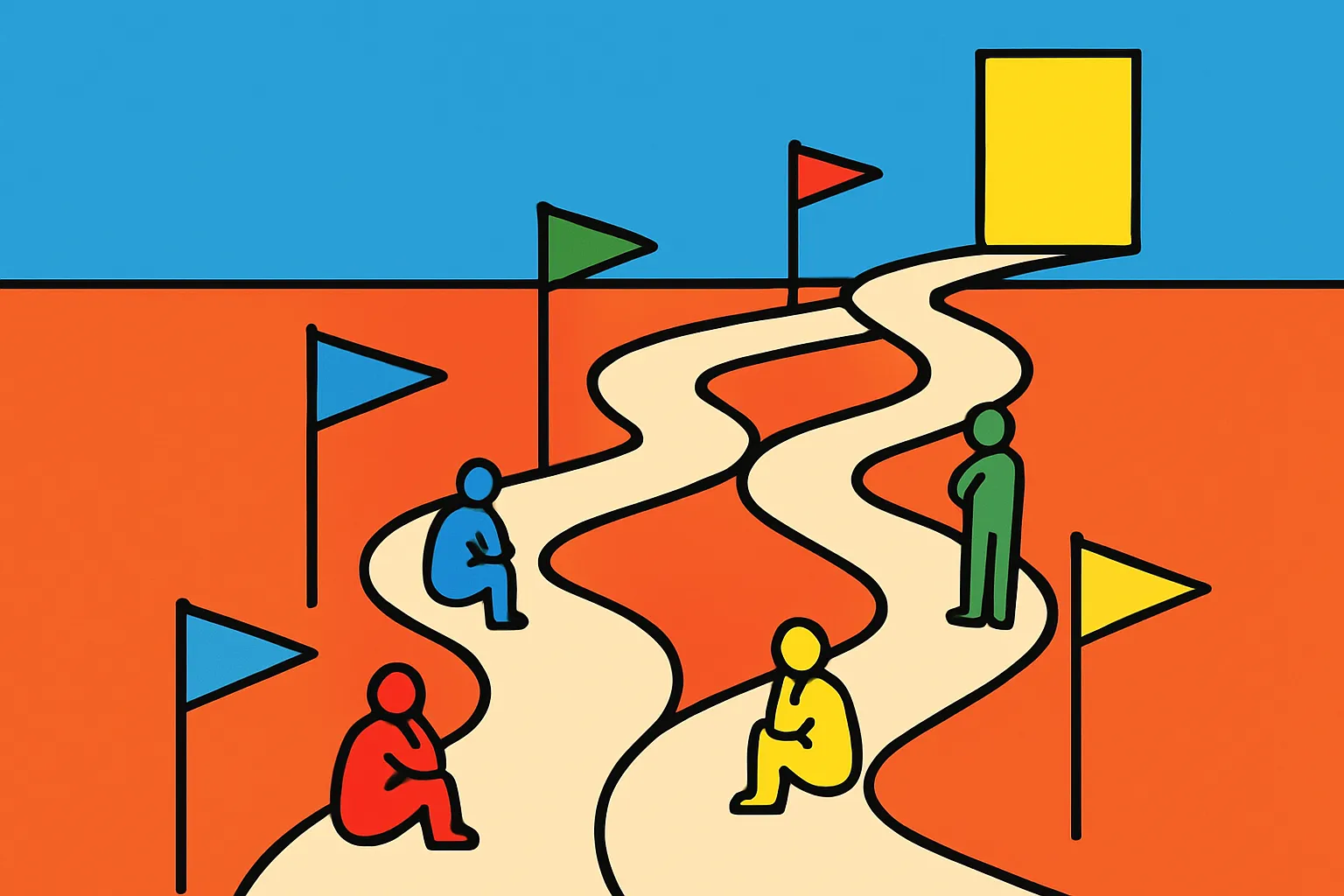
Conversion rate optimization isn't about guessing what might work. It's about systematically mapping how people move through your site, identifying exactly where they stumble, and fixing those friction points with precision. When you visualize the path from landing page to checkout, patterns emerge. You'll see where enthusiasm fades, where confusion sets in, and where small tweaks can yield significant results.
Think of your website as that winding road with checkpoints. Each stage—awareness, consideration, decision—represents a moment where users pause and evaluate whether to continue. Your job is to make that decision effortless. By understanding the psychology behind these micro-moments and implementing data-driven improvements, you're not just hoping for better numbers. You're engineering a system that naturally guides people toward conversion.
This guide will walk you through practical strategies for mapping your user journey, diagnosing drop-off points, and implementing targeted fixes that directly impact your bottom line. No fluff, just actionable insights you can apply today.
Understanding the Complete User Journey
Before you can optimize anything, you need to see the full picture. The user journey encompasses every touchpoint from first awareness to post-purchase advocacy. Most businesses make the mistake of focusing solely on the transaction itself, missing critical moments that shape conversion decisions.
User journey mapping starts with identifying all possible entry points. People don't just land on your homepage—they arrive via social media, organic search, paid ads, email campaigns, and referrals. Each source brings different expectations and intent levels. A cold visitor from a display ad needs more nurturing than someone who searched for your specific product name.
Next, document the stages: awareness (they discover you exist), consideration (they're evaluating whether you're the right solution), decision (they're ready to commit), and retention (they become repeat customers). Within each stage, users interact with multiple pages, features, and content pieces. Map these interactions honestly, including the messy parts where people backtrack or jump between stages non-linearly.
Tools like Google Analytics, heat mapping software, and session recordings reveal the actual paths users take versus the ideal path you've designed. The gap between these two realities is where your opportunities live. Don't create theoretical journey maps in isolation—base them on real behavioral data from your actual users.
Identifying Critical Drop-Off Points
Now that you've mapped the journey, it's time to play detective. Where are people leaving, and more importantly, why? Drop-off analysis transforms abstract data into actionable insights.
Start with your conversion funnel analytics. Look at each step sequentially: homepage visits, category browsing, product page views, add-to-cart actions, checkout initiations, and completed purchases. Calculate the percentage of users progressing from each step to the next. Dramatic drops reveal friction points demanding immediate attention.
Exit pages tell you where interest dies. If 60% of visitors leave from your pricing page, that's not coincidence—it's a signal. Maybe your prices seem high without sufficient value justification. Maybe the page loads slowly. Maybe critical information is buried or unclear. Heat maps and scroll maps show whether people are even seeing your key messaging before they bounce.
Form analytics are particularly revealing. If users start filling out a contact form but abandon it halfway through, examine each field. Are you asking for too much information too soon? Is there a technical error? Does your form work properly on mobile devices?
Session recordings let you watch real users navigate your site. You'll spot confusion you never anticipated—people clicking non-clickable elements, searching for information that's technically present but poorly positioned, or getting trapped in navigation dead-ends. These qualitative insights add crucial context to quantitative data.
Optimizing the Awareness Stage
The awareness stage is your first impression—and often your only chance to make one. Users arriving at your site are asking one fundamental question: "Is this relevant to me?" You have seconds to answer convincingly.
Landing page optimization starts with message match. If someone clicked an ad promising "sustainable coffee beans," your landing page better immediately address sustainable coffee beans—not generic coffee shop copy. Headline alignment with the traffic source builds instant credibility and reduces cognitive dissonance.
Visual hierarchy guides attention strategically. Your most important message should dominate the initial viewport. Use size, color, contrast, and whitespace to create a clear path for the eye. Users shouldn't have to hunt for your value proposition—it should be unavoidable.
Loading speed directly impacts awareness-stage conversions. Research consistently shows that delays of even one second increase bounce rates significantly. Compress images, minimize code, leverage browser caching, and consider a content delivery network. Speed isn't a technical nicety—it's a conversion fundamental.
Social proof at this stage builds immediate trust. Display recognizable brand logos, customer counts, or quick testimonial snippets. Don't overwhelm with information, but provide just enough credibility markers to justify continued exploration. The goal here isn't conversion—it's earning the next click.
Strengthening the Consideration Phase
Users in consideration mode are actively evaluating whether you're the right solution. They're comparing, questioning, and looking for reasons to choose you over alternatives. This stage requires depth without overwhelm.
Content strategy becomes critical here. Provide comprehensive information that addresses common questions and concerns. Product descriptions should go beyond features to explain benefits and outcomes. Case studies demonstrate real-world application. Comparison charts help users self-qualify and understand your differentiation.
Navigation clarity prevents frustration. Users should move effortlessly between related products, support content, and conversion points. Breadcrumbs show where they are in the site structure. Internal linking suggests relevant next steps. Search functionality should actually work and return useful results.
Build trust through transparency. Clear return policies, visible contact information, and authentic customer reviews reduce perceived risk. Don't hide behind marketing speak—be straightforward about what you offer, what you don't, and who you're best suited for. Paradoxically, being honest about limitations often increases trust and conversions among the right audience.
Personalization at this stage can accelerate consideration. Show products related to their browsing history. Offer content matched to their industry or use case. Use behavioral triggers to surface relevant information at the right moment. The goal is making their research easier, not creepier.
Removing Friction from the Decision Stage
Your prospect is ready to commit—don't blow it now. The decision stage is where small friction points cause disproportionate drop-off. Every unnecessary step, confusing element, or moment of doubt gives users a reason to reconsider.
Checkout optimization deserves obsessive attention. Reduce required form fields to the absolute minimum. Use autofill and smart defaults. Show progress indicators so users know how many steps remain. Offer guest checkout options—forcing account creation kills conversions.
Display security signals prominently. Trust badges, SSL certificates, and recognized payment logos reduce anxiety. If you're asking for sensitive information, explain why you need it and how you'll protect it. Don't make users wonder whether you're legitimate.
Eliminate surprise costs. Unexpected shipping fees are the number one reason for cart abandonment. Show total costs early. If possible, offer free shipping or build costs transparently into your pricing. Users hate feeling tricked—even if your total price is competitive, adding fees at the last moment destroys trust.
Provide multiple payment options. Different segments prefer different methods—credit cards, PayPal, Apple Pay, installment plans. Each payment method you don't support is a percentage of potential customers you're turning away. The technical investment usually pays for itself quickly through increased conversion.
Leveraging Analytics and Testing
Opinions are cheap. Data is valuable. The difference between effective optimization and random changes is systematic measurement and testing.
A/B testing should be ongoing, not a one-time project. Test one variable at a time: headlines, button colors, form lengths, page layouts. Run tests until you have statistical significance—usually requiring hundreds or thousands of conversions. Small sample sizes produce unreliable results that lead to poor decisions.
Segment your analysis by traffic source, device type, new versus returning visitors, and geographic location. What works for mobile users may not work for desktop. What converts paid traffic might not resonate with organic visitors. Aggregate data hides important patterns—drill down to find insights.
Set up goal tracking for micro-conversions, not just purchases. Track email signups, video plays, PDF downloads, chat initiations, and other engagement indicators. These smaller commitments often predict eventual conversion and reveal optimization opportunities you'd otherwise miss.
Use cohort analysis to understand how changes impact user behavior over time. A design change might increase immediate conversions but reduce lifetime value. Or a friction point you removed might initially lower conversions but improve long-term retention. Context matters—measure what matters to your actual business goals.
Implementing Personalization Strategies
Generic experiences produce generic results. Modern users expect relevance—give it to them through smart personalization.
Behavioral targeting uses past actions to predict future needs. Someone who viewed three articles about email marketing probably wants email marketing solutions, not social media tools. Show them relevant content, products, and offers based on demonstrated interests.
Demographic personalization adjusts messaging for different audience segments. B2B visitors need different value propositions than B2C. Enterprise buyers care about different features than solopreneurs. Use firmographic data, self-identification, or inferred signals to customize the experience appropriately.
Journey-based personalization recognizes where someone is in their buying process. First-time visitors need education. Return visitors who've viewed pricing need decision support. Users who abandoned carts need objection handling or incentives. Match your message and calls-to-action to their stage.
Don't overreach—creepy personalization backfires. Using someone's first name in an email is expected. Referencing their browsing behavior in invasive ways feels surveillance-like. Strike a balance that feels helpful rather than intrusive. When in doubt, be more subtle.
Optimizing for Mobile Users
Mobile isn't a separate consideration—it's often the majority of your traffic. Yet many sites treat mobile as an afterthought, creating frustrating experiences that tank conversions.
Mobile-first design prioritizes the constrained mobile context. Buttons should be large enough for thumb taps. Forms should minimize typing. Navigation should be simplified. Critical information should appear without scrolling. If it works beautifully on mobile, it'll work on desktop—the reverse isn't true.
Page speed matters even more on mobile, where connections are often slower and less reliable. Aggressive optimization is essential—lazy loading images, minimizing JavaScript, prioritizing above-the-fold content. Test on real devices with real network conditions, not just desktop browsers resized to mobile dimensions.
Streamline mobile checkout ruthlessly. Autofill addresses. Use mobile payment options like Apple Pay and Google Pay. Allow camera uploads of credit cards instead of manual entry. Every tap you eliminate increases completion rates.
Consider mobile-specific features that desktop can't match. Click-to-call buttons for immediate contact. Location-based services for finding nearby stores. SMS notifications for order updates. These aren't compromises for small screens—they're advantages unique to mobile that desktop should envy.
Creating Effective Call-to-Action Elements
Your call-to-action is where intention transforms into action. Yet most CTAs are lazy, generic, and easily ignored.
Button design matters more than you'd think. Color creates contrast and draws attention—choose based on your overall color scheme, not arbitrary "best practices" that may not apply to your context. Size signals importance. White space prevents crowding that diminishes impact.
Copy makes the difference between clicks and scrolls. Replace generic "Submit" with specific, benefit-focused language: "Get My Free Guide" or "Start Saving Money" or "See My Personalized Plan." First-person copy ("Start My Trial") often outperforms second-person ("Start Your Trial") by making the action feel more immediate and personal.
Placement affects visibility and conversion rates. Primary CTAs should appear above the fold on landing pages. Product pages benefit from multiple CTA placements—above the fold for quick deciders, after product details for careful researchers. Don't make users hunt for the next step.
Reduce competing CTAs on conversion-focused pages. Every additional option dilutes attention and creates decision paralysis. If you want users to buy, don't also ask them to read blog posts, watch videos, and sign up for newsletters. One page, one primary goal—guide focus ruthlessly.
Continuous Improvement and Iteration
Optimization isn't a project with an end date—it's a discipline and mindset. The businesses with the highest conversion rates didn't get there through one brilliant redesign. They got there through systematic, continuous improvement.
Establish a testing calendar with regular experiments. Maybe you test one significant element weekly and review results monthly. Create a backlog of hypothesis-driven ideas prioritized by potential impact and implementation effort. Tackle high-impact, low-effort wins first to build momentum.
Document everything. What you tested, why you tested it, what happened, and what you learned. Failed tests teach as much as successful ones—maybe more. Without documentation, you'll waste time repeating experiments or forgetting insights.
Involve your team in optimization thinking. Developers notice technical friction. Customer service hears objections and confusion. Sales teams understand why deals stall. Your best optimization ideas often come from people closest to customer pain points—create channels for them to share observations.
Watch your competitors, but don't copy them blindly. Their changes might be failed experiments. Their audience might have different needs. Their business model might require different trade-offs. Draw inspiration, but always test within your context. What works for them might flop for you—let data decide.
Quick Takeaways
- Map the complete user journey based on real behavioral data, not assumptions, to identify actual paths and friction points
- Analyze drop-off points systematically using funnel analytics, heat maps, and session recordings to pinpoint where and why users leave
- Optimize each stage specifically—awareness needs speed and clarity, consideration needs depth, decision needs friction removal
- Test continuously with proper methodology, statistical significance, and segmented analysis to make data-driven improvements
- Personalize intelligently based on behavior, demographics, and journey stage without crossing into creepy territory
- Prioritize mobile experience with mobile-first design, aggressive speed optimization, and simplified checkout flows
- Create compelling CTAs with strategic placement, specific benefit-focused copy, and reduced competing options
Conclusion: Turn Insights Into Action
You now have a framework for systematically improving your conversion rates through user journey optimization. But frameworks don't increase conversions—implementation does.
Start small. Pick one stage of your funnel with the most significant drop-off. Map what's happening there. Identify the most likely friction point. Form a hypothesis about what might improve it. Test your hypothesis. Measure results. Learn. Repeat.
This iterative approach beats grand redesigns every time. You'll learn faster, risk less, and compound improvements over time. Each small gain multiplies with others, creating momentum that transforms your overall conversion rate.
Remember, optimization is about understanding and serving your users better. It's not manipulation—it's removing obstacles that prevent people from getting what they came for. When you approach it with genuine curiosity about your users' needs and frustrations, you'll make better decisions.
Ready to transform your conversion rates? Start by auditing your current user journey today. Install heat mapping, review your analytics, and watch session recordings. The insights you uncover in the next hour will give you a roadmap for months of valuable improvements. Your users are showing you exactly what needs fixing—you just need to look.
Frequently Asked Questions
What's the most important stage of the user journey to optimize first?
Focus on your biggest drop-off point, regardless of stage. Run a funnel analysis to identify where you're losing the highest percentage or volume of users. That's where optimization effort will yield the fastest returns. For most businesses, checkout and landing pages offer the highest-impact opportunities.
How long should I run an A/B test before making a decision?
Until you reach statistical significance—typically 95% confidence with at least 100-200 conversions per variation. This usually takes 1-4 weeks depending on your traffic volume. Running tests too short produces unreliable results. Use a statistical significance calculator to determine when you have enough data.
Do I need expensive tools to optimize my user journey effectively?
No. Start with free tools like Google Analytics, Microsoft Clarity for heat maps, and manual user testing with friends or customers. These provide 80% of the insights for 0% of the cost. Invest in paid tools once you've exhausted free options and have budget justified by conversion improvements you've already achieved.
How do I prioritize which elements to test when everything needs improvement?
Use the PIE framework: Potential (how much improvement is possible), Importance (how much traffic/revenue flows through this element), and Ease (how simple is implementation). Score each opportunity 1-10 on these factors, multiply the scores, and prioritize highest totals first.
Should I optimize for mobile and desktop separately or together?
Separately. Mobile and desktop users have different behaviors, contexts, and conversion patterns. Design mobile-first for best mobile experience, then enhance for desktop rather than compromising both. Run separate tests for each platform and analyze performance metrics independently for accurate insights.