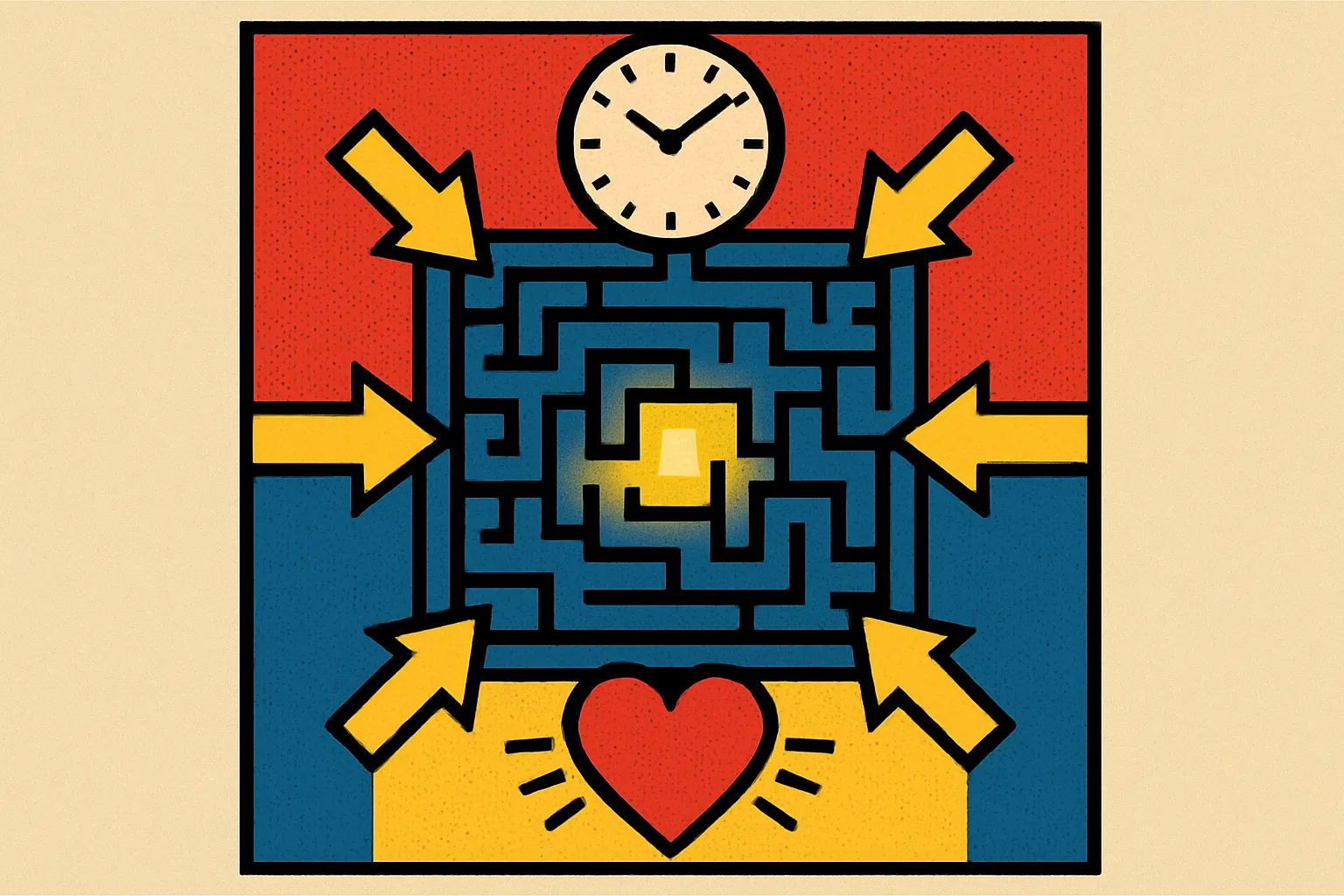
Drive More Engagement: Key UX/UI Enhancements That Work
User engagement isn't accidental—it's the result of deliberate, strategic design decisions that put your users first. If you're watching visitors bounce from your site or abandon their carts, the problem often lies in foundational UX/UI elements that either facilitate or frustrate the user journey. Key UX/UI enhancements can dramatically transform how users interact with your digital products, turning casual browsers into loyal customers.
The reality? Most websites and apps are losing users due to preventable friction points. Research shows that 88% of online consumers are less likely to return to a site after a bad experience. That's not just a lost visitor—it's lost revenue, damaged brand perception, and wasted acquisition costs.
But here's the good news: targeted improvements to navigation structure, page performance, and personalization can create measurable lifts in engagement metrics. We're talking about reduced bounce rates, longer session durations, higher conversion rates, and improved customer retention. These aren't theoretical benefits—they're outcomes I've witnessed across dozens of projects spanning e-commerce, SaaS, and content platforms.
In this article, I'll walk you through the specific UX/UI enhancements that consistently move the needle on user engagement, backed by real-world impact data and practical implementation advice you can apply immediately.
Why Navigation Simplification Matters More Than Ever
Simplifying navigation is perhaps the single most impactful UX enhancement you can implement. When users can't find what they're looking for within seconds, they leave. It's that simple.
Complex navigation structures create cognitive load—forcing users to think too hard about where to click next. I've seen enterprise sites with seven-level deep menus and wonder why their engagement metrics are abysmal. The solution isn't more options; it's clearer pathways.
Start by conducting a content audit to identify your most important user journeys. What are the top 5-7 actions you want users to take? Your navigation should facilitate these journeys with minimal clicks. Every additional level in your navigation hierarchy represents a potential abandonment point.
Consider implementing mega menus with visual hierarchy for complex sites, or simplified hamburger menus for mobile experiences. The key is consistency—users should never feel lost or uncertain about how to navigate back to familiar ground.
One e-commerce client reduced their main navigation from 12 categories to 6 clearly defined ones, resulting in a 34% increase in product page visits and a 22% boost in time on site. The products didn't change—just how users found them.
Test your navigation with real users. Watch session recordings. You'll quickly identify where people hesitate, backtrack, or abandon their journey altogether.
Optimize Load Times to Stop the Bleeding
Every second counts—literally. Page load time optimization directly correlates with engagement rates, and the data is unambiguous. For every additional second of load time, conversion rates drop by approximately 7%.
Users have been conditioned by fast-loading apps and sites to expect near-instant responses. When your site takes more than 3 seconds to load, you're already fighting an uphill battle for attention. Mobile users are even less patient, with 53% abandoning sites that take longer than 3 seconds.
The technical improvements that yield the biggest impact include:
Image optimization through compression and next-gen formats like WebP, lazy loading for below-the-fold content, minifying CSS and JavaScript files, implementing browser caching strategies, and utilizing a content delivery network (CDN) to serve assets from servers closer to your users.
But here's what often gets overlooked: perceived performance matters just as much as actual load time. Skeleton screens, progressive loading, and optimistic UI patterns make your interface feel faster even when actual load times remain unchanged.
I worked with a SaaS platform that reduced their initial load time from 6.2 seconds to 2.1 seconds through systematic optimization. The result? A 41% decrease in bounce rate and a 28% increase in feature adoption. Users who previously grew frustrated waiting for the dashboard now explored more of the product.
Don't guess—measure. Use tools like Google PageSpeed Insights or WebPageTest to identify your biggest bottlenecks.
Personalization Creates Connection and Relevance
Personalized user experiences transform generic interactions into meaningful exchanges. When users feel like your product understands their needs, preferences, and context, engagement naturally increases.
Personalization operates on multiple levels. At the basic tier, you're showing returning users their previous searches or recently viewed items. Mid-level personalization adapts content recommendations based on behavioral patterns. Advanced personalization dynamically restructures entire interfaces based on user segments, preferences, and predictive modeling.
The mistake many teams make is viewing personalization as an all-or-nothing proposition requiring massive data infrastructure. Start small. Even basic personalization—like addressing users by name, remembering their settings, or showing location-specific content—creates a sense of recognition that generic experiences can't match.
Consider these practical personalization opportunities: customized homepages for different user segments, behavior-triggered email sequences, product recommendations based on browsing history, and adaptive search results that learn from user interactions.
A content platform I consulted for implemented topic-based personalization that allowed users to customize their feed. This simple enhancement increased daily active users by 37% and average session duration by 52%. Users no longer had to wade through irrelevant content to find what interested them.
The ethical consideration matters here. Personalization should enhance the user experience, not manipulate it. Be transparent about data collection and give users control over their personalization settings.
Mobile-First Design Is No Longer Optional
With mobile devices accounting for approximately 60% of web traffic, mobile-optimized experiences aren't a nice-to-have—they're mandatory. Yet I still encounter sites that treat mobile as an afterthought, wondering why their engagement metrics suffer.
Mobile-first design means designing for the smallest screen first, then progressively enhancing for larger displays. This constraint forces you to prioritize what truly matters, eliminating unnecessary elements that clutter desktop experiences.
Key mobile UX considerations include: touch-friendly targets (minimum 44×44 pixels), thumb-zone optimization for critical actions, simplified forms with appropriate input types, reduced navigation depth, and content prioritization that front-loads the most important information.
One retail client redesigned their checkout process with a mobile-first approach, reducing form fields from 23 to 8 and implementing one-tap payment options. Mobile conversion rates increased by 56% within the first month. The streamlined experience was so effective they retroactively applied it to their desktop experience.
But mobile-first doesn't mean mobile-only. Your desktop experience should leverage the additional screen real estate to provide richer interactions, not simply stretch the mobile design. Each context has unique opportunities and constraints.
Test on actual devices, not just emulators. Real-world mobile usage—with spotty connections, bright sunlight, and one-handed operation—reveals friction points that lab testing misses.
Visual Hierarchy Guides Attention Intentionally
Effective visual hierarchy doesn't happen by accident. It's a deliberate structure that guides users through your interface in a logical sequence, highlighting what matters most while maintaining overall clarity.
Users don't read websites—they scan them. Eye-tracking studies consistently show F-shaped and Z-shaped scanning patterns, with users spending 80% of their attention on above-the-fold content. Your visual hierarchy should accommodate these natural behaviors, not fight them.
Establish hierarchy through size, color, contrast, spacing, and positioning. Your most important elements—whether that's a CTA button, headline, or key product feature—should dominate visually. Secondary elements should be clearly distinguishable but subordinate. Tertiary content exists to support but not distract.
Typography plays a crucial role here. A clear typographic hierarchy with distinct heading levels, appropriate line height, and adequate contrast makes content scannable and digestible. Dense text blocks with insufficient hierarchy create cognitive overload.
Color draws attention and communicates priority. Your primary action button should be the most visually prominent interactive element on the page. If users have to search for how to proceed, your visual hierarchy has failed.
I redesigned the landing page for a B2B software company, establishing clearer visual hierarchy through strategic use of whitespace, typography, and color. The primary CTA conversion rate increased by 44% without changing any copy. Users simply understood what to do next.
Microinteractions Make Interfaces Feel Alive
Microinteractions are the small, functional animations and feedback mechanisms that communicate system status, guide user actions, and add delight to everyday interactions. They're easy to overlook, but their absence creates interfaces that feel unresponsive and dead.
Consider the simple act of liking a post. Without microinteraction feedback—the button press animation, the color change, the brief confirmation—users are left uncertain whether their action registered. This small moment of doubt degrades the overall experience.
Effective microinteractions serve three primary functions: providing feedback confirming that an action was received and processed, communicating system status during operations that take time, and guiding users toward desired actions through subtle visual cues.
Examples include: button states that respond to hover and press, progress indicators during file uploads or form submissions, success confirmations after completing actions, and transition animations that maintain spatial context during navigation.
The key is subtlety. Microinteractions should enhance the experience without demanding attention. Overused or overly elaborate animations become irritating rather than delightful, creating unnecessary delays in the user journey.
An app I worked on had virtually no microinteraction feedback. Users frequently submitted forms multiple times because they weren't sure if their first submission registered. After implementing proper loading states and success confirmations, duplicate submissions dropped by 67%, and user satisfaction scores increased measurably.
Balance matters. Each microinteraction should serve a functional purpose, not exist purely for decoration.
Accessibility Improvements Benefit Everyone
Accessible design isn't just about compliance or accommodating users with disabilities—though those are important. Accessibility improvements create better experiences for all users, in all contexts.
Consider color contrast. While WCAG guidelines specify minimum contrast ratios to support users with visual impairments, everyone benefits from text that's easier to read, especially in bright sunlight or on lower-quality displays. Similarly, keyboard navigation helps power users move through interfaces faster, not just users who can't use a mouse.
Fundamental accessibility enhancements include: sufficient color contrast ratios (minimum 4.5:1 for normal text), keyboard navigation for all interactive elements, descriptive alt text for images, properly structured heading hierarchies, and focus indicators that clearly show which element is currently selected.
Form accessibility deserves special attention. Labels should be visible and properly associated with inputs. Error messages should be specific and helpful rather than generic. Multi-step forms should clearly indicate progress and allow users to review and edit previous steps.
A financial services client implemented comprehensive accessibility improvements not due to legal requirements but because their user research revealed friction points affecting all users. The result? Form completion rates increased by 31%, and support requests related to interface confusion dropped by 42%.
Accessibility testing tools like WAVE or aXe can identify obvious issues, but nothing replaces testing with actual assistive technologies and diverse users. Screen reader testing often reveals confusing navigation structures that technically pass automated checks but create terrible experiences.
Streamlined Forms Reduce Friction and Abandonment
Form optimization directly impacts conversion rates because forms represent the moment of commitment—when users decide whether your offer is worth their effort. Every unnecessary field increases abandonment risk.
The average online form has an abandonment rate of 67%. That means only one in three people who start filling out your form actually complete it. This isn't a user problem—it's a design problem.
Start by questioning every field. Do you really need that information now? Can you collect it later, after establishing value? Each field should pass this test: does its presence increase conversions more than its removal? If you're not sure, A/B test it.
Form design best practices include: logical field ordering that matches mental models, inline validation that catches errors immediately rather than on submission, clear error messages that explain what's wrong and how to fix it, autofill support for common fields, and appropriate input types that trigger the right mobile keyboard.
Multi-step forms can actually increase completion rates by making complex forms feel more manageable. The key is showing clear progress indicators and allowing users to move backward to review or edit previous steps.
An insurance company I advised reduced their quote form from one long page with 47 fields to a three-step process with conditional logic that adapted based on responses. Only relevant fields appeared. Completion rates jumped from 23% to 61%, and the quality of submissions improved because users took more care with a less overwhelming process.
Content Readability Keeps Users Engaged
Readable content isn't about dumbing down your message—it's about respecting your users' time and cognitive resources. Dense, poorly formatted content gets skipped regardless of how valuable the information might be.
Reading on screens is approximately 25% slower than reading on paper, and users have been conditioned by content abundance to skim rather than read deeply. Your content structure should accommodate these realities.
Readability improvements include: short paragraphs (3-4 sentences maximum), descriptive subheadings that allow users to scan and find relevant sections, bullet points and numbered lists for sequential or grouped information, adequate line length (50-75 characters is optimal), and sufficient line height (1.5x to 1.6x the font size).
Typography choices matter more than many teams realize. Body text should be at least 16px on mobile, with larger sizes for desktop. Avoid light gray text on white backgrounds—it might look sophisticated, but it's harder to read, especially for older users or those with visual impairments.
Content hierarchy through formatting draws attention to key points. Bold the most important phrases. Use block quotes for testimonials or important callouts. Create visual variety that maintains engagement without resorting to gimmicks.
A B2B blog I consulted for had valuable content that performed poorly. The issue wasn't the information—it was the presentation. After reformatting posts with clearer hierarchy, shorter paragraphs, and more visual breathing room, average time on page increased by 73%, and scroll depth improved significantly. The content was the same; the readability was better.
Strategic CTAs Drive Desired Actions
Well-designed calls-to-action convert passive browsing into active engagement. Yet most CTAs fail due to poor positioning, weak copy, or insufficient visual prominence.
Your CTA should answer three questions for users: What happens when I click? Why should I click now? What value will I receive? Generic CTAs like "Submit" or "Click Here" answer none of these questions. Specific, benefit-oriented CTAs like "Get Your Free Analysis" or "Start Your 14-Day Trial" clearly communicate value.
CTA placement matters enormously. The primary CTA should appear above the fold and at natural decision points throughout the page. For longer pages, multiple CTAs at logical stopping points maintain momentum. Don't make users scroll back up to convert after you've convinced them.
Visual design should make CTAs immediately recognizable as interactive elements. Sufficient size, contrasting colors, adequate whitespace, and hover states all signal that this element is meant to be clicked. Your primary CTA should be the most visually prominent button on the page—period.
Button copy should be action-oriented and specific. "Get Started" is better than "Submit." "Download Your Guide" is better than "Click Here." First-person phrasing ("Start My Free Trial") can increase conversions by creating a sense of ownership.
A SaaS company I worked with had a CTA that said "Learn More" above the fold. We changed it to "See How It Works" and moved it 200 pixels left to better align with the natural reading flow. Conversions increased by 28%. Same page, same offer—different CTA strategy.
Quick Takeaways
- Simplified navigation structures reduce cognitive load and help users find what they need quickly, directly impacting engagement and conversion rates
- Optimizing page load times below 3 seconds prevents abandonment and creates a foundation for positive user experiences across all devices
- Personalized experiences that adapt to user preferences and behavior create relevance and connection that generic interfaces cannot match
- Mobile-first design approaches ensure optimal experiences for the majority of users while forcing prioritization of essential elements
- Strong visual hierarchy and accessible design guide user attention, improve readability, and create better experiences for all users regardless of ability
- Microinteractions and streamlined forms reduce friction at critical conversion points where small improvements yield disproportionate results
- Strategic CTAs with clear value propositions and optimal placement convert passive browsers into active users
Creating Lasting Engagement Through Intentional Design
User engagement isn't a mystery—it's the predictable result of design decisions that prioritize user needs over organizational preferences. Every enhancement we've discussed shares a common thread: they remove friction, provide clarity, and respect users' time and attention.
The organizations that consistently achieve high engagement metrics don't rely on tricks or dark patterns. They systematically identify friction points in the user journey and methodically eliminate them. They test actual users, measure real behavior, and iterate based on evidence rather than assumptions.
Start with the quick wins. Audit your page load times, simplify your navigation structure, and review your forms with a critical eye. These foundational improvements often yield immediate, measurable results that build momentum for more comprehensive UX initiatives.
But remember: UX/UI enhancement is a continuous process, not a one-time project. User expectations evolve, technology advances, and your business objectives change. What worked last year might create friction today. Establish processes for ongoing user research, usability testing, and performance monitoring.
The competitive advantage increasingly belongs to organizations that understand this fundamental truth: in a world of infinite options and shrinking attention spans, the experiences that respect users' needs win. Every enhancement you implement compounds, creating interfaces that don't just function—they engage, delight, and convert.
Ready to identify the friction points hurting your engagement metrics? Start by analyzing your user flow from landing to conversion, noting every moment of hesitation or confusion. Those moments are your opportunities—and your roadmap to better engagement.
Frequently Asked Questions
What's the single most impactful UX enhancement for improving engagement?
While every project differs, simplified navigation consistently delivers the highest ROI with the least implementation complexity. When users can find what they need quickly, every other metric improves—session duration, pages per visit, and conversion rates all benefit from clearer navigation structures.
How fast should my pages load to maintain good engagement?
Aim for under 2 seconds on desktop and under 3 seconds on mobile for optimal engagement. However, perceived performance through progressive loading and skeleton screens can make slightly slower actual load times feel faster. Focus on optimizing the largest contentful paint and time to interactive metrics specifically.
Is personalization worth the technical investment for smaller sites?
Absolutely, but start small. Basic personalization like remembering user preferences, showing location-specific content, or displaying recently viewed items requires minimal technical overhead but creates noticeable improvements in user experience. Advanced predictive personalization can wait until you have sufficient traffic and resources.
How do I know which UX improvements to prioritize?
Let data guide your decisions. Analyze user behavior through session recordings, heatmaps, and analytics to identify where users struggle, abandon, or show frustration. Prioritize improvements at high-traffic, high-value pages where small changes impact the most users. Quick wins that require minimal development effort should come first.
Can too many microinteractions hurt the user experience?
Yes. Microinteractions should be subtle and purposeful, confirming actions and guiding users without demanding attention. Overly elaborate animations create delays and irritation, especially for power users completing familiar tasks. Each microinteraction should serve a functional purpose, not exist purely for decoration or novelty.