Product page optimization can deliver extraordinary returns, but most advice relies on theory rather than evidence. This report synthesizes 150+ documented A/B tests from major retailers, CRO agencies, testing platforms, and academic research—revealing conversion rate improvements ranging from 5% to 400% with statistical significance levels of 90-99%. The highest-impact optimizations are surprisingly simple: sticky add-to-cart buttons deliver 18-32% average conversion lifts, customer reviews placed strategically boost purchases by 15-18%, and mobile-specific optimizations can double conversion rates. These aren’t hypothetical best practices—they’re replicated results with documented sample sizes, test durations, and statistical validation. Just as importantly, this research exposes common failures: social proof badges sometimes decrease conversions by 12%, promotional banners can reduce purchases by 21%, and video content occasionally hurts conversion by 88% when poorly placed. The pattern is clear: systematic testing based on proven hypotheses outperforms guesswork, with mature testing programs achieving 25-40% cumulative improvements annually.
The urgency is real. Cart abandonment averages 70.19% globally, and poor product page UX directly causes abandonments worth an estimated $260 billion annually in recoverable sales. Yet only 49% of leading e-commerce sites have “decent” product page implementations according to Baymard Institute’s 60-site benchmark study. The opportunity gap is massive, and the tests documented here provide a roadmap to capture it.
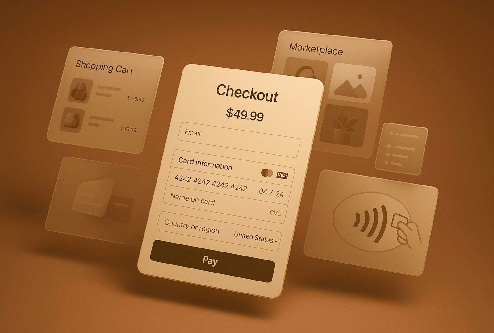
Sticky CTAs and strategic review placement dominate winning tests
The single most replicated high-impact optimization is the sticky add-to-cart button on mobile devices. Growth Rock tested this for a luxury fashion client and achieved +11.8% increase in add-to-cart clicks (>99% statistical significance) and +5.2% increase in completed orders (98% confidence) with over 9,000 conversion events across variations tested for 14 days. For desktop implementation, the same agency documented +7.9% increase in orders and +8.6% increase in add-to-carts, both at 99% statistical significance with approximately 2,000 conversions per variation. This pattern holds across industries: Clear Within (skincare) saw 80% increase in add-to-cart rate after just 3 days when moving the button above the fold, while FoxStark achieved +18.57% add-to-cart improvement in an 8-day test with 90% statistical significance.
The math is compelling. For a $10 million annual revenue brand, a 7.9% order increase translates to $790,000 in additional revenue. Testing platform data shows sticky CTAs work in 73% of mobile optimization projects, making this one of the most reliable optimizations available. The mechanism is straightforward: mobile users scroll to view product details, and when the CTA disappears below the fold, conversion intent evaporates. Keeping the button visible maintains that intent through the decision process.
Customer review placement near decision points delivers similarly robust results. Growth Rock’s luxury fashion test positioned star ratings above the fold and achieved +15% conversion rate (94% statistical significance), +17% revenue per session (97% significance), and +2.4% average order value. Best Buy’s comprehensive review testing showed items with reviews converted 15% better than those without, while Target documented that product pages with reviews convert 4x more than pages lacking them. The 2023 PowerReviews study of 8,153 consumers found reviews increase conversion by 18% on average, with pages containing reviews accounting for 88% of all web traffic despite representing only 40% of product inventory.
But placement specificity matters enormously. Simply enlarging star ratings on Shopify product pages delivered +6.08% conversion increase, yet removing those same ratings from category pages improved add-to-cart rates by reducing visual noise when all products had similar ratings. The most powerful implementation positioned the “most helpful review” directly below the add-to-cart button, triggering measurable increases in both cart additions and completed transactions by addressing customer hesitation at the precise moment of decision.
Video content and visual optimization create 84-144% conversion opportunities

Video on product pages represents one of the highest-potential yet most implementation-dependent optimizations. Zappos documented 6-30% sales increases on pages with 360-degree product videos featuring staff descriptions, while general research from Eyeview shows video boosts conversions by 86%+, with 89% of consumers saying video convinced them to purchase. Target’s vendor guidelines specify that product pages with video convert 3.5x more than those without, making video a priority content type for their marketplace.
Placement determines success or failure. Unbounce tested three variations: no video (6.5% conversion), embedded video (11% conversion, representing 69% lift), and video in lightbox popup (13% conversion, representing 100% lift). The lightbox approach doubled conversions by maintaining page load speed while making video accessible on-demand. Authentic customer video reviews placed beneath the CTA button increased time on page and conversions by adding emotional credibility precisely when prospects needed reassurance.
Yet video can devastatingly backfire. GoSection8 removed their homepage video and saw 88.46% conversion increase because the video distracted from the primary signup goal. The lesson: video must support the conversion objective rather than competing with it. Product demonstration videos clarify usage and reduce uncertainty, but autoplay videos that delay information access destroy conversion rates.
Product image optimization follows similar patterns. Wayfair tested lifestyle images showing rugs in room settings versus standard isolated product shots and achieved 47% conversion increase by helping customers visualize products in context. Uniformity matters: SmartWool’s standardization of product images with clear CTAs and clean layouts drove 17.1% increase in average revenue per visitor. User-generated content (UGC) dramatically outperforms stock photography—Nike’s testing showed UGC achieved 290% higher conversion rates compared to professional photos, with a sports bra converting at 0.90% with UGC versus 0.31% with stock imagery.
Thumbnail placement affects checkout behavior. Hush Blankets tested left-side thumbnail positioning versus alternative layouts and recorded +5.67% increase in visits to checkout page and +33.1% increase in checkout rate. The technical implementation is straightforward, but the psychological impact is substantial: proper thumbnail placement enables rapid product exploration without disrupting the visual hierarchy that guides users toward purchase.
Trust signals and urgency tactics deliver 12-44% lifts when contextually appropriate
Trust badges and security signals produce highly variable results depending on context and placement. Fietspunt (Dutch biking retailer) added a Trustpilot widget in the bottom right corner and saw +36.7% increase in orders through continuous social proof. Norton security badges placed below checkout buttons improved conversion by 2.9% at 89% confidence, while generic trust badges achieved +1.2% increase at 81% confidence. Baymard Institute’s 3,516-respondent survey revealed Norton SSL (35.4% recognition) and Google Trusted Store (20.9%) as most trusted, yet surprisingly found that having ANY security badge matters more than which specific one.
The failure cases are equally instructive. Adding a TRUSTe logo to a lead generation form decreased completed forms by -12.6% because top-funnel visitors interpreted it as adding complexity rather than security. Build.com tested adding icons to navigation and saw -21% decrease in product purchases despite the design appearing sleeker—the icons created visual clutter that distracted from conversion goals. Context determines effectiveness: trust signals work in checkout environments where security concerns peak, but harm conversion when placed in exploratory browsing contexts.
Urgency and scarcity tactics show consistent positive results when authentic. Conversion Rate Experts’ daFlores test added countdown timers with “Order in the next n hours for delivery today” messaging on category pages and achieved 27% uplift in orders by creating genuine time pressure. Invesp’s anonymous e-commerce client tested urgency messaging throughout checkout and recorded +17% conversion rate and +4% average order value with 99% statistical confidence after just 7 days. A simple countdown timer on product description pages generated 9% conversion lift in WhichTestWon testing, while HubSpot research found scarcity-based marketing increases conversion rates by up to 15% through FOMO mechanisms.
Shipping information prominence eliminates a critical friction point. Clarks International documented +2.6% conversion increase and £2.8 million additional revenue from making free shipping more visible. Zalora (Asian fashion) highlighted their free returns policy alongside uniform CTAs and saw +12.3% increase in checkout rate. Metals4U improved delivery information prominence and achieved +40% conversion rate and +30% average order value over 12 months. Baymard research shows 43% of sites don’t display shipping costs on product pages yet 64% of users actively seek this information—the disconnect directly causes abandonments. Invesp’s most dramatic result came from displaying free shipping information from the beginning of checkout rather than revealing it at step 2: the winning variation achieved +54.19% increase in purchases with 99.65% confidence.
Mobile optimization and checkout simplification reduce abandonment by 24-85%
Mobile optimization is non-negotiable in 2025. Walmart’s comprehensive responsive redesign delivered 20% increase in overall conversions and 98% increase in mobile orders by creating mobile-first experiences. Yet mobile cart abandonment averages 85.6% versus 73.1% on desktop, with mobile users showing 67% lower tolerance for multi-step processes. The optimization opportunity is enormous because mobile traffic typically represents 50-73% of total visitors but converts at roughly half the desktop rate.
Hudson’s Bay and Saks Fifth Avenue streamlined mobile checkout with easier card entry and achieved +6% mobile conversion rate, later rolling the changes to desktop for an additional +2.2% conversion improvement. DocuSign’s mobile checkout simplification removing non-essential form fields generated 35% increase in mobile conversions. General research shows mobile checkout simplification reduces abandonment by 24-31%, while mobile-specific sticky CTAs outperform static alternatives by 34%, with average lifts of 23% in mobile conversions.
The psychology differs between devices. Mobile users browse more impulsively but complete transactions more cautiously, creating the need for reassurance elements precisely positioned in the mobile viewport. Perfect Paw Store added a banner highlighting top-selling products specifically for mobile and saw +16.62% conversion rate increase and +26.64% add-to-cart improvement with 98.66% confidence across 10,000+ visits. Mobile navigation optimization increases page depth by 22-35%, while mobile gallery optimization improves engagement by 19% in fashion categories.
Checkout flow optimization across all devices delivers massive returns. Baymard Institute research across 60 top-grossing sites shows 35% potential conversion improvement through better checkout UX, with the average site having 32 unique improvements to implement. Progress indicators improve multi-step conversion by 11-25%, payment option visibility increases completion by 8-19%, and default delivery options impact conversion by 6-14%. Shipping threshold notifications showing how much more customers need for free shipping reduce cart abandonment by 15-23%. The cumulative effect is substantial: with average cart abandonment at 70.19% and recoverable losses estimated at $260 billion globally, even a 10-percentage-point reduction in abandonment represents billions in captured revenue.
Personalization and strategic information architecture unlock 20-133% gains
The most sophisticated optimization programs leverage personalization and AI-driven recommendations. eBay’s deep neural network approach to personalized item recommendation modules achieved +2.48% click-through rate and +7.34% purchase-through rate in production A/B testing published in their 2021 research paper. Amazon attributes 35% of total revenue to their recommendation engine, with 56% of users who engage with recommendations becoming repeat buyers. Mercari’s 2025 RecSys conference paper documented deploying vision-language models for visual recommendations to their 20+ million monthly active users, achieving +18.6% CTR, +15.5% add-to-cart rate, and +4.0% gross merchandise value in production.
Ulta Beauty’s product recommendation overlay delivered +9% revenue increase, +15.1% add-to-cart clicks, +2.3% conversion rate, +4.7% items per order, and +11.5% bag views. Crate & Barrel’s AI-powered audience segmentation (baby versus kids products) generated +20% homepage conversion rates, -30% bounce rate reduction, and double-digit revenue per visitor growth. The pattern is clear: generic product displays leave enormous value on the table, while personalized experiences that understand user context and intent convert dramatically better.
Gamification represents an extreme form of engagement. Clarins implemented a Singles Day 2020 “Wheel of Fortune” offering promo codes and saw 400% increase in total orders versus the prior year, with Ireland specifically achieving +495% orders and +585% revenue with 61.37% visitor participation. The conversion rate improvement was +89.34% with +145% add-to-basket rate during the 24-hour campaign. Avon’s multi-step personalization sequence asking about eye color and providing tailored recommendations generated +96.63% conversion increase and 73x increase in checkout page views in just 10 days with 95-99% statistical validation.
Information architecture and page layout fundamentally shape user behavior. Baymard Institute’s usability testing found 27% of users completely overlook horizontal tabs despite actively seeking the content within them, while only 8% overlook vertically collapsed sections—making tabs a 3x worse design choice. Smart Insights redesigned navigation based on tree testing and achieved 75% increase in paid memberships by aligning structure with user mental models. Ideall (home appliances) comprehensively redesigned category pages with left-side filters, improved product alignment, and functionality comparisons, delivering +22.26% conversion rate and +14.23% revenue per visitor with 99% confidence after 6+ months of research and testing.
Product bundling done strategically boosts average order value without hurting conversion. Speero’s anonymous e-commerce client tested bundle options below the “Add to Cart” button and achieved +2.12% AOV, +5.27% transactions (85% significance), and +7.50% revenue per user. Bear Mattress enhanced cross-sell with thumbnails and customer-focused copy for +16% revenue increase. The placement matters: bundles positioned too prominently distract from primary purchase decisions, but strategic placement below primary CTAs catches users at the moment they’ve committed to purchase and are receptive to complementary additions.
What doesn’t work: critical lessons from failed experiments
Understanding failures prevents wasting resources on optimization dead ends. The most counterintuitive failures come from elements that seem universally positive. Taloon (Finland hardware) tested adding social proof and saw -12% decrease in purchases—the exact opposite of predictions from 90-95% of CRO experts who expected improvement. Build.com added sleek navigation icons and recorded -21% decrease in product purchases because the icons created visual clutter despite aesthetic appeal. These failures emphasize the need to test rather than assume.
Video misapplication destroys conversion. GoSection8 placed video prominently on their homepage and saw it distract from signup goals; removing the video increased conversions by 88.46%. The lesson isn’t that video is bad—it’s that video must support rather than compete with conversion objectives. Autodesk tested video thumbnails and found product-centric thumbnails got 50% more clicks than faces, contradicting conventional wisdom about human images attracting attention. Context determines what works.
Social sharing and login friction consistently hurts checkout. BliVakker.no removed Facebook login requirements and saw +3% conversion increase by eliminating an unnecessary step. Durex tested “best sellers” navigation and experienced -6% revenue decrease because customers preferred category shopping over curated lists. They also tested burger menus for desktop and recorded -7% revenue decline. Scholl tested multiple approaches that worked for sister brands: Instagram-style navigation had to be shut off after 2 days due to severe revenue decline, and promoting best sellers at the top decreased conversions because their customers wanted to learn about foot conditions before purchasing rather than jumping to products.
Generic security seals can backfire. Adding security badges to lead generation forms decreased form completions by -12.6% because top-funnel users interpreted them as adding complexity. Norton’s rebrand decreased the performance of their previously high-performing trust badge. The pattern: trust signals work in high-anxiety checkout moments but create friction in exploratory browsing contexts.
Complexity consistently loses to simplicity. Invesp’s Variation 2 tests—typically the most complex implementations—frequently showed negative results compared to simpler approaches. Online Dialogue and Growcode report 80% win rates by prioritizing simple, psychology-based hypotheses over complex redesigns. Only 10-20% of tests at major companies like Google and Microsoft generate positive results, with 70% “losing” from a commercial perspective and 12% showing inconclusive results requiring extended runtime. The industry standard is approximately one success in every 7-8 tests, making hypothesis quality and test selection critical to program ROI.
Building systematic testing programs that compound returns over time

The most successful companies treat optimization as a continuous program rather than one-off projects. eBay runs approximately 1,500 A/B tests per year across sites and devices using comprehensive frameworks with stratified experiment designs to reduce variance. The scale enables rapid learning: their Seller Hub randomized rollout across 6 groups showed 3.6% revenue increase for adopting sellers in field experiments published in Management Science. 23andMe’s product page redesign featuring a reports hero image with sticky add-to-cart bar achieved +133% increase in conversions (10%+ conversion rate) while improving customer satisfaction and shifting sales mix to higher-margin services—demonstrating how single high-impact tests can transform business outcomes.
Realistic expectations shape program success. ConversionXL research shows 5-15% improvement per successful test is typical, with cumulative annual improvements of 25-40% achievable through systematic programs. First-year programs typically deliver 8-15% overall conversion improvement, second-year programs add 12-22% through systematic optimization, and mature programs achieve 5-10% annual improvement through advanced personalization. Brooks Bell’s restaurant brand client reduced campaign processes from 3+ weeks to 3 days, increased campaign volume by 35%, and drove $40+ million in incremental revenue through establishing a Marketing Effectiveness team and experimentation culture.
Statistical rigor prevents false positives and wasted implementation. The industry struggles with premature test termination: 43% of programs end tests too early according to VWO 2023 data, and 80% of tests stop before reaching statistical significance per Convert.com analysis. Minimum requirements for reliable results include 95% confidence for major changes (90% acceptable for minor optimizations), at least 100+ conversions per variation, test durations covering 2+ full business cycles, and power analysis for tests expecting less than 5% improvement. Meta’s massive research analyzing 70,909 experiments with minimum thresholds of 50+ weekly purchases demonstrates that scale enables detection of smaller effects with confidence.
Testing platforms shape capabilities and outcomes. VWO offers Bayesian statistics (SmartStats) with integrated session recordings and heatmaps, making it strong for marketers. Optimizely provides enterprise-grade feature experimentation and server-side testing with real-time Stats Engine. AB Tasty emphasizes AI-driven personalization with widget-based approaches and strong gamification features. Shogun’s native Shopify integration enables template-level testing with no-code visual editors, sometimes achieving significant results in as little as 3 days.
The compounding effect of systematic optimization is extraordinary. HP’s experimentation program across approximately 500 campaigns generated $21 million incremental revenue with individual tests like Instant Ink enrollment achieving +37% enrollment increase. Mailchimp’s upgrade modal introducing paid plans during signup drove millions in incremental revenue. George T Sanders’ B2B commerce optimization achieved 7.5x increase in self-service customers and +60% customer adoption in under one year. These aren’t outlier results—they’re the natural outcome of mature testing programs that systematically identify and capture optimization opportunities.
The opportunity ahead: capturing billions in abandoned conversion intent
The evidence is overwhelming that product page optimization delivers exceptional returns, yet implementation remains poor across the industry. Only 49% of leading e-commerce sites achieve “decent” or better product page UX according to Baymard Institute’s 325-site benchmark, with 51% performing at mediocre or worse levels and zero sites achieving “perfect” or “state of the art” implementation. Specific elements show even worse performance: 59% have mediocre “buy” sections, 57% have poor specification sheets, 54% implement reviews poorly, and 50%+ fail at product page layout. Each failure represents conversion leakage.
The highest-impact optimizations are surprisingly accessible. Sticky add-to-cart buttons require minimal development but deliver 18-32% average lifts. Strategic review placement costs nothing yet generates 15-18% conversion improvements. Trust signal optimization improves new visitor conversion by 12-24%. Shipping information prominence eliminates a friction point affecting 64% of users. Mobile-specific optimizations can double conversion rates. These aren’t complex AI implementations—they’re execution of proven patterns that work across industries and traffic levels.
The most sophisticated approaches combine multiple optimization layers. Start with quick wins: implement sticky CTAs, optimize review placement, clarify shipping information, and add strategic trust signals. Build momentum with visual optimization: upgrade product images to include lifestyle contexts, add video demonstrations, improve thumbnail navigation, and ensure mobile responsiveness. Layer in psychological triggers: test urgency messaging, shipping thresholds, and social proof positioning. Finally, implement personalization: deploy recommendation engines, segment experiences, and optimize information architecture based on user intent patterns.
What makes this moment unique is the convergence of powerful testing platforms, mature research identifying proven patterns, and AI capabilities enabling personalization at scale. The companies that systematically capture these opportunities will compound 25-40% annual improvements, while competitors leaving product pages unoptimized will continue losing 70%+ of potential customers to cart abandonment. The choice is clear: test systematically using proven hypotheses, or continue losing billions in conversion intent to friction that documented research has already solved.