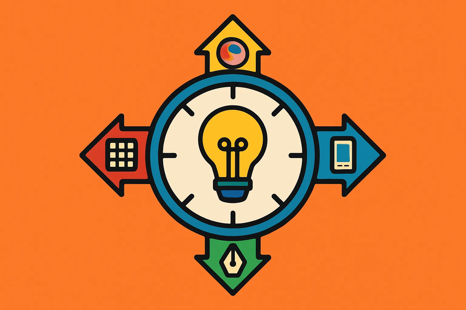
Mastering design trends for startups: Aligning UX/UI with vision

Mastering design trends for startups: Aligning UX/UI with vision

The startup landscape moves fast, and design trends move even faster. Every year brings a fresh wave of visual styles, interaction patterns, and interface innovations that promise to revolutionize user experience. But here's the uncomfortable truth: chasing every design trend can dilute your product's identity and confuse your users. For startups operating with limited resources and tight timelines, the question isn't whether to follow design trends—it's which ones deserve your attention and investment.

Understanding design trends for startups requires a different lens than established companies use. You're not redesigning a mature product with millions of users; you're building something from scratch while trying to validate product-market fit. The stakes are different. The right design choice can communicate credibility and modernity, helping you compete with larger players. The wrong one can make your product feel like a clone or, worse, distract from your core value proposition.

This guide helps you develop a framework for evaluating UX/UI trends through the lens of your startup's unique vision and user needs. We'll explore how to separate meaningful innovations from fleeting aesthetics, and how to make design decisions that serve your business goals rather than just following the crowd.

Quick Takeaways

  • Not all trends serve all products—evaluate each trend against your specific user needs and business objectives
  • Timing matters—early adoption carries risk, but late adoption can make you look outdated
  • User research trumps aesthetics—validate that trendy elements actually improve your user experience
  • Resource constraints are real—prioritize trends that offer maximum impact with minimal implementation complexity
  • Brand consistency beats trend-chasing—your visual identity should evolve thoughtfully, not reactively
  • Accessibility and performance are永续 trends—these foundational elements never go out of style
  • Test before committing—use A/B testing and user feedback to validate design decisions

Understanding the Trend Lifecycle and Your Position

Every design trend follows a predictable lifecycle: innovation, early adoption, mainstream acceptance, saturation, and eventual decline. Startups need to understand where they enter this cycle. Being too early means educating users on unfamiliar patterns, which increases cognitive load. Being too late means looking derivative.

The innovation phase happens in design labs, agencies, and forward-thinking tech companies. Early adoption occurs when industry leaders implement these ideas, lending them credibility. This is often the sweet spot for startups—the trend is validated but not yet ubiquitous.

Mainstream acceptance brings both opportunity and risk. On one hand, users become comfortable with these patterns, reducing friction. On the other, differentiation becomes harder. Saturation is when every competitor uses the same approach, and decline follows when users actively tire of overused patterns.

Consider glassmorphism—the frosted-glass aesthetic that peaked around 2021. Early adopters looked cutting-edge. Mainstream adopters looked current. Late adopters looked like they were copying everyone else. Your positioning strategy should inform your timing.

Building Your Trend Evaluation Framework

Before analyzing specific trends, establish criteria for evaluation. A solid framework prevents impulsive decisions and keeps your team aligned on what matters. Start with three fundamental questions: Does this trend serve our users? Does it align with our brand? Can we execute it well?

User service means the trend solves a real problem or meaningfully improves the experience. If glassmorphism doesn't enhance readability or navigation in your specific context, it's decoration, not design. Document your primary user jobs-to-be-done and evaluate whether the trend supports these objectives.

Brand alignment asks whether the trend fits your positioning. A fintech startup building trust with conservative investors might skip playful, maximalist designs even if they're trending. A creative collaboration tool might embrace them. Your brand values should guide these choices.

Execution capability matters enormously for resource-constrained startups. Complex animations might look impressive but require significant development time and ongoing maintenance. Calculate the opportunity cost—what else could your team build with those resources?

Add quantifiable metrics: implementation time, performance impact, accessibility compliance, and cross-platform compatibility. This transforms subjective debates into objective evaluations.

Separating Innovation from Decoration

The most critical skill in trend evaluation is distinguishing meaningful innovation from superficial decoration. Innovation changes how users interact with your product, making tasks easier or enabling new capabilities. Decoration changes only appearance.

Dark mode represents genuine innovation. It reduces eye strain in low-light conditions, conserves battery life on OLED screens, and meets a documented user preference. The trend emerged from solving real problems, not aesthetic whims. When you implement dark mode, you're adding functional value.

Conversely, many micro-interaction trends exist primarily for visual interest. Subtle hover effects and loading animations can enhance perceived performance and delight, but they rarely solve core usability problems. This doesn't make them worthless—user delight has value—but understand their role.

Apply this test: If you removed this trendy element, would core tasks become harder? If yes, it's innovation. If no, it's decoration. Both have their place, but innovation should dominate your roadmap, especially early on when establishing your product's value proposition.

Also consider whether the trend introduces new mental models. Completely novel interaction patterns require user learning, which creates friction. Thoughtful innovation often feels familiar even when new—it extends existing patterns rather than replacing them.

Your product vision acts as a north star for design decisions. Every startup has a unique perspective on the problem they're solving and how they'll solve it. Trends should amplify this vision, not obscure it.

Start by articulating your core differentiators. Are you competing on simplicity? Speed? Power user features? Aesthetic beauty? Each positioning suggests different design priorities. If simplicity is your differentiator, minimalist design trends align naturally. If you're targeting power users, you might embrace information density trends that others avoid.

Consider how the trend affects your product narrative. When users first encounter your interface, they form immediate impressions. Does the trend reinforce what you want them to feel? A healthcare startup might prioritize calming colors and clear hierarchy over bold, high-contrast aesthetics that work for entertainment products.

Document your vision explicitly and revisit it when evaluating trends. Ask: "Does this move us closer to our ideal user experience?" If the answer isn't clearly yes, table it. The most successful startup products have cohesive visions that shine through every design choice.

Remember that trends can be adapted, not just adopted wholesale. Take the core insight from a trend and interpret it through your unique lens. This creates distinctiveness while maintaining currency.

Conducting Effective Trend Research

Strategic trend research goes beyond browsing design galleries. While sites like Dribbble and Behance showcase beautiful work, they often emphasize visual spectacle over functional design. Diversify your research sources to get a complete picture.

Analyze your direct competitors first. What design choices are they making? Where do they converge, and where do they differentiate? Convergence often indicates industry best practices—patterns users expect. Divergence shows where competitors are seeking advantage.

Extend research to adjacent industries. If you're building B2B software, study both enterprise tools and consumer products. Consumer trends often migrate to enterprise contexts once proven. Understanding this trajectory helps you anticipate where your industry is heading.

Use analytics platforms like Hotjar or FullStory on your existing product (if you have one) to identify friction points. Then research whether current trends address those specific issues. This grounds trend evaluation in actual user behavior rather than aesthetic preference.

Follow thought leaders and design systems from major tech companies. Google's Material Design, Apple's Human Interface Guidelines, and Microsoft's Fluent Design evolve regularly, telegraphing where interaction design is headed. These companies invest heavily in user research, making their guidance valuable.

Never commit to a trend across your entire product without validation. Testing reduces risk and provides data for decision-making. Start small, measure impact, then expand if results warrant it.

A/B testing works beautifully for evaluating design trends. Implement the trendy approach for 50% of users while maintaining your current design for the other 50%. Track key metrics: conversion rates, task completion times, bounce rates, and user satisfaction scores.

Qualitative research adds crucial context to quantitative data. Conduct user interviews or usability tests specifically focused on the new design elements. Ask open-ended questions: "What do you notice about this interface?" and "How does this make you feel?" Users often react to trends in surprising ways.

Prototype testing comes earlier in the process. Tools like Figma allow you to create interactive prototypes incorporating trendy elements without writing production code. Test these prototypes with 5-8 users to catch major issues before development investment.

Consider cohort analysis if you're testing with your existing user base. Long-term users may resist change simply because it's unfamiliar, while new users provide cleaner signals about whether the trend improves first impressions. Both perspectives matter, but they tell different stories.

The most effective startup designs balance contemporary trends with timeless UX principles. Principles like clarity, consistency, and feedback never go out of style. They should form your foundation, with trends layered carefully on top.

Visual hierarchy remains essential regardless of whether you embrace neumorphism, flat design, or whatever comes next. Users need to immediately grasp what's most important on any screen. Before adopting a trend, verify it doesn't compromise hierarchy through reduced contrast or unclear affordances.

Consistency creates learnability. If you adopt a trend selectively—say, using bold typography in your marketing site but not your product—users must relearn patterns as they move between contexts. Apply trends systematically or not at all.

Feedback and perceived performance trump visual flair. Users need immediate acknowledgment when they take actions. Trendy loading states or transition animations should enhance this feedback, not replace it. If your beautiful animation increases perceived loading time, it fails the fundamental test.

Accessibility principles are non-negotiable. Some trends, like low-contrast color schemes or gesture-only navigation, can create barriers for users with disabilities. Ensure any trend you adopt meets WCAG guidelines. This isn't just ethical—it expands your addressable market.

Resource Allocation and Technical Feasibility

Startups operate under significant resource constraints. Every design decision carries an opportunity cost. That complex particle animation system might wow users, but it consumes development hours that could build revenue-generating features.

Assess implementation complexity honestly. Some trends require specialized expertise or extensive testing across devices and browsers. Others integrate easily into existing design systems. Create a rough estimate: how many developer hours will this trend require, including initial build and ongoing maintenance?

Consider performance implications, especially for mobile users. Heavy animations, large image assets, and complex visual effects impact load times and battery consumption. Users abandon slow products, regardless of how trendy they look. Use performance budgets to keep trends from degrading experience.

Technical debt matters for early-stage startups. If you're likely to pivot or substantially redesign within the next year, investing heavily in implementing trends may not make sense. Focus on functional excellence and moderate aesthetic quality until your product direction stabilizes.

Conversely, some trends actually reduce development effort. Design systems and component libraries built around modern frameworks can speed development while keeping your product looking current. Adopting these ecosystem-level trends often pays immediate dividends.

Industry-Specific Trend Considerations

Different industries embrace design trends at different rates and in different ways. Understanding your industry's design culture prevents costly misalignments.

B2B and enterprise products typically move more conservatively. Decision-makers in these contexts value professionalism, trust signals, and feature depth over cutting-edge aesthetics. That said, there's growing appetite for consumerized B2B experiences that incorporate contemporary patterns while maintaining enterprise credibility.

Consumer products, particularly in lifestyle, entertainment, and social categories, can push boundaries more aggressively. Users expect frequent updates and fresh experiences. Early trend adoption signals that your product is active and innovative, which builds confidence in consumer contexts.

Healthcare, finance, and education face regulatory considerations that affect design choices. High contrast, clear labels, and explicit confirmation steps may be mandatory, limiting how much you can simplify or stylize interfaces. Verify compliance before adopting trends in regulated industries.

E-commerce has established conventions around product display, checkout flows, and trust indicators. While there's room for innovation, deviating too far from these patterns increases cognitive load during high-stakes purchasing decisions. Test thoroughly if you're innovating here.

Creating Your Own Design Identity

The ultimate goal isn't perfect trend adoption—it's developing a distinctive design identity that users associate specifically with your product. This requires selectively incorporating trends while maintaining consistent, recognizable elements.

Define 2-3 signature design elements that remain constant even as you evolve other aspects. This might be a distinctive color palette, a unique illustration style, or a particular approach to typography. These signatures create continuity and brand recognition.

Document your design principles explicitly. Companies like Stripe, Notion, and Linear have strong design identities precisely because they articulated clear principles that guide every decision. Principles like "speed in every interaction" or "powerful simplicity" help teams evaluate trends consistently.

Consider your design roadmap across quarters and years. Strategic design evolution feels intentional; reactive trend-chasing feels desperate. Plan how your design might mature over time, incorporating lessons from trends without losing your core identity.

Create mood boards and style guides that blend inspirational trend examples with your unique perspective. This gives designers and developers clear direction while allowing creative interpretation. Update these resources quarterly to reflect evolving tastes without abandoning your foundation.

Measuring Design Impact on Business Metrics

Design isn't just aesthetics—it directly impacts business outcomes. Track how trend adoption affects your key performance indicators to justify design investments and refine your approach.

For acquisition-focused startups, measure how design changes affect conversion rates from landing page to signup. A/B test trendy hero sections, pricing page layouts, or call-to-action styles. Small improvements in these areas compound into significant user growth.

Activation and onboarding metrics reveal whether trendy interaction patterns help or hinder new user success. Track time-to-first-value, completion rates for onboarding flows, and early retention numbers. If a trendy progressive disclosure pattern confuses users, the data will show it.

Engagement metrics matter for retention-focused products. Do users spend more time in your product after interface updates? Do they explore more features? Engagement increases suggest your design changes added value; decreases indicate problems requiring investigation.

Revenue impact often takes longer to materialize but matters most. Connect design changes to revenue metrics through cohort analysis. Did users who first experienced your product after the redesign convert to paid plans at higher rates? Attribution is complex but essential.

Qualitative feedback complements quantitative metrics. Monitor support tickets, user reviews, and social media mentions for reactions to design changes. This early warning system catches problems before they show up in retention curves.

Conclusion: Charting Your Own Design Path

Navigating design trends as a startup requires balancing multiple forces: staying current without losing identity, delighting users without sacrificing usability, and making bold choices within resource constraints. The startups that succeed don't follow every trend blindly—they develop clear frameworks for evaluation and make intentional choices aligned with their vision.

Start by deeply understanding your users and their needs. Ground every design decision in this foundation. Use trends as tools, not templates. When a trend genuinely solves a user problem or amplifies your value proposition, embrace it. When it's merely fashionable, have the confidence to pass.

Build your evaluation framework today. Document your product vision, establish criteria for assessing trends, and commit to testing before full implementation. This discipline prevents costly mistakes and builds organizational capability in design thinking.

Remember that the most memorable products aren't trendy—they're distinctive. Airbnb, Slack, and Notion each incorporated contemporary design thinking while developing unmistakable identities. Your startup can do the same by thoughtfully curating influences rather than copying them wholesale.

Ready to develop a design strategy that serves your unique vision? Evaluate your current design against the framework outlined here. Identify one trend that genuinely aligns with your user needs and test it this quarter. Small, validated steps build toward a cohesive design identity that attracts users and supports your business goals. Your compass should point toward what makes your product uniquely valuable, not just what's popular right now.

Frequently Asked Questions

How do I know if a design trend is worth implementing in my startup?

Evaluate the trend against three criteria: Does it solve a real user problem in your product? Does it align with your brand positioning and values? Can you execute it well with available resources? If all three answers are yes, conduct small-scale testing before full implementation. Track both quantitative metrics (conversion, engagement) and qualitative feedback to validate the trend's impact.

Should startups prioritize following design trends or building something unique?

The best approach combines both. Use trends selectively where they solve specific problems or meet user expectations, but maintain 2-3 signature design elements that remain consistently yours. Think of trends as ingredients in a recipe—you're creating something distinctive using contemporary components. Your unique product vision should always guide which trends you adopt and how you implement them.

How much of my design budget should go toward trendy elements versus fundamental usability?

Prioritize fundamental usability first—clear navigation, fast performance, accessibility, and task completion. Allocate at least 70-80% of design resources to these foundations. Use the remaining 20-30% for contemporary styling and delight factors. This ratio ensures you're building on solid ground while maintaining a modern feel that doesn't turn off users expecting current design standards.

What if my competitors are all using a particular design trend?

Industry convergence on a trend often signals it's become a user expectation rather than just a nice-to-have. Analyze whether the trend serves a functional purpose (like dark mode) or is purely aesthetic. If functional, you may need to adopt it to remain competitive. If aesthetic, consider how you might differentiate while still meeting baseline expectations for a modern product in your category.

How often should I redesign my startup's product to stay current with trends?

Avoid wholesale redesigns unless absolutely necessary—they're resource-intensive and risk alienating existing users. Instead, adopt a continuous evolution approach with quarterly design reviews. Update 2-3 elements each quarter based on user feedback and validated trends. This keeps your product feeling current without the disruption and cost of full redesigns. Save major redesigns for significant product pivots or after achieving strong product-market fit.

372 Replies to “Mastering design trends for startups: Aligning UX/UI with vision”

  1. La pagina oficial de evaelfie.es ofrece contenido exclusivo, noticias de ultima hora y actualizaciones periodicas. Mantengase al dia con las nuevas publicaciones y anuncios.

  2. MMORPG игра Скрайд — онлайн-мир приключений, сражений и развития персонажа. Выбирайте класс героя, исследуйте локации, участвуйте в PvP и PvE боях, вступайте в гильдии и проходите квесты в захватывающей многопользовательской игре.

  3. Мучает варикоз? https://zdorovie-veny.ru информационный сайт о здоровье вен и лечении варикоза ног: УЗДС диагностика, лечение варикоза, ЭВЛО (лазерное лечение), склеротерапия, восстановление и компрессионный трикотаж. Рекомендации врача, ответы на частые вопросы и профилактика варикоза.

  4. Ищешь кран? краны под сварку для трубопроводов различного назначения. Надежная запорная арматура для систем водоснабжения, отопления, газа и промышленных магистралей. Высокая герметичность, долговечность и устойчивость к нагрузкам.

  5. Проблемы с застройщиком? неустойка по дду помощь юриста по долевому строительству, расчет неустойки, подготовка претензии и подача иска в суд. Защитим права дольщиков и поможем получить компенсацию.

  6. Информационный сайт https://zdorovie-veny.ru о здоровье вен и лечении варикоза ног: УЗДС диагностика, лечение варикоза, ЭВЛО (лазерное лечение), склеротерапия, восстановление и компрессионный трикотаж. Рекомендации врача, ответы на частые вопросы и профилактика варикоза.

  7. A website https://grand-screen.com for searching and analyzing mobile apps. Compare features, explore reviews, ratings, and capabilities of Android and iOS apps. A convenient catalog helps you quickly find useful services and programs.

  8. Нужен отель? отель белорусская идеальное место для расслабления в центре столицы. Тихий бутик-отель 4* сочетает классический комфорт с современным спа-комплексом. Гостей ждет настоящий отдых: можно посетить бассейн, расслабиться в сауне или заказать индивидуальные программы. Уютные номера и близость к метро делают этот отель со спа в Москве идеальным выбором для романтических и оздоровительных путешествий.

  9. Отель в центре Москвы апартаменты в москва сити на час омфортное размещение рядом с главными достопримечательностями столицы. Уютные номера, современный сервис, удобное расположение рядом с метро, ресторанами и деловыми центрами города.

  10. Нужна гостиница? почасовая гостиница уютные номера рядом с метро и деловым центром города. Удобное размещение для туристов и деловых поездок, комфортные условия проживания, современный сервис и удобная транспортная доступность.

  11. Информационный портал https://tga-info.ru обо всем: статьи о технологиях, здоровье, образе жизни, финансах, путешествиях и саморазвитии. Полезные советы, интересные факты и актуальные материалы для тех, кто хочет узнавать новое каждый день.

  12. Портал о строительстве https://nesmetnoe.ru и ремонте: технологии возведения домов, отделка помещений, выбор строительных материалов и инструмента. Полезные статьи, инструкции, советы специалистов и идеи для обустройства жилья.

  13. Онлайн-журнал https://lifeoflove.ru для женщин о красоте, моде, здоровье и отношениях. Полезные советы по уходу за собой, статьи о психологии, семье, стиле и саморазвитии. Идеи для вдохновения, гармонии и счастливой жизни.

  14. Сайт новостей https://hardexpert.net компьютерного мира: технологии, программное обеспечение, компьютерное железо и гаджеты. Свежие новости IT, обзоры устройств, аналитика и полезные материалы о современных цифровых технологиях.

  15. Все про автомобили https://hyundai-sto.ru новости автопрома, обзоры новых моделей, технические характеристики, советы по выбору машины и обслуживанию. Полезные статьи о ремонте, эксплуатации, тюнинге и современных технологиях автомобильной индустрии.

  16. Информационный журнал https://greendachnik.ru для садоводов и дачников. Статьи о саде, огороде и ландшафтном дизайне, советы по посадке и уходу за растениями, идеи оформления участка и рекомендации по созданию уютного сада.

  17. Все женские секреты https://allsekrets.ru сайт о красоте, здоровье, отношениях и стиле жизни. Полезные советы по уходу за собой, психологии, моде, семье и саморазвитию. Идеи для вдохновения, гармонии и счастливой жизни современной женщины.

  18. Сайт о строительстве https://profsmeta3dn.ru и ремонте: полезные советы по строительству домов, ремонту квартир и отделке помещений. Обзоры строительных материалов, инструкции по работам и рекомендации специалистов для обустройства дома.

  19. Все о стройке https://dobdom.ru и ремонте — полезные статьи о строительстве домов, ремонте квартир, отделке помещений и выборе материалов. Практические советы мастеров, инструкции по строительным работам и идеи для обустройства дома.

  20. Мы выполняем работы https://kartremont.ru “от и до”: демонтаж, черновые и чистовые работы, установку сантехники, электрики, отделку стен, пола, потолка, кондиционеров, вентиляции, мебели и клининг.

  21. Услуги по настройке https://sysadmin.guru и администрированию серверов и компьютеров. Установка систем, настройка сетей, обслуживание серверной инфраструктуры, защита данных и техническая поддержка. Помогаем обеспечить стабильную работу IT-систем.

  22. Нужен кондиционер? установка кондиционера в Москве мы устанавливаем все марки и модели кондиционеров, сплит-системы, мультисплит-системы, кассетные, канальные и напольно-потолочные. Также предоставляем сопутствующие услуги автовышки или альпиниста, оказываем гарантийное и сервисное обслуживание.

  23. Если хотите быть в теме по слоту Mental 3 – где обсуждают механику, бонуски, заносы/незаносы и делятся наблюдениями без воды – залетайте в нашу группу. Там удобно быстро спросить мнение, посмотреть свежие скрины и понять, как слот ведёт себя на дистанции, а не по одному “удачному” спину.

  24. Если вы ищете лучшие казино по отзывам игроков, смотрите не только на общий рейтинг, но и на повторяющиеся детали: как быстро выводят, какие платежки реально проходят, насколько вменяемая поддержка, и нет ли массовых жалоб на блокировки или резкие ограничения. Мы как раз отслеживаем такие моменты и публикуем свежие подборки и обновления в Telegram – чтобы можно было быстро понять, где сейчас стабильно и честно. Ссылка на канал: https://t.me/s/rating_casino_russia/23

  25. Качественное SEO https://outreachseo.ru продвижение сайта для бизнеса. Наши специалисты предлагают эффективные решения для роста позиций в поисковых системах. Подробнее об услугах и стратегиях можно узнать на сайте

  26. Онлайн казино https://wordpressinside.ru с большим выбором слотов, настольных игр и бонусных предложений. Платформа предлагает удобный интерфейс, популярные игровые автоматы и различные способы оплаты.

  27. Лучшее казино https://россиягоржусь.рф платформа для онлайн игр с большим выбором слотов и настольных развлечений. Бонусные предложения и удобный интерфейс делают игру комфортной.

  28. Большой выбор автоматов пин ап казино вход настольных развлечений и бонусных предложений делает игру более разнообразной. Пин Ап казино предлагает пользователям популярные слоты и удобную игровую платформу.

  29. Разнообразные игровые автоматы pin up casino официальный сайт настольные развлечения доступны на популярной игровой платформе. Пин Ап казино предлагает большой каталог слотов и удобный интерфейс для пользователей.

  30. Любишь азарт? пин ап предлагает разнообразные игровые автоматы, настольные игры и интересные бонусные программы. Платформа создана для комфортной игры и предлагает широкий выбор развлечений.

  31. Casino Pinco предоставляет доступ к современным слотам и популярным играм.
    Pinco Casino
    Платформа отличается стабильной работой и высоким уровнем безопасности.

  32. Старый паркет? шлифовка паркета профессиональное восстановление деревянного пола без пыли и лишних затрат. Удаляем царапины, потемнения и старое покрытие, возвращаем гладкость и естественный цвет. Используем современное оборудование, выполняем циклевку, шлифовку и лакировку паркета под ключ с гарантией качества и точным соблюдением сроков.

  33. Volvo в Україні якісна техніка екскаватори, фронтальні навантажувачі та дорожні машини. Надійність, ефективність і сучасні рішення для будівництва. Продаж, підбір і обслуговування техніки для бізнесу.

  34. Нужны заклепки? заклепки алюминиевые вытяжные 2.4 прочный крепеж для соединения деталей. Алюминиевые, стальные и нержавеющие варианты. Надежность, долговечность и удобство монтажа для различных задач и конструкций.

  35. Лучшее путешествие джиппинг ялта горы, каньоны и побережье. Увлекательные маршруты, опытные гиды и яркие впечатления от путешествий по Крыму.

  36. Do you trade cryptocurrencies? register on bitkelttrade automate your transactions and earn passive income. Smart algorithms analyze the market and help you make decisions. Increase your income and reduce risks with modern technology.

  37. Хочешь оригинальную подушку? купить дакимакуру комфорт и уют для сна. Длинная форма, мягкий наполнитель и стильные принты. Отлично подходит для отдыха и расслабления.

  38. Нужен пластический хирург? https://plasticheskaya-hirurgiya-klinika.ru современные операции и эстетические процедуры. Опытные хирурги, безопасные методики и индивидуальный подход. Консультации, диагностика и качественный результат.

  39. Нужна мебель? мебель на заказ премиум эксклюзивные изделия из натурального дерева. Индивидуальный дизайн, качественные материалы и точное изготовление. Решения для дома и бизнеса.

  40. Нужна премиум мебель? мебель на заказ премиум изготовление на заказ. Натуральные материалы, эксклюзивный дизайн и долговечность. Решения для дома и бизнеса с высоким уровнем качества.

  41. Материал о нативной рекламе в Discord для игровых издателей раскрывает стратегии встраивания рекламных сообщений в естественный контент платформы без нарушения пользовательского опыта. Discord превратился из мессенджера для геймеров в полноценную экосистему для маркетинга, где органичная интеграция объявлений достигает высокий уровень вовлечённости. В статье подробно разбираются методы создания нативных интеграций через боты, спонсорские объявления в каналах и встраивание брендированного контента в серверы партнёров. Авторы объясняют, как правильно позиционировать промо-материалы, чтобы аудитория воспринимала их как полезную информацию, а не навязчивую рекламу. Такой подход особенно эффективен для издателей игр, которые ищут прямой канал коммуникации с целевой аудиторией и готовы инвестировать в долгосрочное сообщество вокруг своего продукта.

  42. Twitter remains a high-potential but heavily gatekept channel, and https://npprteam.shop/en/articles/twitter/circumventing-moderation-in-twitter-ads-acceptable-and-risky-schemes/ equips teams with the exact decision-making framework Twitter’s moderation systems use. Rather than relying on trial-and-error or outdated forum advice, the guide provides current intelligence on which creative angles, landing page structures, and account behaviors receive green lights versus which invite automatic blocks or manual review. Media buyers, performance marketers, and in-house advertising teams gain a competitive edge by understanding the difference between clever optimization and actual rule-breaking, enabling them to push boundaries confidently while maintaining compliant operations. This directly translates to faster campaign deployment, higher approval rates, and the ability to capture market windows before competitors do, ultimately improving ROI and reducing the friction that typically slows growth on restricted networks.

  43. In evaluations of online retail systems focused on structure and ease of use, a strong example is Opal Grove Market Hall where simple interface and content feels neatly arranged throughout the pages, helping users browse categories through a clean and organized layout.

  44. When analyzing digital storefront systems built for usability and structure, one standout platform is Ember Vendor Stone Vault where clean and modern look makes the browsing experience quite pleasant, helping users move through categories effortlessly with a clear and organized layout.

  45. In comparisons of e-commerce systems focused on clarity and usability, a strong example is Glade Vendor Frost Vault which maintains feels structured and simple, making it easy to explore content, providing a smooth browsing experience through clean and logically arranged sections.

  46. Users interacting with structured retail guild platforms often value clean organization and logical grouping of items that makes browsing large inventories easier and less mentally demanding over time Retail Guild Navigation Panel improving readability and section clarity – Everything feels neatly arranged, allowing users to transition between categories smoothly while maintaining focus on relevant listings

  47. While exploring digital trading post websites for research and usability testing purposes I came across ember willow goods trading view during my evaluation of multiple marketplace interfaces – The browsing experience felt fairly organized and easy to follow, making navigation simple and comfortable throughout the visit.

  48. Modern retail guild dashboards benefit from clean layouts that reduce visual clutter and make it easier for users to focus on relevant categories and listings Raven Guild Navigation Portal enhancing clarity and structure – The browsing experience feels well organized, allowing users to move through the platform comfortably and efficiently

  49. During a structured review of ecommerce systems for UX flow and navigation clarity I examined a category interface featuring a href=”//opalgladeboutiquehall.shop/](https://opalgladeboutiquehall.shop/)” />Glade Boutique Opal Hall Exchange within a grid layout, – The clean layout ensures everything is easy to locate and view providing a straightforward and comfortable browsing experience

  50. I had been looking into similar topics for a while and unexpectedly came across a reference embedded within some content learn more here which appears to offer a unique angle and might be worth taking some extra time to explore thoroughly

  51. During a structured usability study of ecommerce prototypes for navigation behavior and UX consistency I explored a browsing dashboard featuring a href=”//dawnbrookgoodsatelier.shop/](https://dawnbrookgoodsatelier.shop/)” />Brook Dawn Atelier Goods Space embedded within a catalog layout, – pages load smoothly and the structure is clear which makes browsing feel natural and easy to manage

  52. While analyzing multiple digital marketplace interfaces for usability testing and structure I navigated a catalog module containing a href=”//iciclegrovemerchantmart.shop/](https://iciclegrovemerchantmart.shop/)” />Merchant Grove Icicle Mart Studio inside a structured browsing panel, – The site feels simple and straightforward without any distractions making it easy for users to explore sections without confusion or unnecessary visual elements

  53. While reviewing different restaurant discovery pages and cuisine blogs, I noticed something embedded mid-content check curry page and it caught my eye, looking flavorful and full of character with an inviting and rich food identity overall

  54. While testing various online shopping prototypes for interface responsiveness and UX clarity I explored a catalog page containing Upland Valley Commerce Line placed inside a structured product grid and sidebar filter system, – everything loaded at high speed which made navigating through categories feel efficient and time saving.

  55. While browsing through plant-focused learning and gardening websites, I noticed something mid-content check garden guide and it provides beautiful gardening content that feels calming and highly informative for beginners just starting out

  56. While reviewing different digital portfolio websites and personal branding pages online, I found something placed in the middle take a look here and it has a clean professional design that feels well structured and visually appealing overall

  57. As I was going through various food-related recommendations and reviews, I encountered something within the text explore this spot and it looks like a great place overall, definitely something that stood out and made me curious enough to check it further

  58. While testing different digital commerce systems for UX optimization and interface stability, I navigated a product browsing page featuring Ridge Lemon Lane Commerce Hub inside a structured catalog layout, and I did not encounter any issues while interacting with sections – the overall feel was smooth, reliable, and easy to use throughout.

  59. As I continued going through various document processing websites, I encountered something within the text see more here and it is a useful document solutions platform that appears efficient, organized, and practical

  60. While researching multiple artisan and craft marketplace websites for evaluation purposes, I came across dawn canyon makers gallery during my comparison of layout styles and it appeared quite organized and accessible – I found it to be a surprisingly decent discovery with a clean browsing structure overall.

  61. Earlier today, while casually scrolling through informative articles and updates, I decided to embed interesting source within my thoughts – the material available there broadened my perspective and added meaningful context to what I was reading.

  62. As I continued browsing through various product showcases and subscription ideas, I inserted check it out into this line – the concept looked appealing and everything seemed arranged with a strong sense of style.

  63. While looking into alternative rock band pages and music culture sites, I came across fan music page – The vibe is really engaging, and the content feels carefully structured in a way that makes browsing enjoyable and naturally interesting.

  64. During a structured review of ecommerce UI designs for usability optimization and visual hierarchy I explored a category page featuring a href=”//amberwillowmarketplace.shop/](https://amberwillowmarketplace.shop/)” />Amber Willow Shop Marketplace Network embedded in a grid layout, – the experience feels pleasant with content arranged neatly across pages making browsing simple and comfortable throughout all sections

  65. While reviewing multiple structured digital vendor systems and exploring how information is grouped across dashboards, I noticed several usability improvements that help users move faster through sections Ruby Orchard Trade Collective Overview – The overall structure makes it easy to interpret categories without confusion, supporting a clean and efficient browsing experience across the platform.

  66. During exploration of nonprofit funding platforms and charitable trust organizations, I found content including catalyst community support trust placed within discussions about social impact initiatives – this organization focuses on financing community-driven projects designed to improve education, infrastructure, and social welfare in underserved regions through sustainable development programs

  67. While exploring mental wellness resources and self-help platforms online, I found support info portal – The information is presented clearly and directly, focusing on real help rather than unnecessary extras that can distract from the main purpose.

  68. While analyzing structured vendor dashboards and their usability across categorized content sections, I found a user-friendly layout style Trail Market Lounge Explorer that helps maintain focus during browsing – The interface felt smooth, organized, and visually comfortable enough for extended use

  69. While going through various personal blogs and lifestyle sharing platforms, I encountered something mid-content visit this blog and it feels authentic overall, with content that comes across as very personal and easy to connect with

  70. During an in-depth UX evaluation of ecommerce prototypes for navigation efficiency I examined a catalog page featuring a href=”//harborlakefrontboutiquehub.shop/](https://harborlakefrontboutiquehub.shop/)” />Harbor Boutique Lakefront Exchange inside a product listing module, – The interface has clean presentation which makes browsing feel simple and stress free overall while keeping navigation intuitive and well organized across all visible sections

  71. While exploring creative photography portfolios and travel storytelling projects online, I came across a beautifully curated section featuring travel photography storytelling portfolio and it showcases visual journeys from different destinations, blending adventure and artistic composition to create immersive image-based narratives that highlight culture, landscapes, and personal travel experiences

  72. While reviewing online jewelry boutiques and artisan craft collections, I discovered content featuring creative artisan jewelry hub within product presentation pages – it showcases handmade jewelry designs that emphasize uniqueness, cultural artistry, and detailed craftsmanship, offering customers distinctive accessories with meaningful and stylish visual appeal

  73. While browsing through various educational and institutional websites today, I came across something placed within the content visit this school site and it looks very professional and welcoming, giving a strong first impression that immediately builds trust and interest

  74. While browsing various health and mindfulness platforms, I discovered daily yoga practice portal which emphasizes simple routines and accessible guidance – the site encourages steady progress through beginner-friendly poses, breathing exercises, and structured sessions designed to support both physical wellness and emotional balance over time.

  75. During a search for child development tools and classroom therapy resources, I discovered therapy guidance page – The content is clearly designed with practicality in mind, making it helpful for both educators and parents who need simple, usable support strategies.

  76. While browsing various health and mindfulness platforms, I discovered daily yoga practice portal which emphasizes simple routines and accessible guidance – the site encourages steady progress through beginner-friendly poses, breathing exercises, and structured sessions designed to support both physical wellness and emotional balance over time.

  77. As I browsed football wellness and injury recovery websites, I stumbled upon sports therapy link – The concept of merging sport and structured healing feels quite innovative and not something commonly seen in traditional football training environments.

  78. During a casual browsing session across different stylish websites, something caught my attention while reviewing multiple links, have a look, and it feels fresh and easy to browse, offering a smooth and user-friendly experience

  79. Web usability analysts and digital researchers frequently examine how online platforms organize information to improve readability and user engagement across diverse audiences structured_content_gateway – The content presentation feels neatly arranged allowing visitors to quickly locate relevant information while maintaining a consistent flow throughout the browsing experience and page sections

  80. As I moved through various informational and archive-style websites, I found something naturally placed in between content, explore further, and it appears to be an interesting website where I came across helpful details while browsing pages today

  81. While reading through various online retail discovery platforms and boutique showcases, I found something notable at Boutique Hall Info Portal that offered a smooth browsing experience and I appreciated how the layout supported quick scanning as well as more detailed reading when needed.

  82. Many designers interested in pet themed visuals rely on curated collections that emphasize emotional expression and artistic storytelling techniques canine memory prints offering creative insight – The artwork captures nostalgic and meaningful connections between owners and pets through carefully detailed illustrations.

  83. Across multiple usability studies of e-commerce platforms, a notable example is Harbor Stone Commerce Hub where nice layout with clear sections and straightforward navigation flow, allowing users to locate items quickly through an intuitive and logically arranged interface.

  84. People researching structured medical information often prefer platforms that consolidate vaccination details into simple formats, where they may encounter immunization info network – The site is generally viewed as an organized reference for learning about vaccine availability, eligibility criteria, and community health initiatives.

  85. While casually browsing a variety of lifestyle improvement platforms, something appeared in context, see details, and the design feels modern and user-friendly, making it very easy for visitors to interact with smoothly

  86. Nature lovers exploring online inspiration often come across curated collections that highlight scenic beauty and outdoor tranquility, and they may see green woods diary – It typically offers reflective content that encourages users to connect emotionally with forests, wildlife, and peaceful natural surroundings.

  87. Voters seeking reliable election data often explore online campaign resources and informational policy pages election policy overview site to better understand candidate positions and priorities – The website provides structured and accessible information designed to support informed voter awareness and understanding for everyone online today

  88. I was going through multiple instrument learning pages when something appeared naturally in context, visit here now, and the content quality is solid, seems updated, and is nicely organized for easy understanding and practice

  89. Local artists and residents often seek collaborative spaces where exhibitions and workshops merge with community learning opportunities, and during this search they may discover creative arts hub – The platform highlights local exhibitions, workshops, and cultural gatherings designed to encourage participation and strengthen appreciation for diverse artistic expression across the community.

  90. I was casually going through various travel blogs and coastal destination pages when something stood out in context, take a look here, and the site feels nice overall, with simple structure making everything easy to find and understand quickly

  91. People who frequently use public transport often depend on accurate route information to manage time effectively, and they may visit public transport guidebook – It is commonly recognized as a straightforward resource that explains transit systems in a way that supports easier navigation for both new and experienced riders.

  92. In the process of reviewing various informational foundations, I found click for details – The overall presentation feels straightforward and useful, allowing readers to easily grasp the key points and apply the information in a practical way.

  93. While reviewing a mix of baking blogs and recipe platforms, I came across something naturally placed, open and see, and I like the platform overall because it feels reliable and easy to navigate for beginners and regular users

  94. Individuals interested in uplifting personal accounts often browse storytelling websites that highlight resilience and second chances and they may discover new chapter stories – These experiences often help readers reflect on life transitions while encouraging optimism and personal growth through shared human experiences.

  95. While reviewing multiple community organization websites online, I found something naturally embedded in the flow, see coalition site, and 320coalition presents an informative platform focused on community-driven goals and structured initiatives

  96. When analyzing modern retail systems built for structure and clarity, a strong example is Glade Frost Network Vault which maintains feels structured and simple, making it easy to explore content, providing users with a calm, organized, and visually consistent interface throughout the site.

  97. Researchers exploring cultural heritage often consult online festival archives that document performances traditions and community experiences worldwide cultural research festival_history_archive_center to analyze how collective celebrations evolve while maintaining authenticity and fostering cultural continuity across societies over time globally

  98. Shoppers exploring curated online stores often enjoy platforms that maintain consistency in typography, spacing, and product presentation for a more immersive experience gilded cove curated emporium – The design ensures a smooth browsing rhythm where items feel thoughtfully arranged and visually easy to evaluate at a glance.

  99. While searching through personal commentary platforms I discovered a site that shares perspectives in a simple and unembellished way featuring direct views archive – the content is structured in a way that feels intentionally provocative while still remaining accessible and easy to follow for readers

  100. While browsing curated Hawaii lodging collections and boutique stays, I recently discovered a beautifully presented property showcase that stood out significantly < holualoa retreat overview – The presentation feels calm and inviting, offering a relaxing overview that highlights comfort, scenery, and thoughtful hospitality details overall

  101. I was casually going through several online gaming-related pages when something caught my attention in between the content, take a look here, and it seems like a pretty original idea that makes me curious about upcoming changes and future development progress

  102. I was casually going through different commentary and discussion platforms when something stood out in context, take a look here, and everything works fine with a clean and user-friendly design that feels simple to navigate

  103. Users exploring curated online stores often enjoy vault-inspired platforms that provide a secure, structured feel with smooth navigation and clear product presentation Glass Harbor Vault Flow – The layout is clean and modern, allowing users to move through categories effortlessly while maintaining strong visual clarity at every step.

  104. Users who value clean artisan ecommerce design often engage with sites like Trail Wave Creative Bazaar where products are presented in a structured and visually appealing way – The interface focuses on organization and style, ensuring browsing feels smooth, intuitive, and aesthetically pleasing throughout the shopping journey.

  105. Political activists monitoring electoral campaigns often review candidate webpages to stay informed about policy updates and community outreach programs advocacy information portal – The campaign page shares evolving policy positions and voter engagement details intended to maintain consistent communication with constituents

  106. While exploring niche retail and concept based online stores, I came across a rather unusual but intriguing platform presentation that stood out during browsing hope inspired market concept – The layout is simple yet effective, making the idea easy to understand while keeping navigation straightforward overall

  107. In evaluations of digital storefront platforms focused on clarity, a strong example is Night Glade Global House where everything feels straightforward and browsing is comfortable and stable, helping users access information quickly without unnecessary clutter or confusion.

  108. While researching luxury beverage brands online, I came across a beautifully designed winery website that emphasizes both product detail and brand identity iniskillin wine detail portal – The wine information is detailed and appealing, creating a professional and polished overall browsing experience

  109. Online shoppers who appreciate coastal-inspired branding and streamlined interfaces often find themselves browsing curated collections on websites such as Coastal Berry Cove Shop where the presentation is intentionally minimal, allowing users to focus on products while enjoying a calm and structured digital experience – The store combines aesthetic simplicity with practical navigation, creating a pleasant environment for consistent and easy shopping

  110. In comparisons of digital marketplace experiences focused on usability, a standout example is Harbor Sage Unified Vault which delivers clean design and content is arranged in a logical order, ensuring a seamless and well structured browsing experience across the entire site.

  111. While reviewing multiple charity and outreach websites online, I found something naturally embedded in the flow, see charity page, and it reflects a positive mission with visible community support and structured outreach goals overall

  112. While reviewing different animal welfare initiatives, I found check this out – The presentation feels clean and purposeful, reflecting a strong sense of care in how the information is arranged and delivered to visitors.

  113. Users browsing curated ecommerce collections often respond positively to layouts that emphasize simplicity and consistency, improving how quickly items can be discovered and compared Collective Ridge Glade Shop – The interface maintains a modern structured feel, ensuring browsing remains smooth, visually balanced, and easy to understand across all product sections.

  114. Modern design critics and lifestyle editors frequently examine furniture companies that redefine how interiors are styled and experienced in contemporary settings concept furniture studio – It delivers innovative style ideas focused on clean aesthetics, functional design, and artistic expression suitable for modern homes and professional environments alike

  115. While researching modern experimental web experiences, I encountered a visually distinct site that prioritizes creative formatting and unusual structure abstract digital design portal – The website feels creatively structured, offering an experimental presentation style that stands out from standard layouts and typical design patterns

  116. People who appreciate artisan ecommerce environments often engage with sites like Opal Handmade Craft Collective where products are displayed with thoughtful structure and artistic balance – The platform highlights handcrafted authenticity in a way that makes browsing feel personal, immersive, and visually consistent throughout the experience.

  117. People exploring curated digital storefronts often value emporium layouts that highlight products effectively while maintaining a smooth and structured browsing flow Harbor Emporium Glass Shop – The presentation is clean and visually balanced, making it easy for users to find items quickly while enjoying a polished shopping experience.

  118. While browsing professional portfolio style websites and personal brand pages, I came across a clean and well structured profile that stood out for its clarity professional profile hub – The page feels polished, with smooth navigation and clearly presented information that is easy to follow overall

  119. At one point during my browsing routine, I noticed something that appeared naturally within the flow of content, open this site, and it gives off a very clean and simple interface that makes the reading and browsing experience smooth and comfortable

  120. Users exploring curated marketplaces often value emporium systems that maintain a strong visual identity across all sections while improving browsing flow Glass Stone Emporium Select – The design is polished and consistent, ensuring a visually clear experience where users can easily navigate and compare products across categories.

  121. While exploring alternative design focused websites I discovered a platform that pushes creative boundaries through creative expression hub – the overall feel is bold and impactful offering a visually engaging experience that stands apart from more conventional sites

  122. In comparisons of modern e-commerce experiences focused on UX clarity, a strong example is Orchard Commerce Upland Hub which ensures well structured pages and browsing feels natural and efficient, delivering a balanced and distraction free browsing environment throughout the site.

  123. While researching multicultural inspired online platforms, I discovered a website that mixes urban and global cultural elements in a smooth presentation cultural mix showcase page – The site feels interesting and diverse, offering an engaging combination of styles that enhances visual appeal throughout

  124. While going through several restaurant-related articles, I found something that stood out in the middle of everything else, read more here, and the content is interesting enough that I would definitely revisit again sometime soon

  125. Users browsing showcase hubs typically expect well organized visual systems that highlight featured products clearly Cove Golden Showcase Hub – We structure content to ensure clarity and engagement using balanced layouts consistent styling and intuitive navigation that allows users to explore featured items easily while maintaining a visually appealing and cohesive browsing experience throughout the platform environment today experience online

  126. As I explored various trust-oriented platforms, I encountered learn more here – The information is presented in a clear and structured way, making it feel reliable and valuable for users seeking straightforward and meaningful details.

  127. Medical education analysts and healthcare bloggers often review physician platforms to understand how patient care information is structured and communicated to audiences seeking clarity patient_care_center especially when evaluating professional communication standards in modern digital healthcare environments – It is often described as an informational medical page offering structured insights into patient wellbeing, doctor services, and general healthcare awareness designed for a wide audience of readers

  128. Online visitors interested in creative goods frequently prioritize platforms that blend design and usability and while navigating different shops they may encounter harbor violet craft market offering diverse artisan selections and smooth category transitions for improved shopping comfort – This marketplace provides an engaging experience centered on handcrafted quality and intuitive browsing structure.

  129. Users who enjoy minimal ecommerce outlet systems often browse platforms such as Harbor Stone Outlet Value Hub where product organization is straightforward – The design ensures users can quickly find items while maintaining a clean, efficient, and easy to use browsing environment throughout the store.

  130. While browsing unique cultural fusion websites, I discovered a platform that mixes different stylistic and thematic elements in an appealing digital presentation brooklyn jeddah fusion hub – The experience feels engaging and culturally diverse, offering a creative blend of ideas that keeps the content visually interesting

  131. While browsing corporate style online platforms I found a site that emphasizes structure and usability including business services portal – the design feels clean and professional with a navigation system that works seamlessly across different sections of the site

  132. Users who value dynamic marketplace structures often appreciate platforms such as Pine Collective Trading Post where products are continuously updated by a community of traders – The interface feels lively and responsive, supporting an evolving shopping experience that reflects real time participation and shared commerce energy.

  133. Digital political strategists and communication experts often review campaign websites to evaluate how candidates present their goals and connect with constituents through structured online messaging election_information_center – The site shares campaign priorities and voter engagement updates in a straightforward format designed to ensure accessibility and transparency for the public

  134. People who enjoy winter inspired ecommerce styles often engage with sites like Isle Market Icicle Frost Hub where products are displayed in a clean and icy aesthetic – The interface creates a refreshing browsing flow that feels simple, structured, and easy to navigate without visual overload or distraction.

  135. I discovered a niche sports entertainment page while browsing online communities that focuses on volleyball discussions and fandom content fun volleyball discussion corner – It encourages relaxed engagement with humorous undertones and simple presentation that makes the experience enjoyable and approachable

  136. Shoppers who enjoy friendly and approachable ecommerce design often prefer platforms such as Cove Comfort Goods where product presentation is clean and well structured – The layout encourages easy discovery while maintaining a warm and inviting digital atmosphere

  137. Users who prefer simple structured ecommerce systems often engage with platforms like Glade Stone Outpost Core Hub where branding is minimal and functional – The design supports fast browsing and easy navigation, ensuring users can interact with products in a clean and efficient environment.

  138. While checking various matchmaking websites I discovered a platform focused on pairing service portal – the interface feels clean and the navigation system supports a straightforward and efficient browsing experience for users looking to explore quickly

  139. While exploring property search engines I found a real estate website that focuses on presenting listings in a minimal and efficient layout home listing exploration hub – The platform is straightforward and practical, helping users browse housing options without distraction and with clear informational structure

  140. While browsing curated entertainment websites I came across a platform focused on maintaining a safe space for family film discovery and age appropriate viewing recommendations family friendly cinema guide – The site feels organized and reassuring, making it easy to browse content that aligns with safe viewing standards

  141. While exploring online sweet themed branding portfolios I found a website that highlights dessert inspired visuals in a structured and visually appealing format that makes it easy to browse and understand the creative direction presented throughout sweet design inspiration site – The presentation feels polished and engaging, with a balanced layout that enhances visual clarity

  142. Online visitors interested in creative goods frequently prioritize platforms that blend design and usability and while navigating different shops they may encounter harbor violet craft market offering diverse artisan selections and smooth category transitions for improved shopping comfort – This marketplace provides an engaging experience centered on handcrafted quality and intuitive browsing structure.

  143. Users who appreciate rural-inspired ecommerce design often find value in platforms that maintain clarity and flow, especially when browsing Meadow Path Goods Exchange where the layout is intentionally simple, helping visitors focus on products while enjoying a smooth and uninterrupted browsing experience.

  144. While searching for sports injury recovery platforms I discovered a football therapy focused website that presents practical advice in a supportive and clearly organized manner aimed at helping athletes improve physical condition and recovery routines team recovery performance page – The information feels useful and grounded, offering a supportive approach to sports therapy concepts

  145. Users exploring practical ecommerce outlet designs often appreciate how structured layouts improve shopping efficiency when browsing platforms such as Harbor Pine Outlet Market Hub where products are grouped into clear categories that make navigation simple and intuitive – The outlet mart structure focuses on practical organization, ensuring users can quickly locate products while enjoying a clean, well categorized browsing experience across all sections.

  146. Shoppers using modern ecommerce vault platforms often seek intuitive navigation combined with clean visual hierarchy for easier product discovery Vaulted Hazel Harbor Store – The layout ensures structured browsing with clearly defined sections helping users move efficiently between categories while maintaining a visually consistent and distraction free environment that supports smooth shopping experiences across the entire platform interface today online system.

  147. Users who appreciate organized and bright digital stores often engage with platforms such as Harbor Sun Commerce Plaza – The structure ensures clear navigation and fast product discovery, creating a smooth and visually appealing shopping experience that feels welcoming and easy to use.

  148. While browsing lifestyle and culture platforms I discovered a Seattle urban website that showcases modern city living through dynamic visuals and engaging content designed to reflect the energy of urban environments city living inspiration hub – The site feels vibrant and well designed, focusing on urban lifestyle trends

  149. In exploring curated handmade platforms I came across a marketplace that feels both modern and authentically creative space where Walnut Cove artisan goods space offering a wide variety of artisan crafted products online platform – It supports small creators while delivering a visually appealing shopping experience for users global audience

  150. While exploring online storefronts I found a product based website that focuses on simple presentation and clear layout helping users browse items quickly without distraction or clutter in the shopping experience clean product showcase shop – The layout feels minimal and easy to follow

  151. Online retail users often appreciate platforms that integrate search efficiency with organized browsing structures, especially when navigating complex catalogs that resemble systems like Harbor Exchange Portal which is built to streamline product discovery by offering intuitive navigation paths, enabling customers to locate desired items quickly while maintaining a stable and user-friendly interface design.

  152. Shoppers who enjoy aesthetic ecommerce design often engage with sites such as Vendor Trail Harbor Design Hub where products are arranged in a studio inspired format that emphasizes visual harmony and creative structure – The browsing experience feels intentional and stylish, supporting both discovery and appreciation of curated goods.

  153. People who enjoy elegant ecommerce vault concepts often engage with sites like Ridge Ivory Hidden Vault Hub where products are presented in a clean and curated layout – The interface focuses on clarity and simplicity, making browsing feel smooth, organized, and visually consistent throughout the platform.

  154. While exploring online community resources I came across a Lochwinnoch site that shares local information in an inviting and easy to follow style helping users learn more about the area and its community services lochwinnoch local info hub – The presentation feels warm and approachable, focused on helpful details

  155. While checking various e-commerce destinations focused on hiking and coastal adventure gear, I found a platform that places emphasis on clarity and user flow, and in the center of my browsing I discovered Coastal Trail Store among similar shops – updated insight: navigation is straightforward, visuals are not overwhelming, and the overall shopping journey feels balanced and efficient.

  156. While exploring digital marketplace platforms I found a vendor hall site that presents items in neatly arranged sections helping users browse categories efficiently and understand product groupings without confusion or visual overload category based vendor hub – The structure feels clear and well organized

  157. While exploring a variety of structured online trade house platforms and evaluating how clarity improves usability, I came across explore raven harbor trade hub – The concept feels strong and practical, and all information is arranged in a clear, structured way that is easy to follow throughout browsing.

  158. Online buyers seeking practical shopping solutions often explore websites with clear structure and variety, and in the middle of such browsing they may encounter plum cove retail hub presenting multiple product selections for everyday use – A convenient e commerce platform that prioritizes easy navigation and value driven purchasing experiences.

  159. People who value easy to understand trading platforms often explore sites like Harbor Trading Wave Network where market information is displayed clearly and updated efficiently – The design ensures users can quickly interpret data while maintaining a visually clean and intuitive interface that supports fast decision making.

  160. While exploring alternative rock resources online I discovered a Manic Street Preachers website that provides structured nostalgic content about the band making it useful for users interested in their musical evolution and legacy band tribute information hub – The site feels organized and nostalgic throughout

  161. While assessing different e-commerce platforms focused on outdoor equipment and travel gear, I paid attention to layout clarity and how effectively users can navigate product listings CoastalCoveMarket – updated commentary: information architecture is simple, making browsing feel intuitive and reducing time spent searching for items significantly.

  162. While exploring various online shopping platforms that emphasize usability and organized product displays I came across a site featuring central shopping hub – the layout feels practical and the navigation makes browsing products straightforward and efficient for users of all experience levels

  163. Online retail strategy experts often focus on how digital interface design improves accessibility and engagement especially when evaluating platforms such as Crescent Retail Studio Online which is frequently interpreted as a structured e-commerce environment that blends aesthetic appeal with functional usability and seamless navigation – this supports better user satisfaction.

  164. While going through several analytical resources online, I came across visit this tracker – The material appears carefully compiled, offering a balanced and well-structured overview that helps readers understand complex topics without feeling overwhelmed or lost in unnecessary details or cluttered presentation.

Leave a Reply

Your email address will not be published. Required fields are marked *